
How to Reduce Blue Color Casts in Snowy Landscapes
Snowy landscapes often develop a strong blue color cast, especially when the snow sits beneath a clear blue sky or falls into deep shadow. Some of that blue belongs in the photograph. Snow in shadow should look cooler than snow illuminated by direct sunlight.
The problem begins when the blue becomes so strong that it overwhelms the mountains and distracts from the rest of the scene. The solution isn’t to neutralize the snow completely. It’s to bring the color back into balance while preserving the feeling of shadow and depth.
Don’t Remove All the Blue
It’s tempting to see blue snow and immediately reach for the Temperature slider. Warming the image can reduce the cast, but a broad adjustment may also change parts of the photograph that already look right.
There is also a creative consideration. If the mountains are in shadow, removing all the blue can make them feel disconnected from the light in the rest of the scene. The result may be technically neutral, but it won’t necessarily look believable.
My goal is to reduce the overpowering blue while leaving enough cool color to communicate that the mountains are in shadow. That distinction is important: I’m managing the color cast, not eliminating every trace of it.
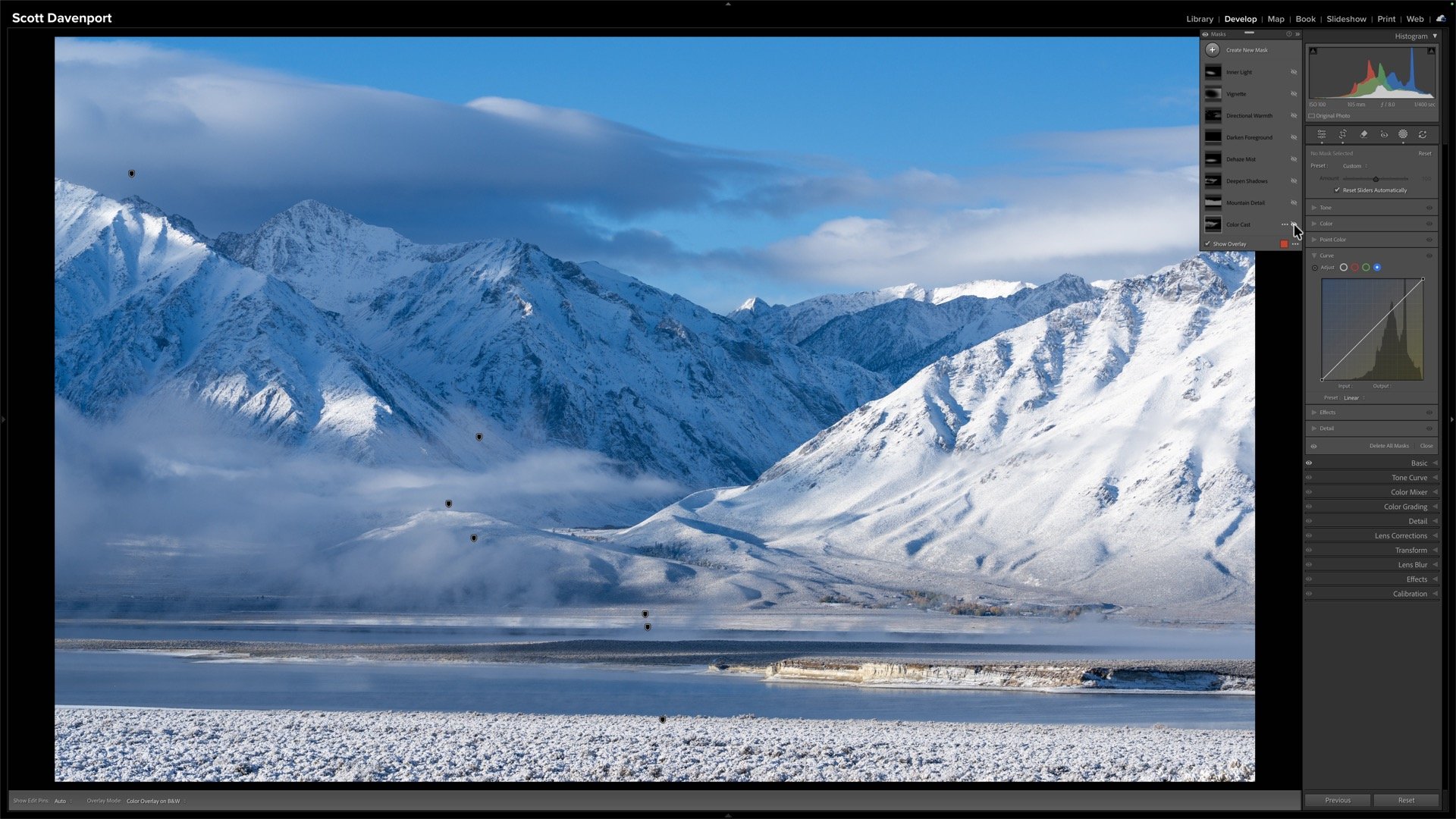
The mountains on the left are in shadow and have a strong blue color cast.
Target the Problem Before Correcting It
The most important part of this workflow isn’t the individual color adjustments. It’s targeting those adjustments so they affect only the areas that need help.
I began with an AI selection of the mountains. It provided a useful starting point, but it wasn’t perfect. The selection included some foreground areas I didn’t want, while missing the mist rolling across the base of the mountains.
That’s normal. An AI selection doesn’t need to produce the finished mask. It only needs to move the selection in the right direction.
I used one brush to add the missing mist and another to remove the unwanted foreground areas. This gave me a better geographic selection of the part of the scene I wanted to adjust.
Refine the Mask by Color
Selecting the mountains narrowed the adjustment to the correct area, but I wanted to target the blue within those mountains more precisely. For that, I added a Color Range selection and sampled the blue tone in the shadowed snow.
I didn’t need to refine the sampled range further. The initial selection reached across the varied blues in the mountain shadows and gave me the targeting I needed.
This combination is what makes the mask effective. The mountain and brush selections define where the adjustment can happen. The Color Range focuses it on the affected blues within that area.
The result is much more controlled than warming or desaturating the entire photograph.
Use selections to cover the areas of the scene that need correction. Then intersect with a Color Range mask to limit adjustments to the blue tones.
Build the Correction with Subtle Adjustments
Once the mask was in place, the actual color correction was straightforward. Rather than asking one control to do all the work, I used several small adjustments.
On the blue channel of the curve, I pulled the curve down slightly near the middle. Lowering the blue channel introduces its complementary color, yellow, which gently offsets the blue cast.
I also sampled the blue with Point Color and reduced its saturation. I wasn’t trying to shift the hue or change the luminance. I simply wanted to tone down the intensity of that color.
Finally, I reduced the overall saturation inside the mask a little. “Overall” is relative here—the adjustment applies globally within the mask, not across the entire photograph. Point Color provides more precise control over the sampled blue, while the broader saturation adjustment quiets everything selected by the mask.
None of these changes was especially strong. Together, they produced a more natural result without stripping the shadows of their color.
Balance Color and Tone Together
The blue cast wasn’t the only reason the mountains felt heavy. They were also quite dark, so I raised the exposure and whites slightly within the same mask. This brightened the snow and helped normalize the shadowed area without making it look as though it were receiving direct light.
Color and tone often influence how we perceive one another. A dark blue can appear more intense than the same blue at a slightly brighter value. Correcting the color while gently opening the tones produced a more balanced result than either adjustment would have achieved alone.
I also knew that later texture and detail adjustments would increase contrast and could darken the mountains again. Giving the tones a modest lift at this stage created some room for those finishing adjustments.
A tug downward on the blue color curve counters cool tones with warmth.
Desaturating specific blue tones with the Point Color tool is a more scoped adjustment.
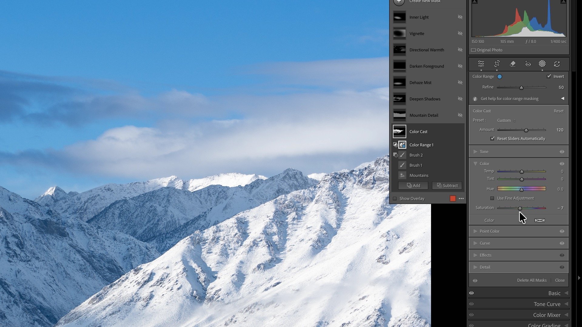
A minor desaturation for the entire mask further reigned in the blues.
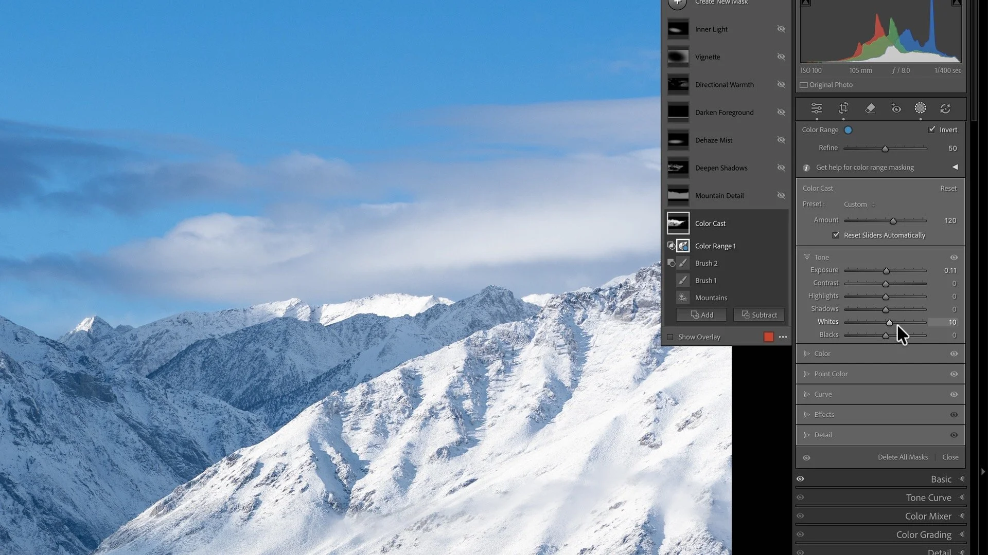
A finishing bump to exposure and whites to brighten the shadowed snow.
Final Thoughts
When a snowy landscape develops a strong blue cast, resist the urge to remove the blue everywhere. Some cool color helps communicate shadow, atmosphere, and depth.
Focus first on building a precise mask. Once the affected area and color are properly targeted, a combination of small curve, color, saturation, and tone adjustments can bring the scene back into balance.
The goal isn’t perfectly white snow. It’s snow that feels believable within the light of the photograph.
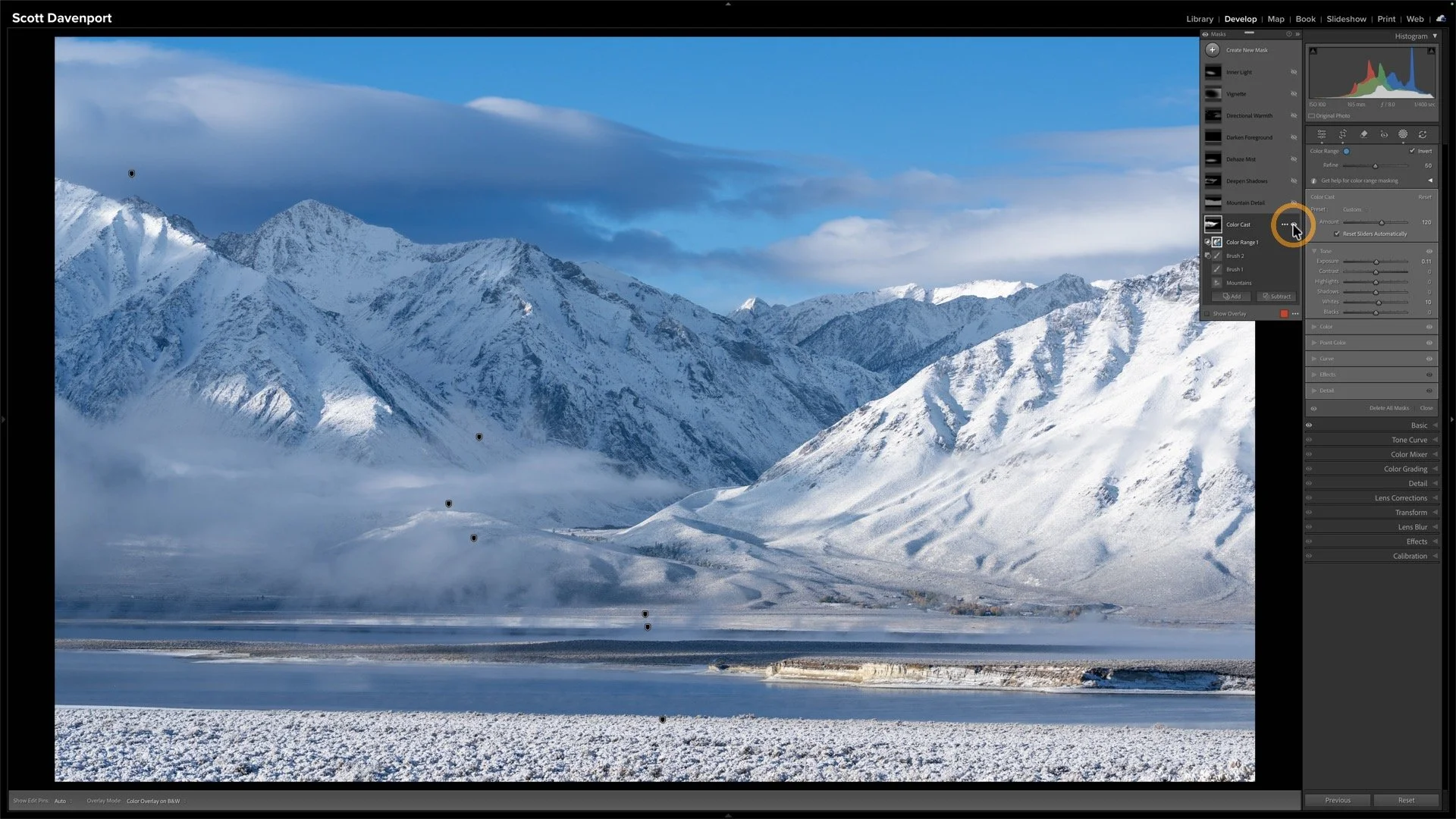
After correcting the blue color cast, the mountain side in shadow is more aligned with the overall scene.
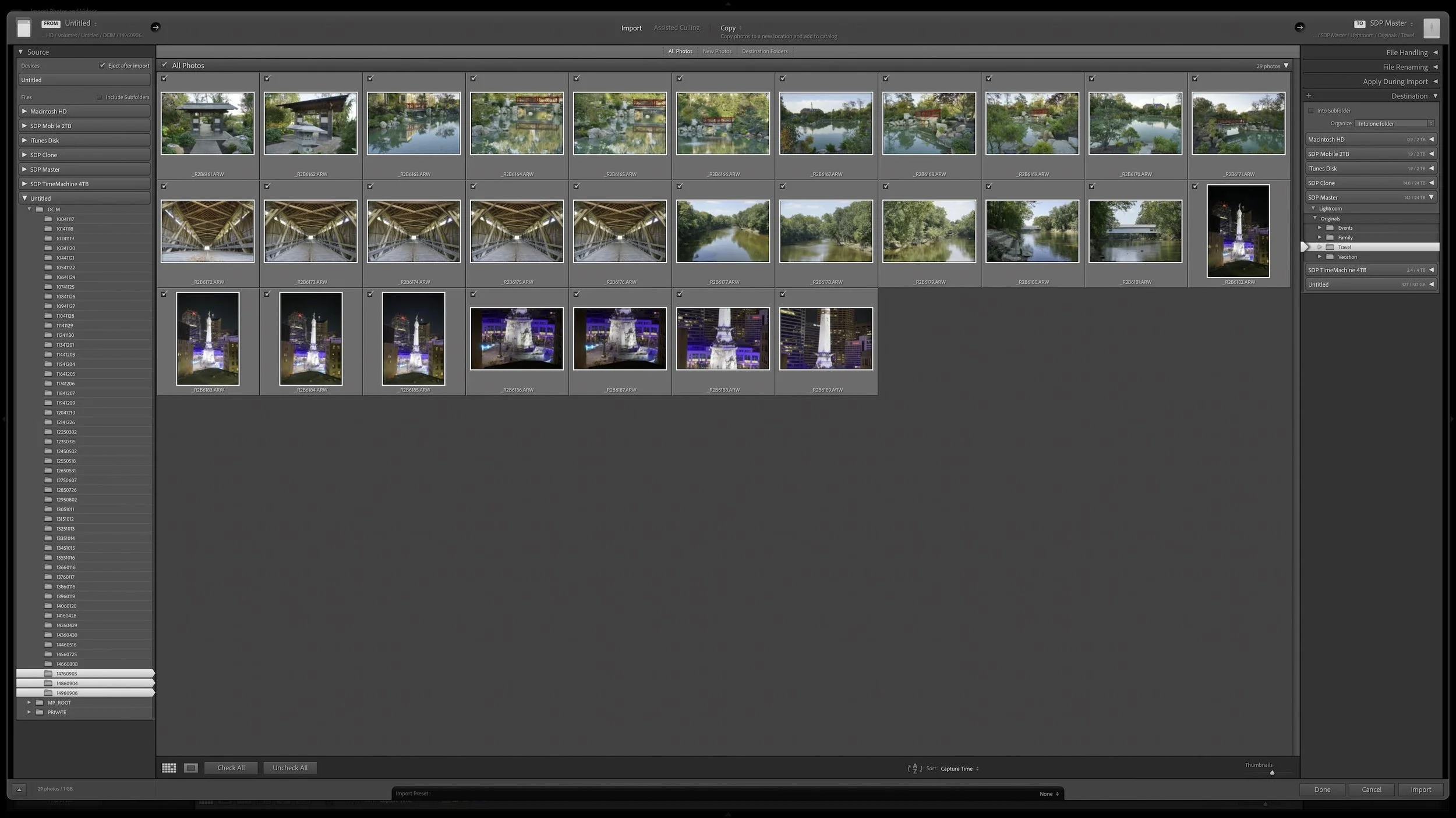
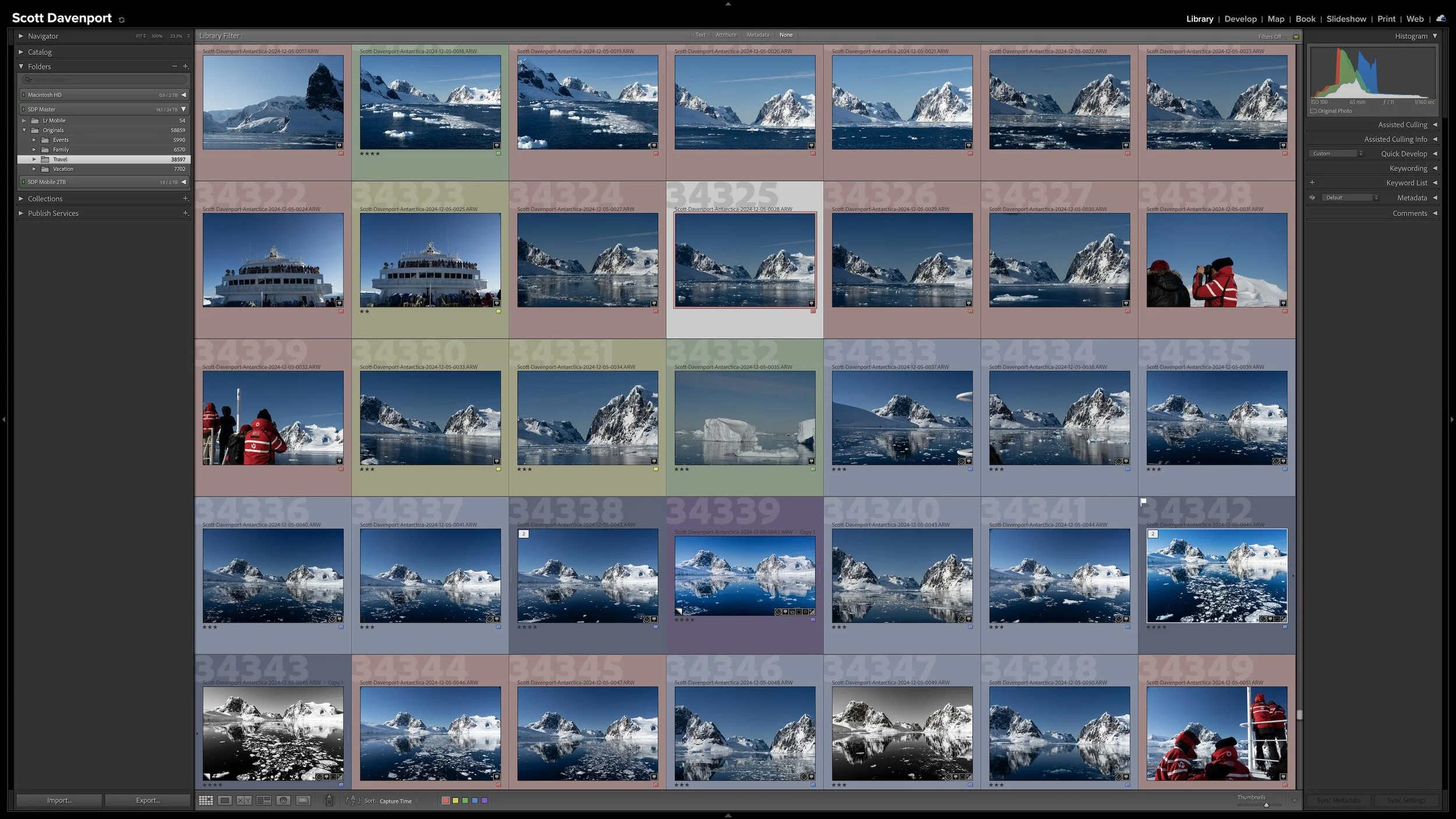

Lightroom Classic's Import dialog asks many of the same questions every time you bring in photos. Rather than rebuilding those settings for every import, you can save the choices that stay consistent in an import preset.
The preset doesn't eliminate the decisions that change from shoot to shoot. It gives you a reliable starting point, so you can concentrate on the source, destination, and other details that actually need your attention.