
In this tutorial, I explore Lightroom Classic’s new Variance slider — a subtle yet powerful addition to the Point Color panel. You’ll learn what Variance does, how it interacts with Range, and why it’s such a game-changer for controlling color contrast and separation in your landscapes. I break down the theory in simple terms, then show real examples where a small tweak to Variance transforms the mood and depth of an image.
Watch as I walk through two landscape photos — from warm fall colors to cool alpine lakes — demonstrating how narrow Variance values give you precise, selective color edits. Whether you want to fine-tune light transitions or enhance warm-cool balance, this tool opens new creative possibilities for shaping color stories in your landscapes. By the end of the video, you’ll know exactly when and how to reach for the Variance slider to get the perfect harmony of color, tone, and atmosphere in your photos.
If you enjoy this technique, be sure to check out my course Mastering Light and Shadow in Lightroom. It dives deep into the creative and technical side of light control, with practical examples that help you transform your photos into stronger visual stories.
Aspens in Aspendell, California
Contact Scott to commission a print or license this image.
Evergreens Reflecting in the Tuolumne River, Yosemite
Contact Scott to commission a print or license this image.
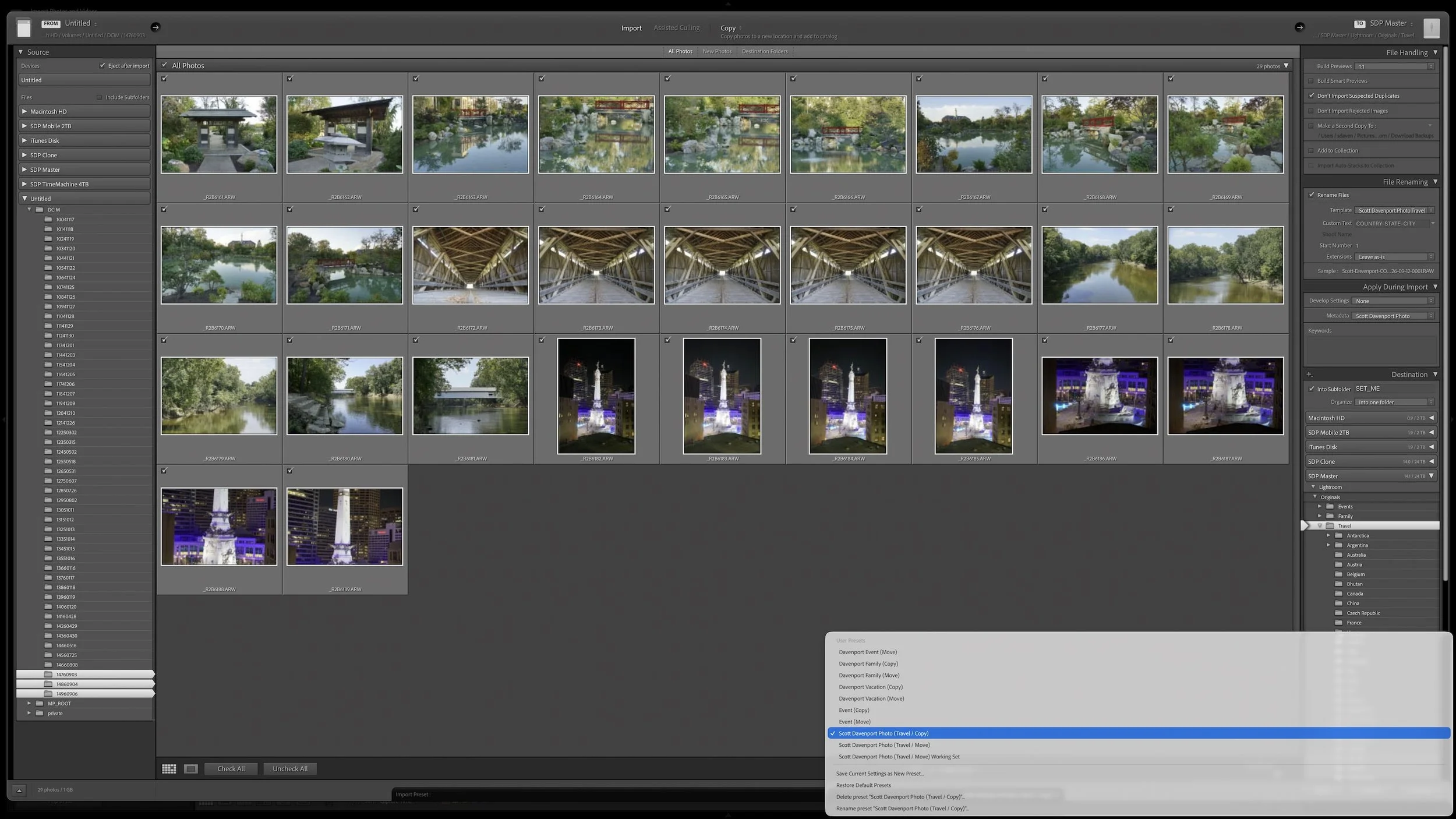
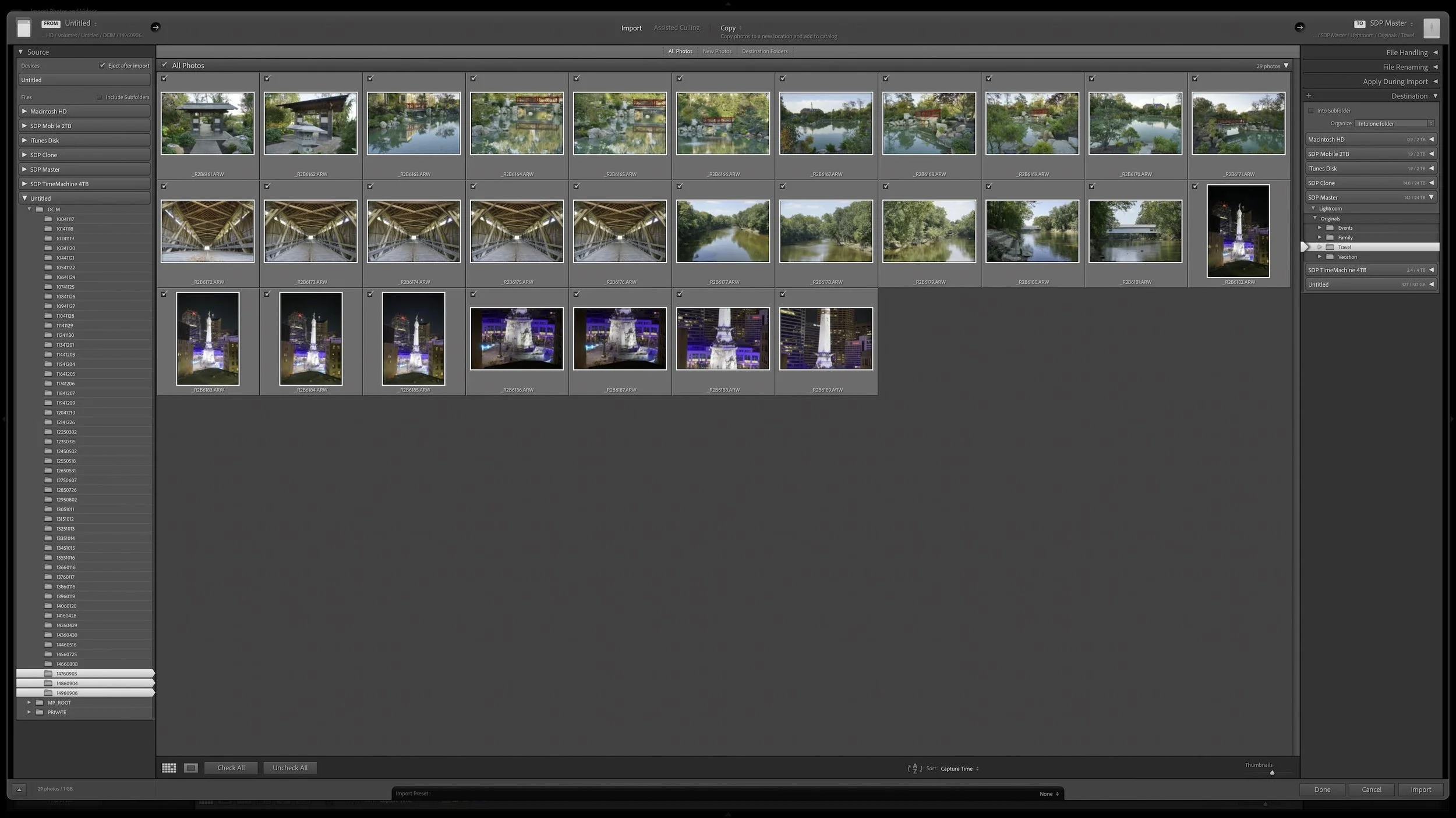
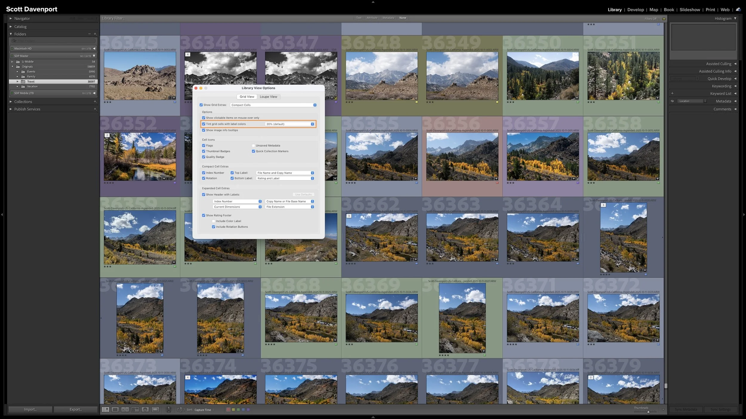
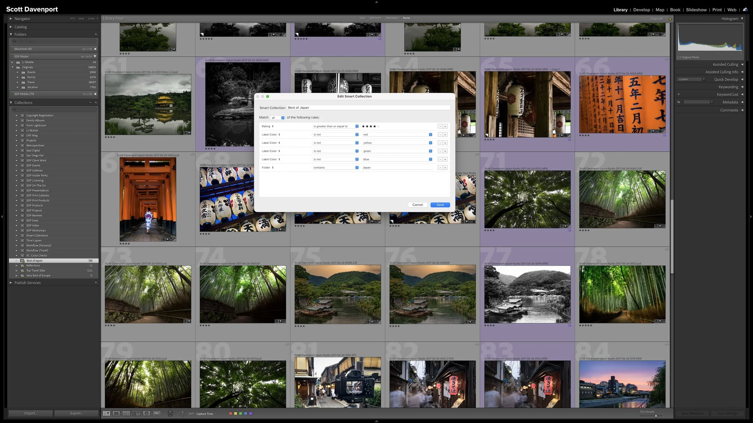
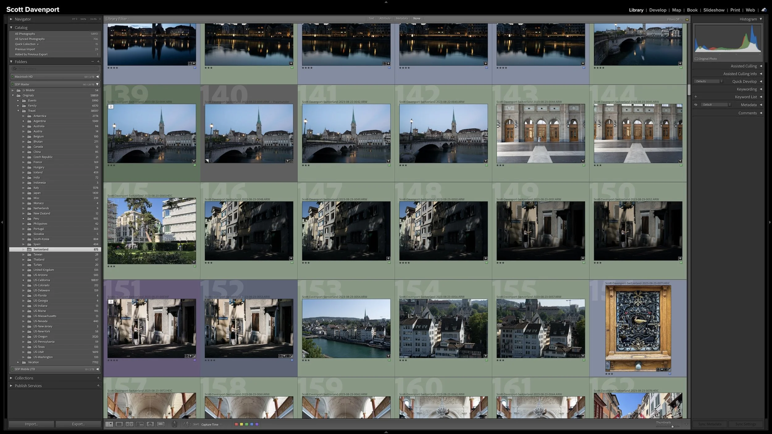
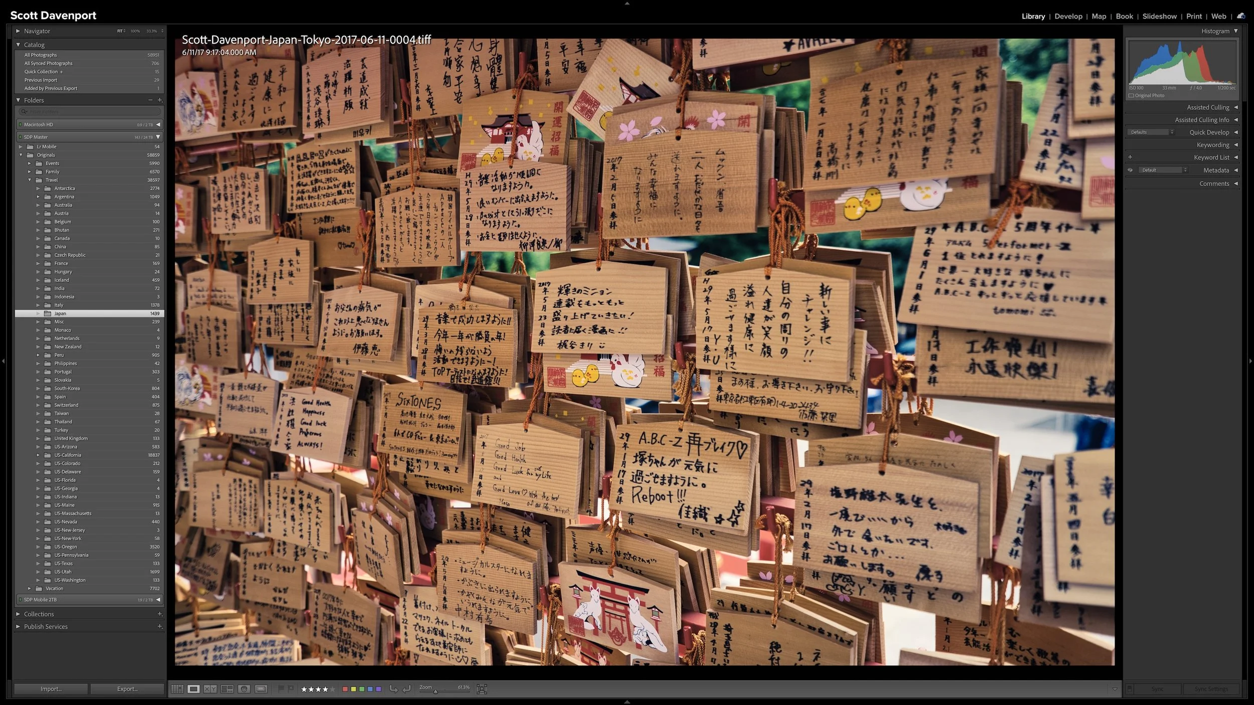
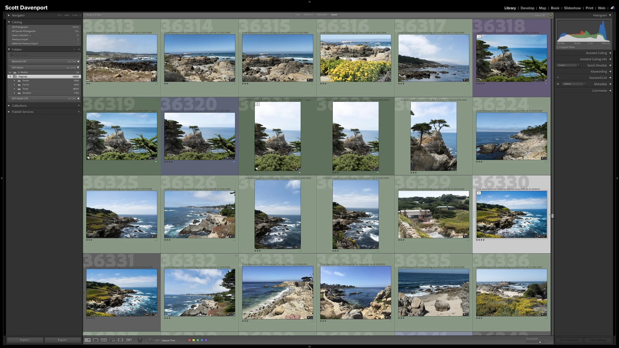
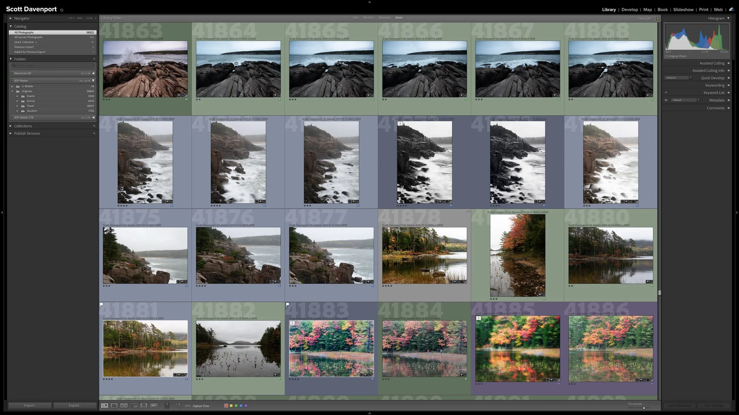

Lightroom Classic gives you five stars for rating photographs, but those stars aren't very useful if their meanings change from one shoot to another. A consistent system lets you know what a three-star or four-star photograph means without rethinking the definitions every time you rate a new group of photos.
My rating system ranges from photographs I keep primarily for sentimental reasons to photographs I consider strong enough to print. You don't need to use the same definitions I do. The important part is giving your ratings stable meanings you can apply consistently over time.