
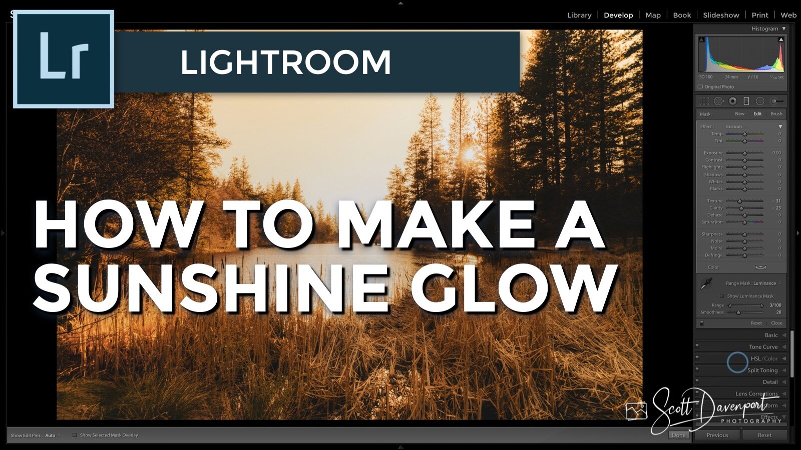
I often turn to tools outside of Lightroom to add glow and sunshine effects. However, there are some adjustments you can make right inside Lightroom to create a sunshine glow look. A mix of temperature, clarity, and texture can produce a softer, diffused look for your images.
Subscribe and share!
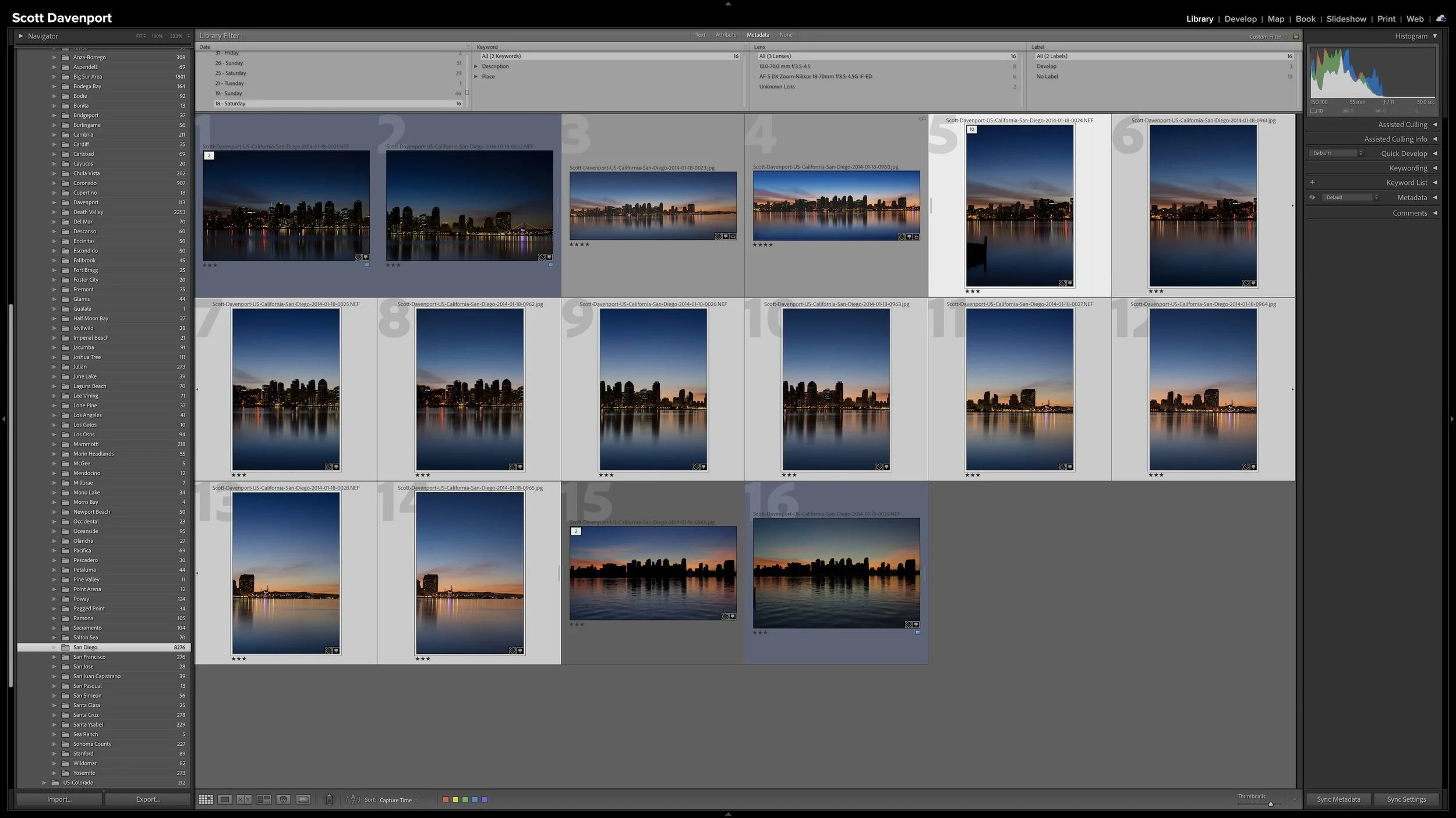
A group of photographs can belong together without every frame needing equal space in Lightroom Classic. Several variations of the same composition, panorama segments, exposure brackets, or a rapid burst can quickly fill Grid view with photographs you don't need to see individually all the time.
Stacks keep those related photographs together while letting one useful photograph represent the group. I use them so the other photographs remain available when I need them without adding unnecessary visual clutter to my catalog.
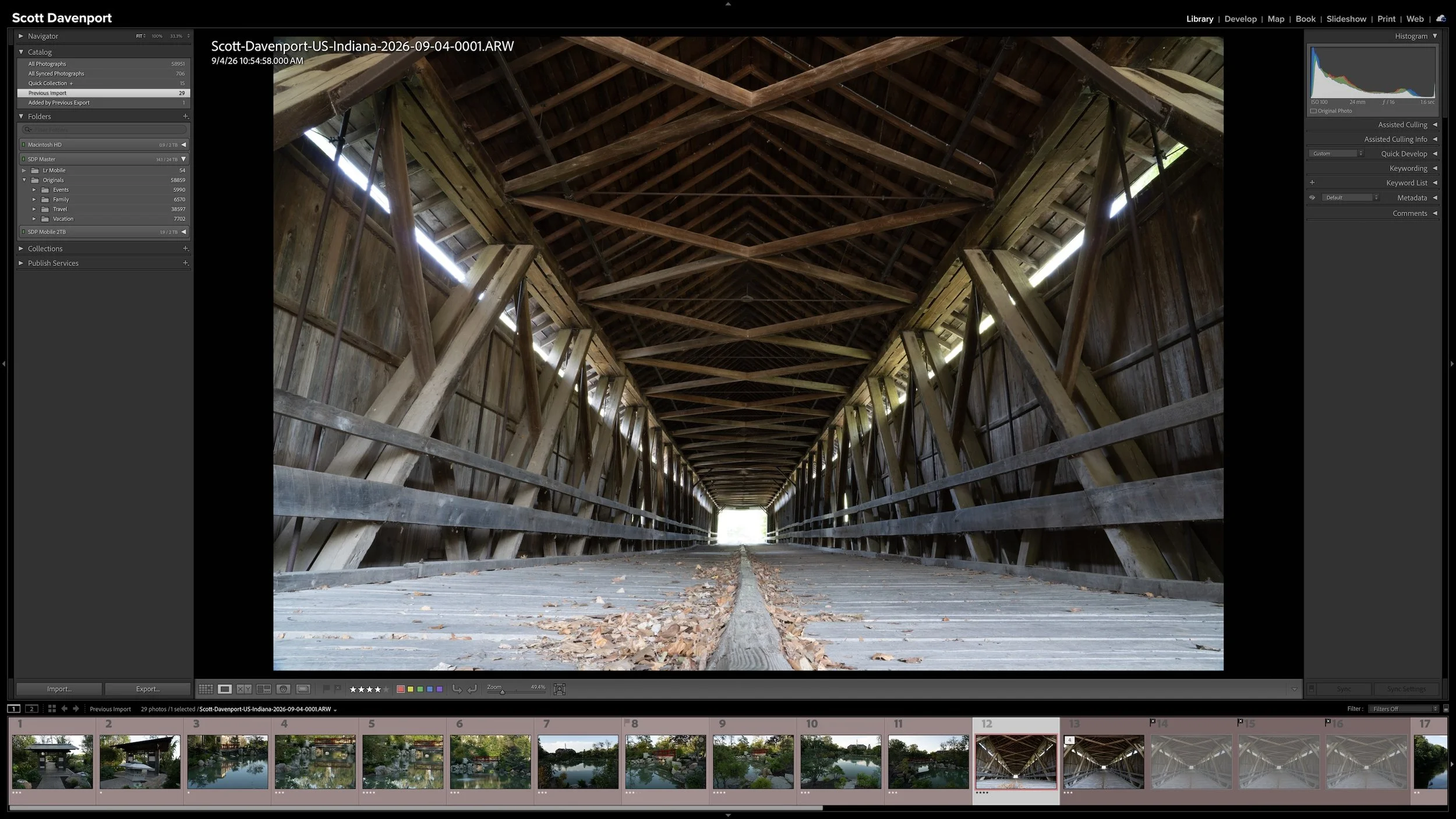
Lightroom Classic gives you five stars for rating photographs, but those stars aren't very useful if their meanings change from one shoot to another. A consistent system lets you know what a three-star or four-star photograph means without rethinking the definitions every time you rate a new group of photos.
My rating system ranges from photographs I keep primarily for sentimental reasons to photographs I consider strong enough to print. You don't need to use the same definitions I do. The important part is giving your ratings stable meanings you can apply consistently over time.
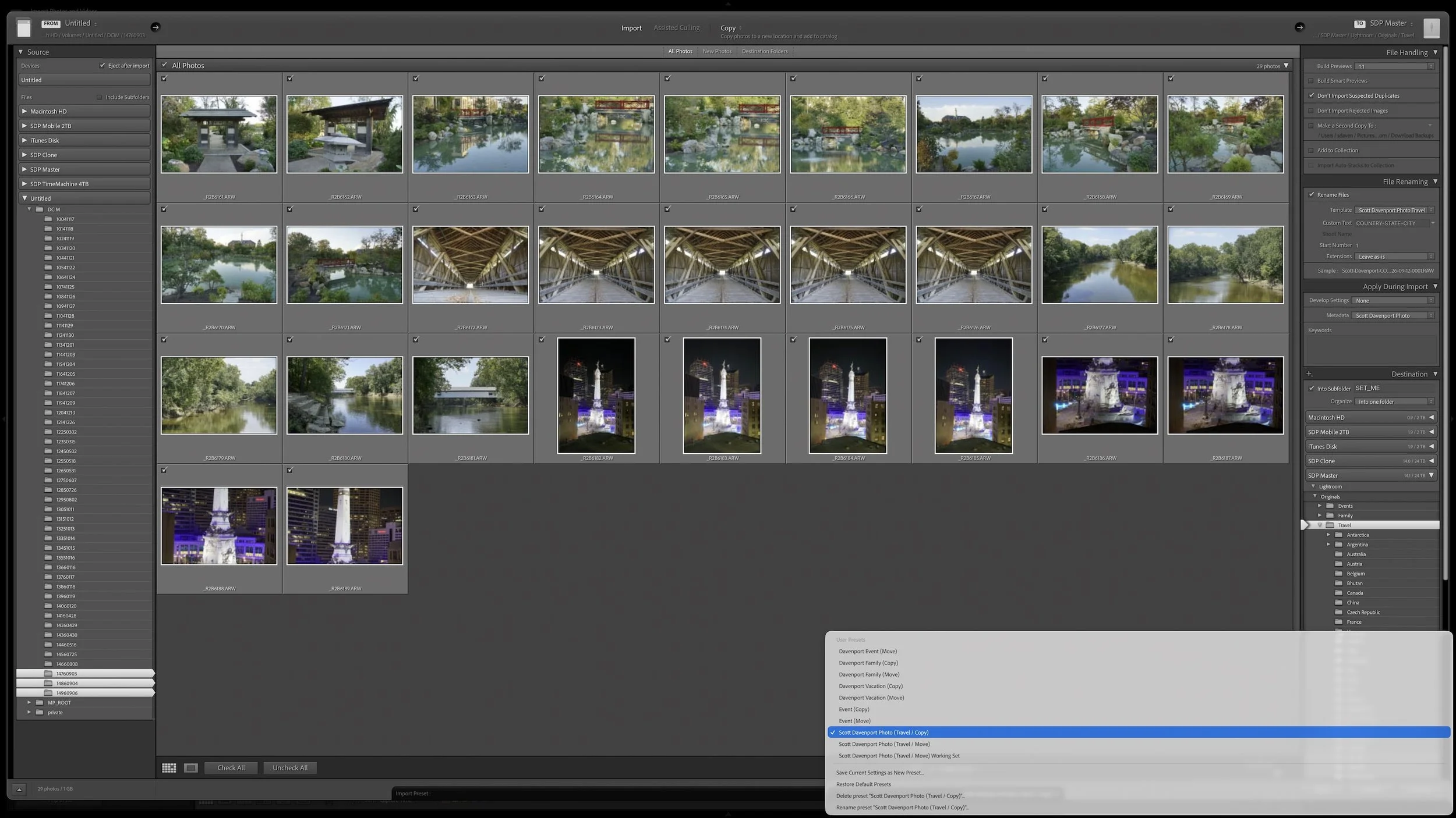
Lightroom Classic's Import dialog asks many of the same questions every time you bring in photos. Rather than rebuilding those settings for every import, you can save the choices that stay consistent in an import preset.
The preset doesn't eliminate the decisions that change from shoot to shoot. It gives you a reliable starting point, so you can concentrate on the source, destination, and other details that actually need your attention.
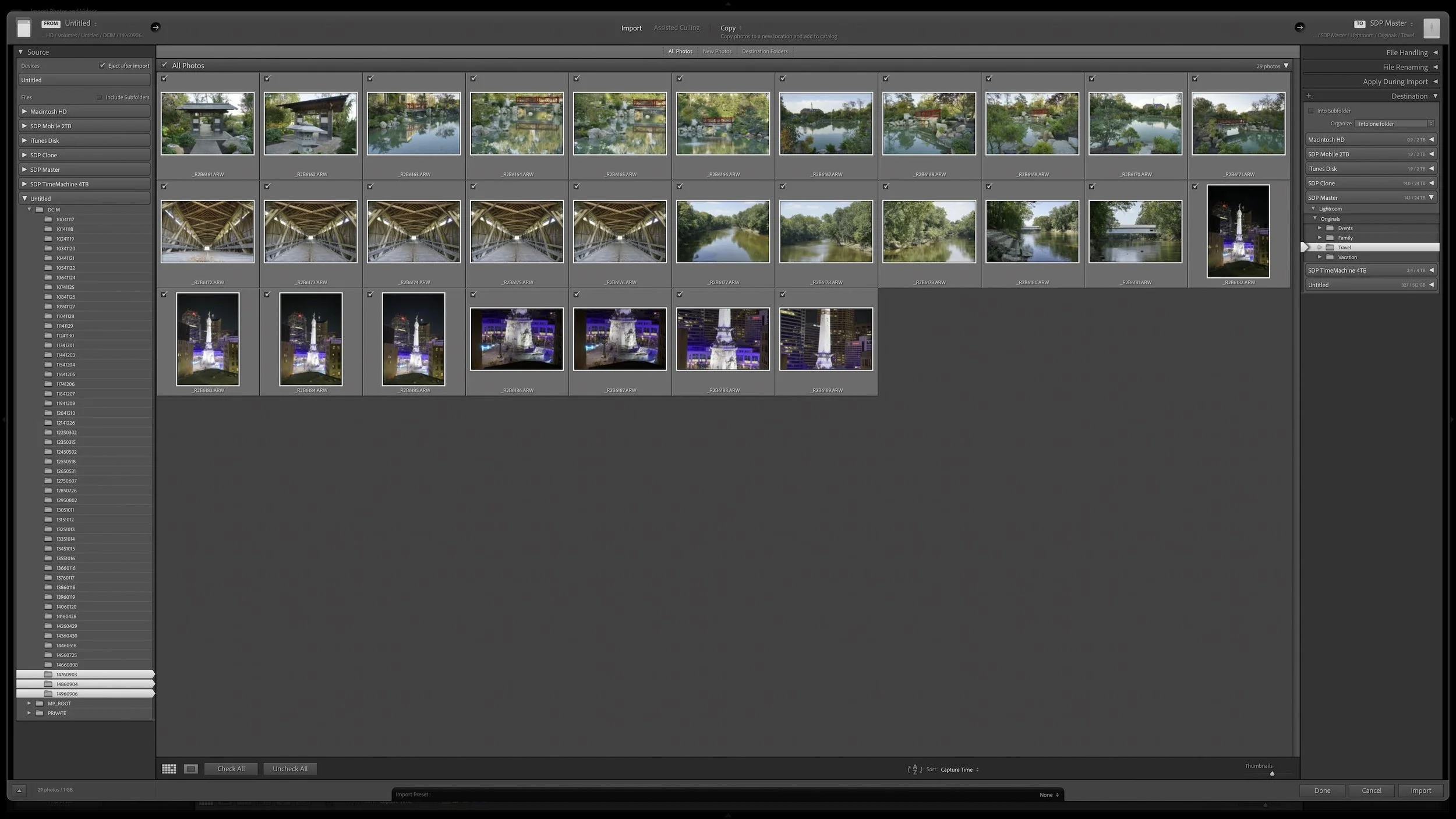
Lightroom Classic's Import dialog presents plenty of choices, but one of the most important decisions is straightforward: where are your photos now, and where do you want the original files to live after the import?
Copy, Move, and Add each handle the original files differently. Once you understand what happens to the physical files and what happens in the Lightroom catalog, choosing the right import method becomes much easier.
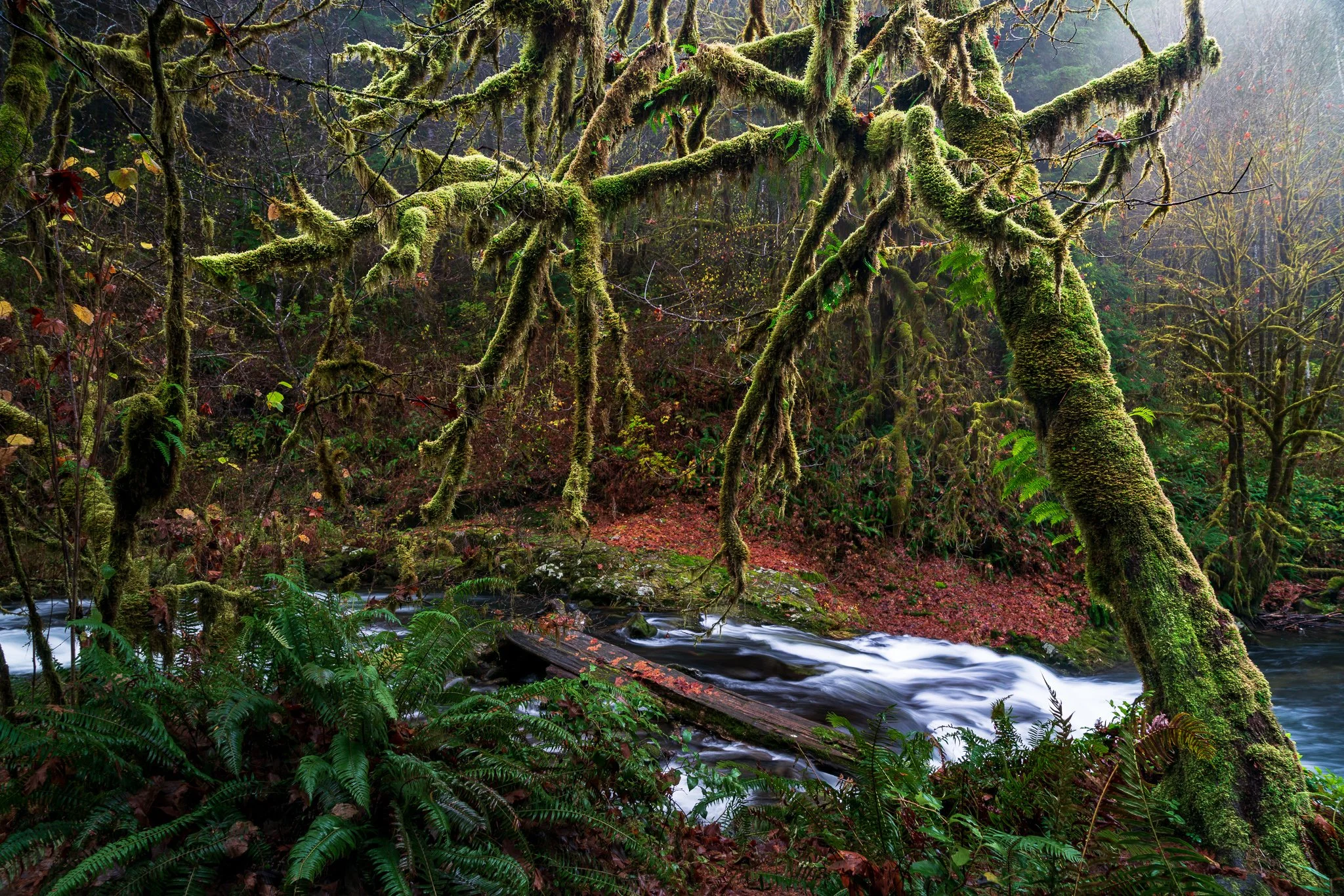
A complicated subject can take a little work to mask well. Once you've made that selection, what else can you do with it? Quite a bit, especially when you want to give your subject more separation from a busy background.
Using a mossy tree as an example, I explain how Lightroom's Duplicate and Invert lets you build several adjustments from one refined mask. You can shape the background and guide the eye while protecting the light on your foreground subject.
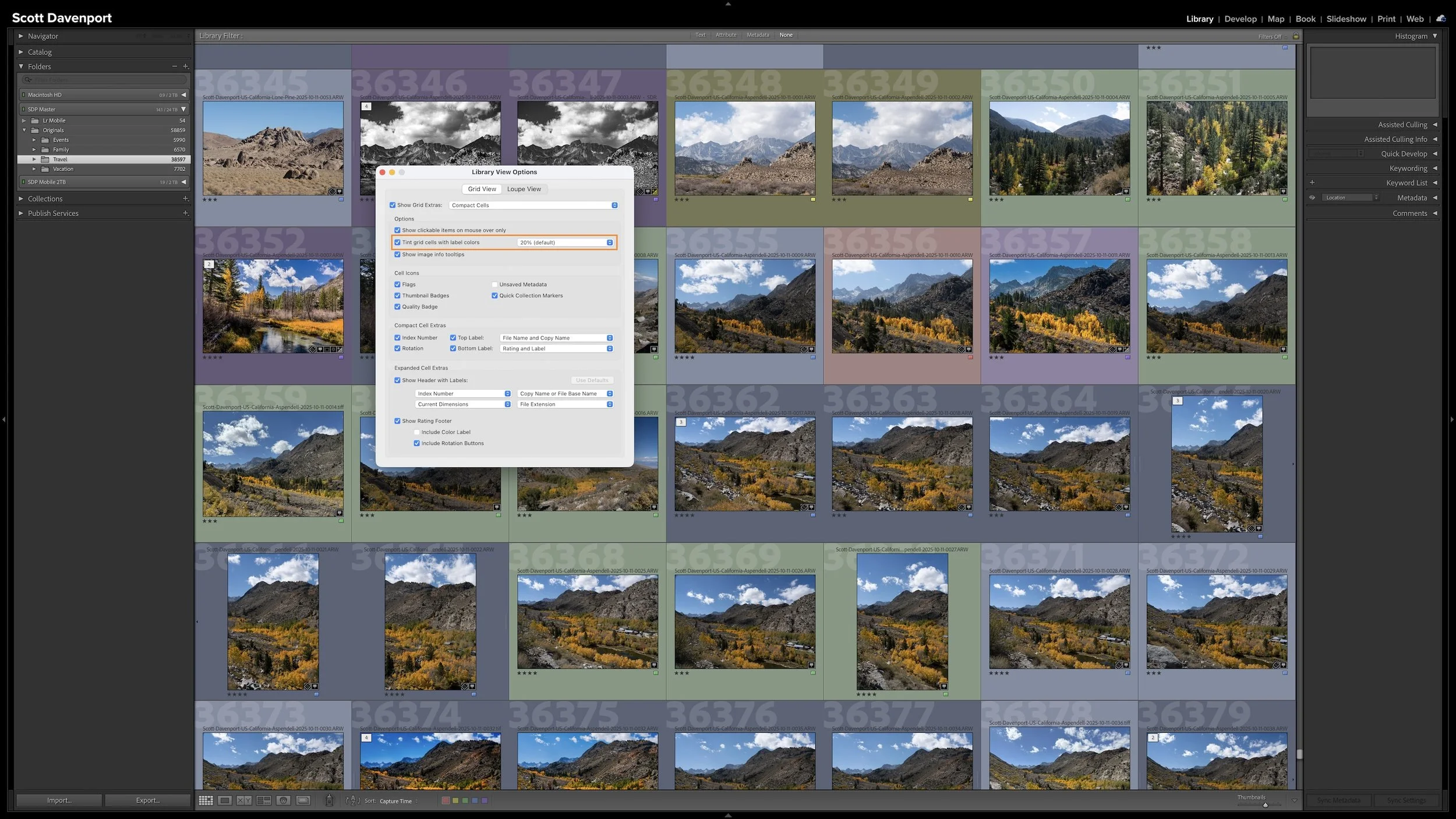
A photo workflow can fall apart when you cannot tell what has been finished and what still needs attention. That becomes especially frustrating when photographs from the same shoot are at different stages.
My six-step Lightroom Classic workflow uses color labels to give every photograph a clear next action. Whether a photo needs rating, location information, keywords, developing, or sharing, I can see where I left off and continue without retracing my steps.
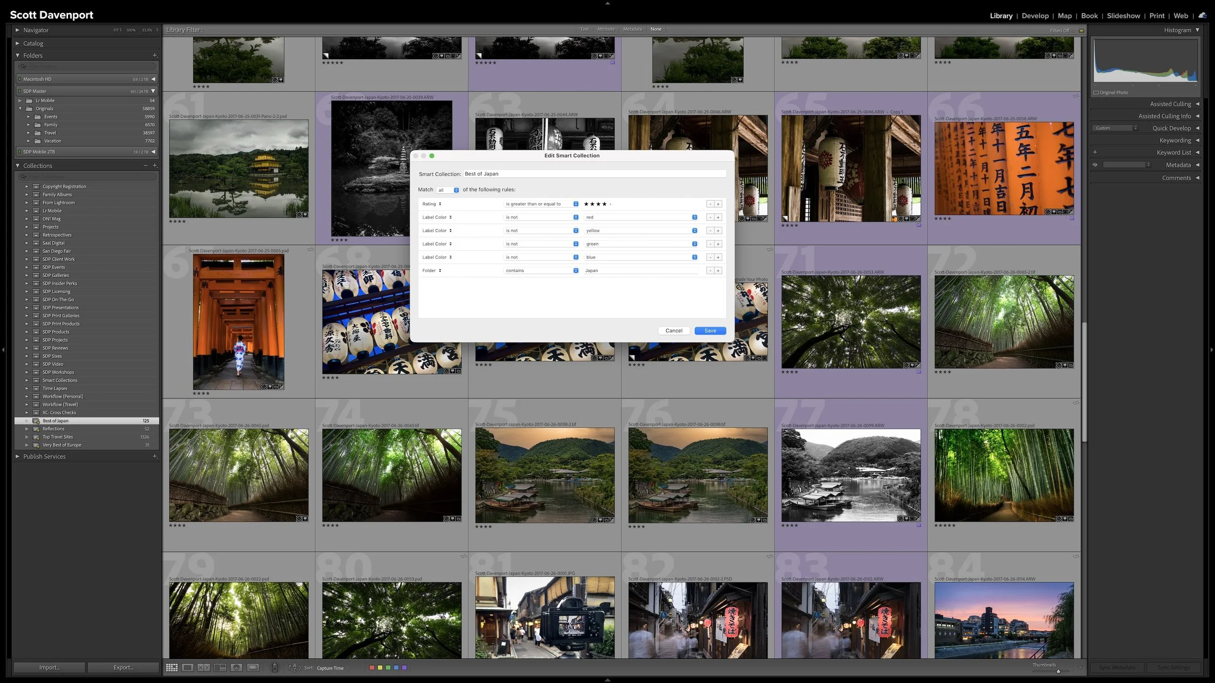
A regular Collection lets you choose which photographs you want to see together. A Smart Collection works differently. You describe the photographs using criteria such as ratings, keywords, location information, or camera metadata, and Lightroom Classic gathers the photographs that match.
The real advantage is that the group isn't static. As photographs enter the catalog or their metadata changes, they can automatically appear in or disappear from a Smart Collection. The rules keep working as the catalog changes.
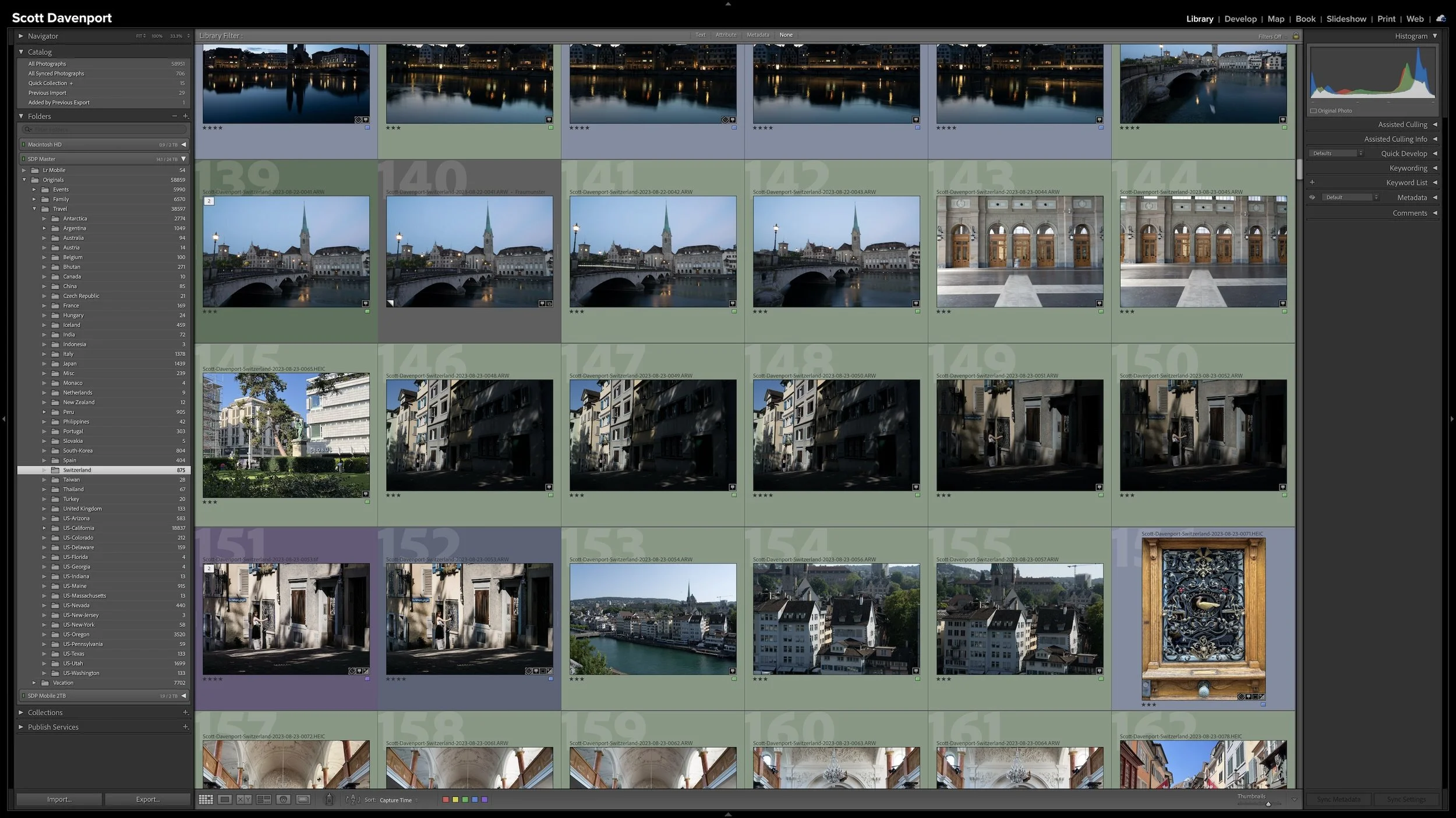
Folders and Collections can both look like ways to organize photographs in Lightroom Classic, but they solve different problems. Folders describe where the original photographs physically live. Collections let you bring photographs together without changing that physical organization.
That becomes especially useful when a gallery, project, subject, or other body of work includes photographs stored in many different folders. Collections give you another way to see those photographs together while leaving the originals exactly where they belong.
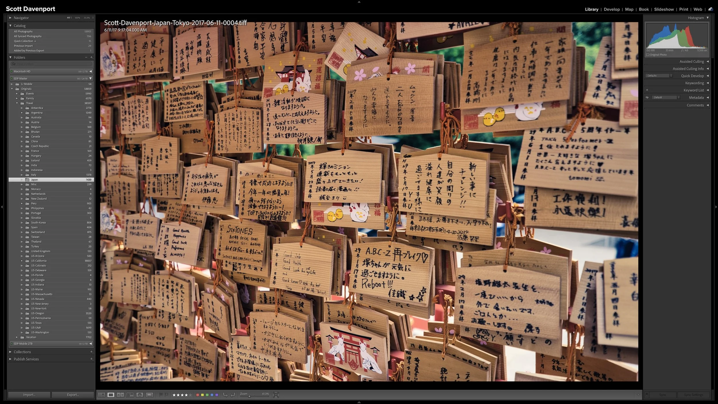
A Lightroom folder structure doesn't need to account for every date, location, subject, or shoot with another level of folders. Organizing photographs into dated folders is especially common, but unless dates are how you naturally look for your photographs, that extra structure may not be helping you. Too much structure can make a photo library harder to understand rather than easier.
I keep all of my photographs beneath one top-level folder, then use a relatively shallow hierarchy underneath it. Different types of photography can follow different organizational logic. The important thing is that the structure matches how you naturally think about and look for your photographs.

Right after a shoot, you know where you made the photographs. A few years later, that may not be nearly as obvious. Adding location information while the shoot is still fresh gives you another durable way to find photographs and understand where they were made.
You don't need to type city, state, and country into every photograph. If the camera records GPS coordinates, much of the work is already done. A GPX track log or, when necessary, Lightroom Classic's Map module provides other ways to add the location. The goal isn't exhaustive geographic metadata. It's enough useful information that you won't have to reconstruct it later.