5 Recipes Using Curves
Curves is a powerful and sometimes misunderstood editing tool. Just about every photo editing application has a Curves tool - Lightroom, Photoshop, ON1, Skylum - they’ve all got it. I have several videos explaining how curves work (see below). In this video, I share 5 “recipes” you can use curves for. They’ll help you get familiar with curves and grow more comfortable using them to adjust your images.
To go deeper into curves, read my other articles about how curves work:
Lightroom; Precision contrast with the tone curve
Luminar; Curves in the Light Tool
Recipe 1 - The Matte Look
A matte look does not have a pure black or pure white point set. Shadows are a charcoal gray and highlights are an off-white. This look is suitable for vintage styling or to simulate an aged, faded photo. To create a matte look in curves:
Raise the black point 1/5 to 1/4 of the curve
Lower the white point 1/5 to 1/4 of the curve
Adjust the curve itself to taste (a gentle S-curve is often used)
A matte look with a curves adjustment.
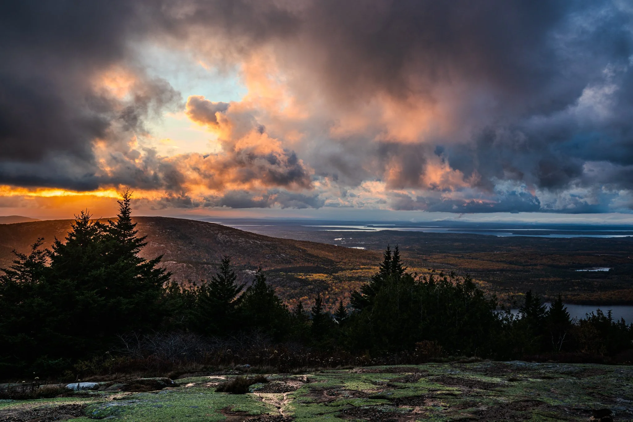
Recipe 2 - Accented Atmosphere
A variation of a matte look is to raise just the black point to wash out the shadows. Areas of fog or mist in a scene are accentuated. Another variation is to protect the deep shadows and highlights, limiting the curve to affect only the low midtones. That’s my preferred variation for an atmosphere accentuation with a curve:
Set a few “anchor” points to bound a region of the tone curve
Raise the bounded region of the curve
Accent atmosphere with a modified matte look
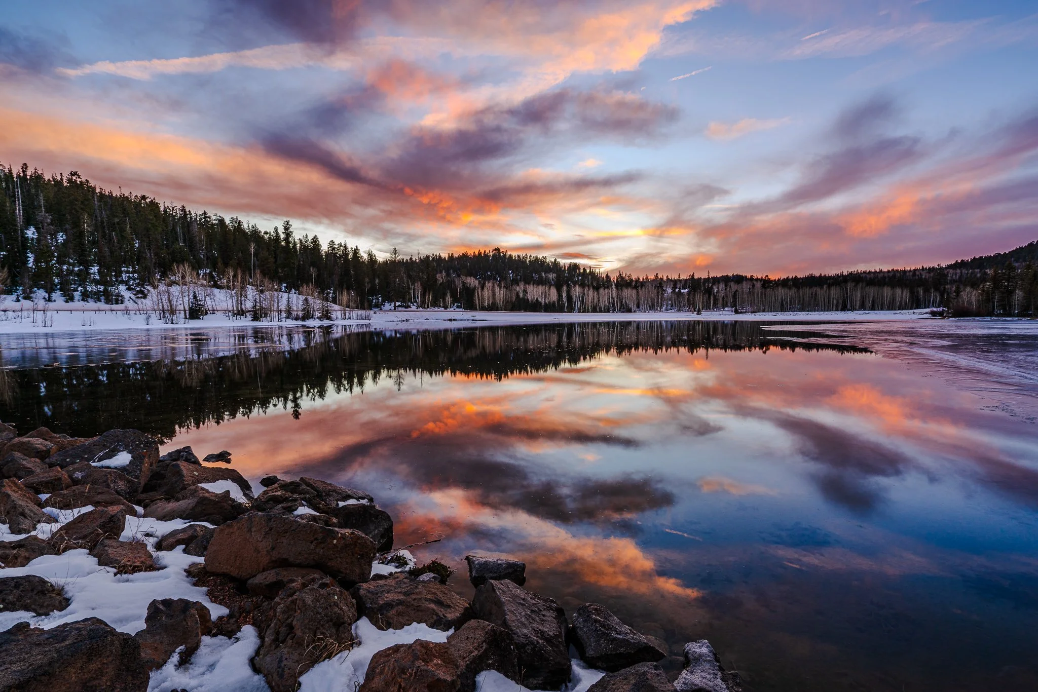
Recipe 3 - Color Grading
There are lots of tools to do color grading. Curves is one of them, and you should have it in your toolkit. The color channels - red, green, and blue - in the curves tool adjust color. Each of these color curves is a push-and-pull of one color against another. Using a curve offers advantages over sliders like Temperature because you have more control over the tonal regions affected.
An example of a cooling a sky and maintaining warmth in the shadows uses the blue curve:
Raise the upper portion of the blue color curve. This adds blue to the highlights.
Lower the lower portion of the blue color curve. This removes blue (adds yellow) to the shadows.
Color grading with curves is actually quite fun. You can achieve very interesting mixes and blends of colors with curves (check out Recipe 5!).
A warm/cool color grading with a curves adjustment
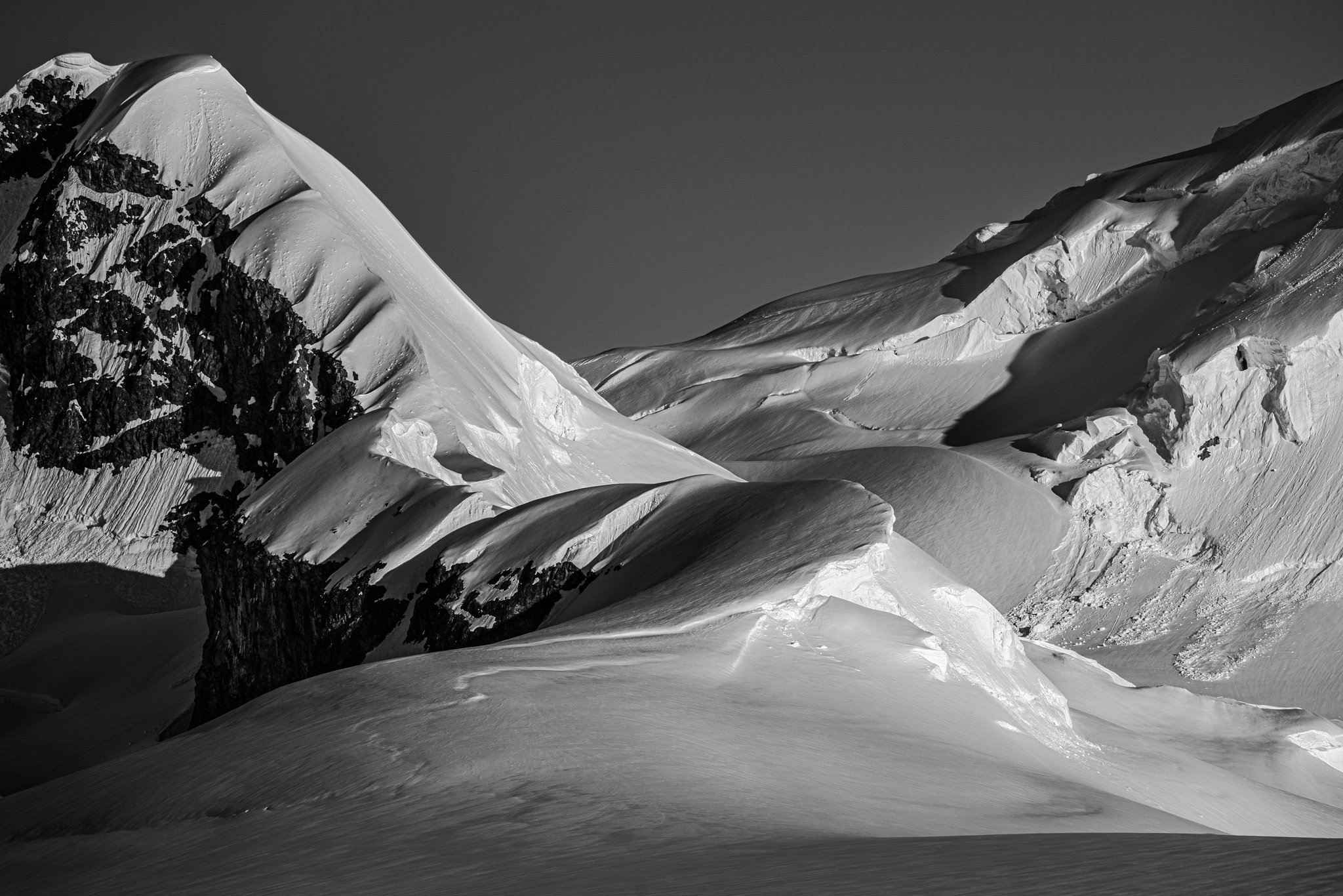
Recipe 4 - High Key Black & White
I am a sucker for a high contrast black and white image. In my black and white work, I like crisp, bright whites. A high key look accentuates the contrast in a scene. For an elegant high key, try a curve:
Set anchor points to lock down the shadows and very low midtones
Raise the upper midtones area of the curve. You can get somewhat aggressive with the brightness increase.
The curves offer more precise control than traditional sliders like highlights, shadows, etc. WIth the curve, you have full control over the transitions among the tonal regions.
Boosting contrast with an aggressive increase in brightness in the upper midtones
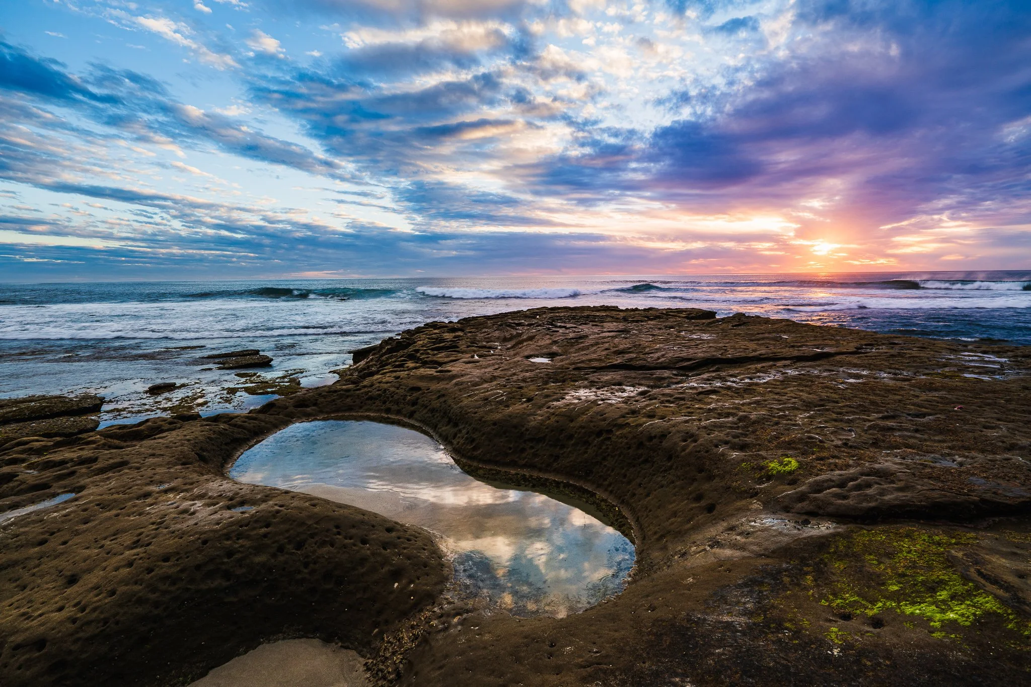
Recipe 5 - The Twilight Look
The color palette at twilight is a personal favorite. I like the mix of oranges and purples, and will often accentuate those in my landscape photos. Here is an easy to do recipe for a twilight look in curves:
Raise the red color curve slightly
Lower the green color curve slightly
Raise the blue color curve slightly
A small adjustment is fine. The result mixes more red, more magenta, and more blue into pleasing cool purples and dreamy oranges. This one is a lot of fun!

Crafting a twilight look with a triplet of color curve adjustments (blue adjustment shown)
Conclusion
There you go! Curves continue to be a valuable editing tool. Incorporate these curves adjustments Into your editing. You’ll gain a better understanding of curves, and then start forming recipes of your own.
La Jolla Potholes
Contact Scott to commission a print or license this image.