
This One Small Adjustment Brought My Black & White Photo to Life
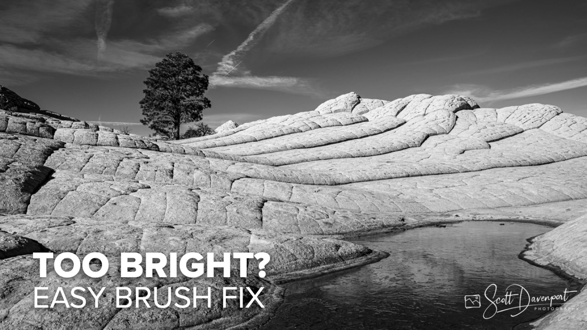
Black and white photography strips away color and leaves you with light, shadow, and balance. And sometimes, part of the frame becomes too visually “heavy.” Too bright. Too dominant. It pulls the eye away from the story.
In this tutorial, I’ll show you how I recognized that problem in a cascade of rock steps. The right side of the photo was so bright it flattened the natural layers. The depth was there—but hidden.
Using a simple brush and a subtle burn adjustment (just –0.3 exposure), I darkened the shadow edge of each step. That small change restored separation, depth, and dimension. The cascades feel three-dimensional again, and the viewer’s eye flows naturally through the scene.
This is a foundational black-and-white editing skill: recognizing visual weight and shaping light to support your composition.
What you’ll learn:
• How to recognize when part of your photo is visually “overweight”
• Why brightness can flatten texture and depth in black and white
• How to use a subtle burn adjustment to restore dimension
• How local adjustments guide the viewer’s eye
Photography is about shaping light. Dodge and burn is one of the most powerful—and most overlooked—tools you have.
Tree And Water, White Pocket, Arizona
Contact Scott to commission a print or license this image.
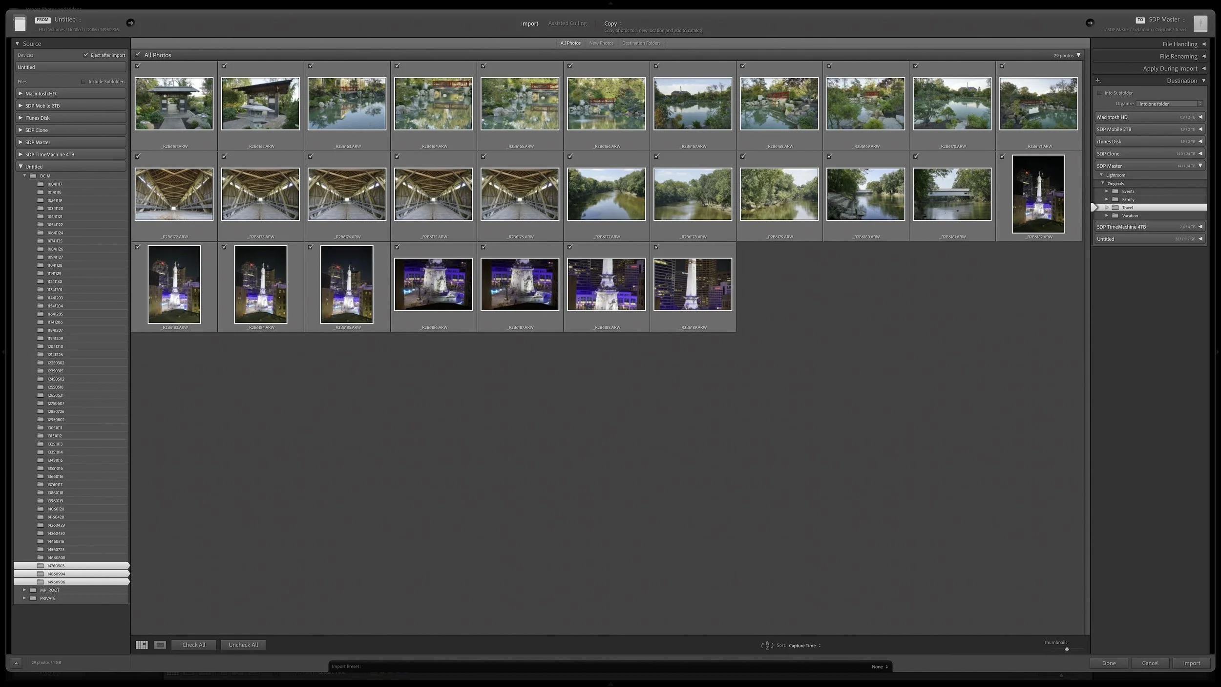
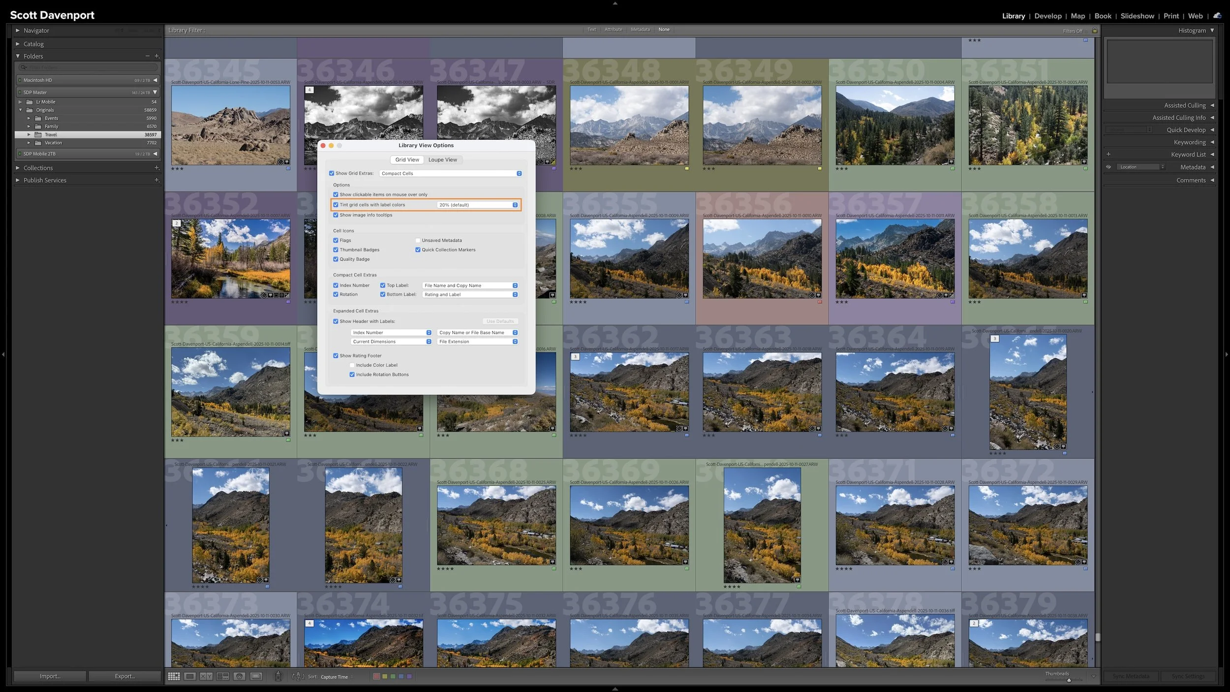
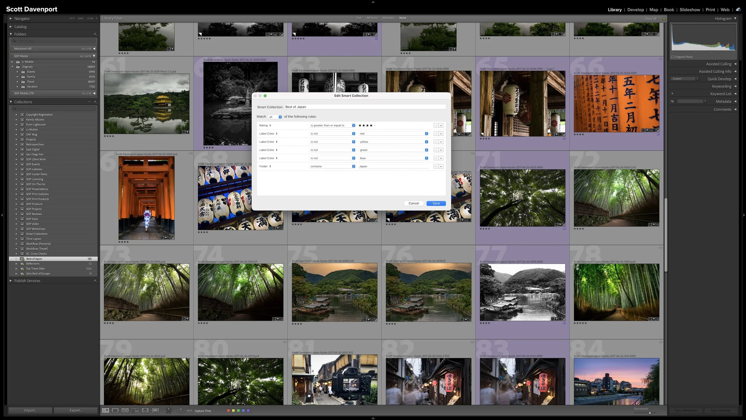

Lightroom Classic's Import dialog asks many of the same questions every time you bring in photos. Rather than rebuilding those settings for every import, you can save the choices that stay consistent in an import preset.
The preset doesn't eliminate the decisions that change from shoot to shoot. It gives you a reliable starting point, so you can concentrate on the source, destination, and other details that actually need your attention.