Revisiting a 10-Year Old Photo: How My Editing Evolved
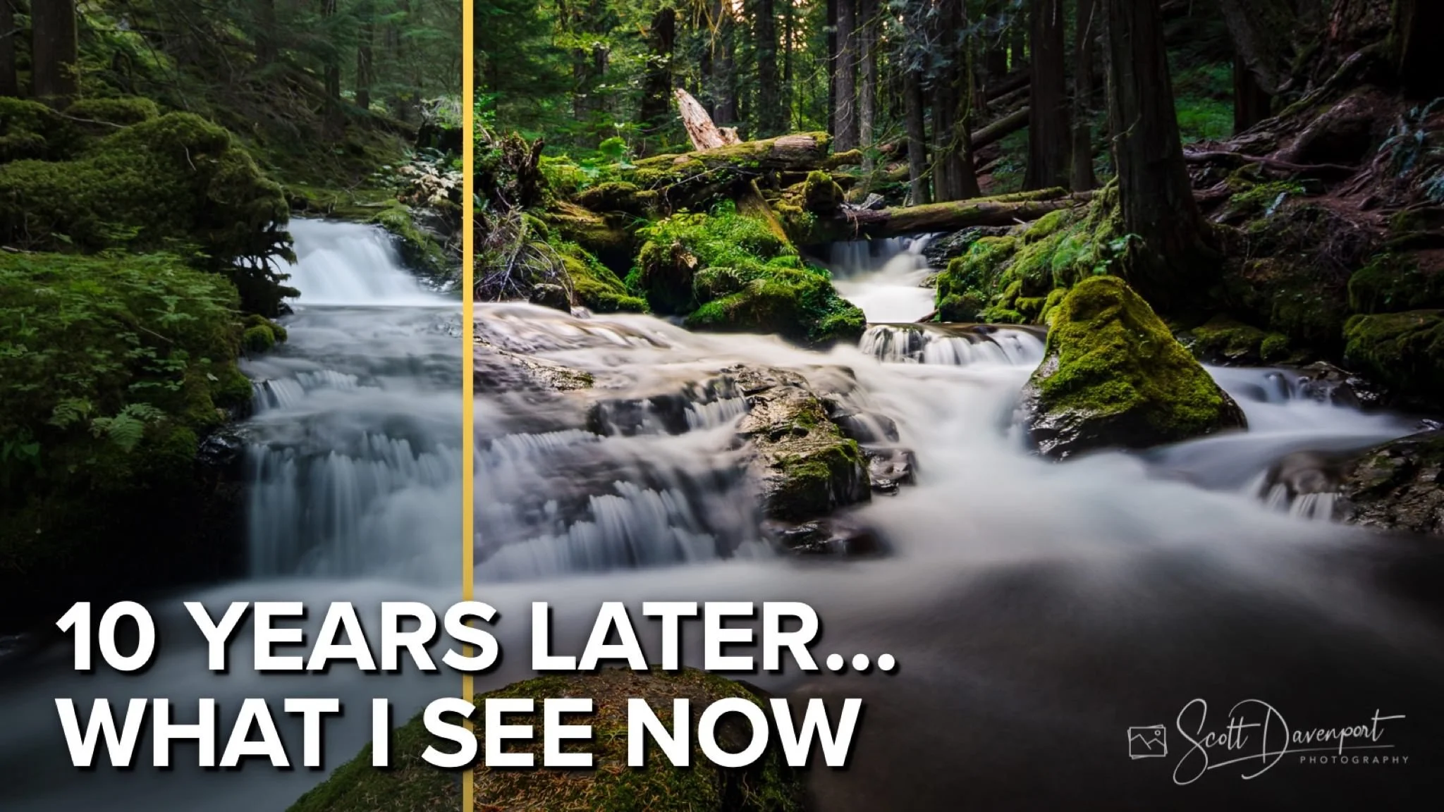
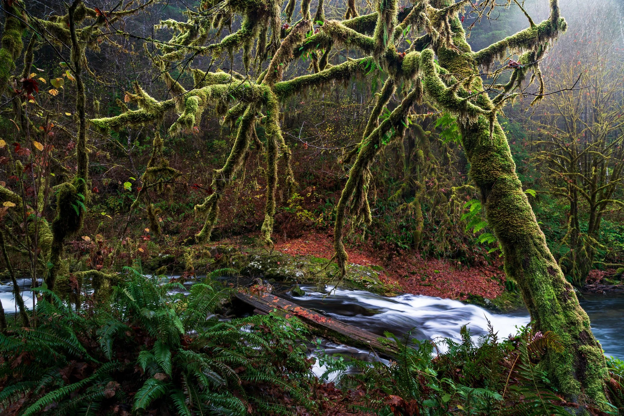
In this video, we crack open the time capsule and revisit a photo I made over a decade ago. Back then, I thought this image was “done.” I liked the composition, I liked the mood — but my skills and my vision were still taking shape. Now, with years of practice, mistakes, and growth behind me, I look at the same image through a very different lens.
I’ll share the original and talk about what I see now — the things that feel overcooked, the moments where my storytelling fell short, and the areas that just don’t feel natural. Then I’ll share the fresh re-edit. This isn’t about chasing trends or flashy effects — it’s about shaping light, refining tone, and letting the scene breathe in a way that invites the viewer in. By the end, you’ll see a side-by-side of then and now — a visual record of how far a photographer can come when they focus on craft over shortcuts. It’s part reflection, part demonstration, and all about making an image feel authentic, stronger, and more compelling.
And this approach — shaping light and refining tone — is a big theme in my upcoming video course, coming mid-September. Watch for it, and be sure to join my mailing list for a special discount when it launches.
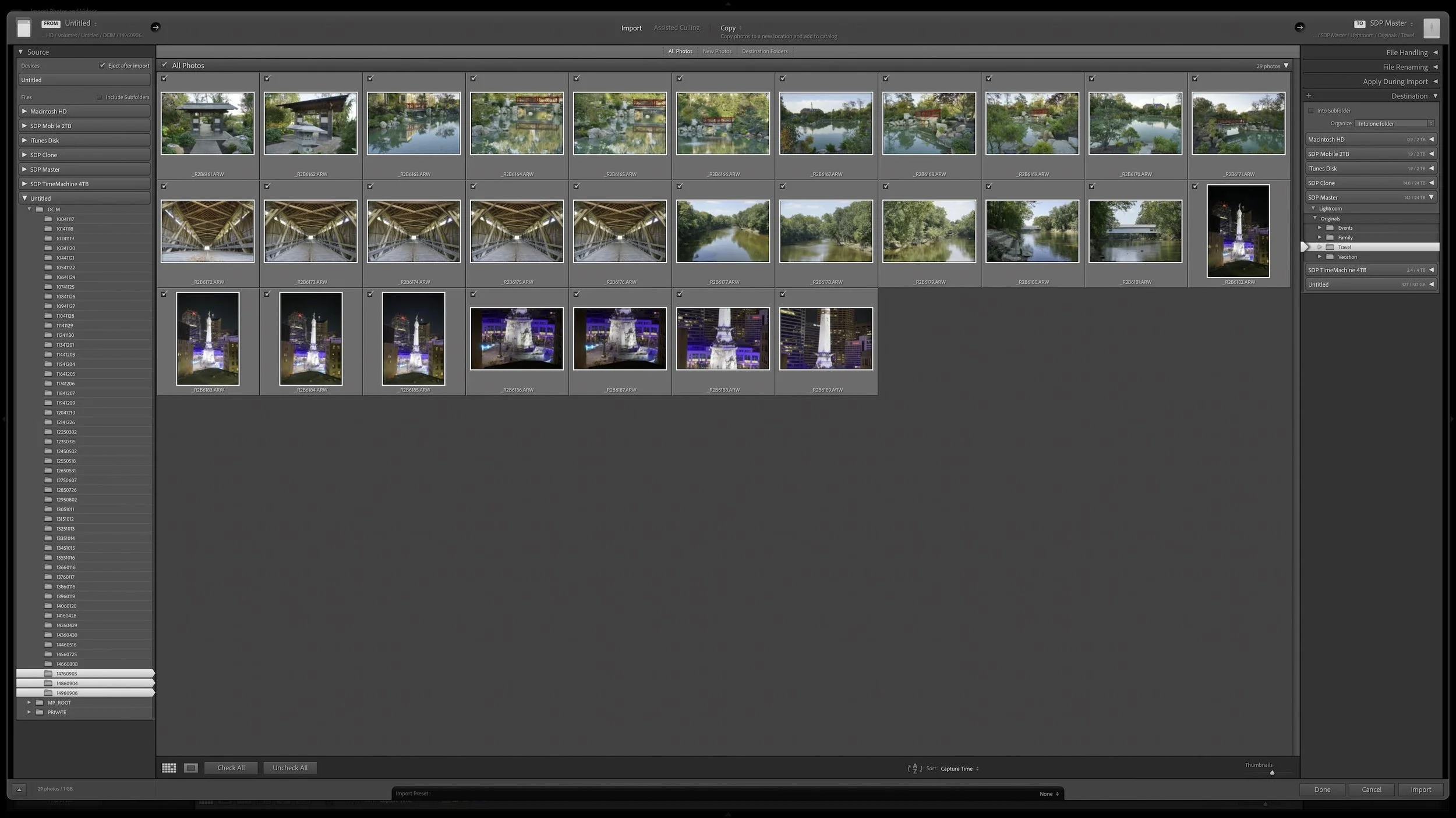
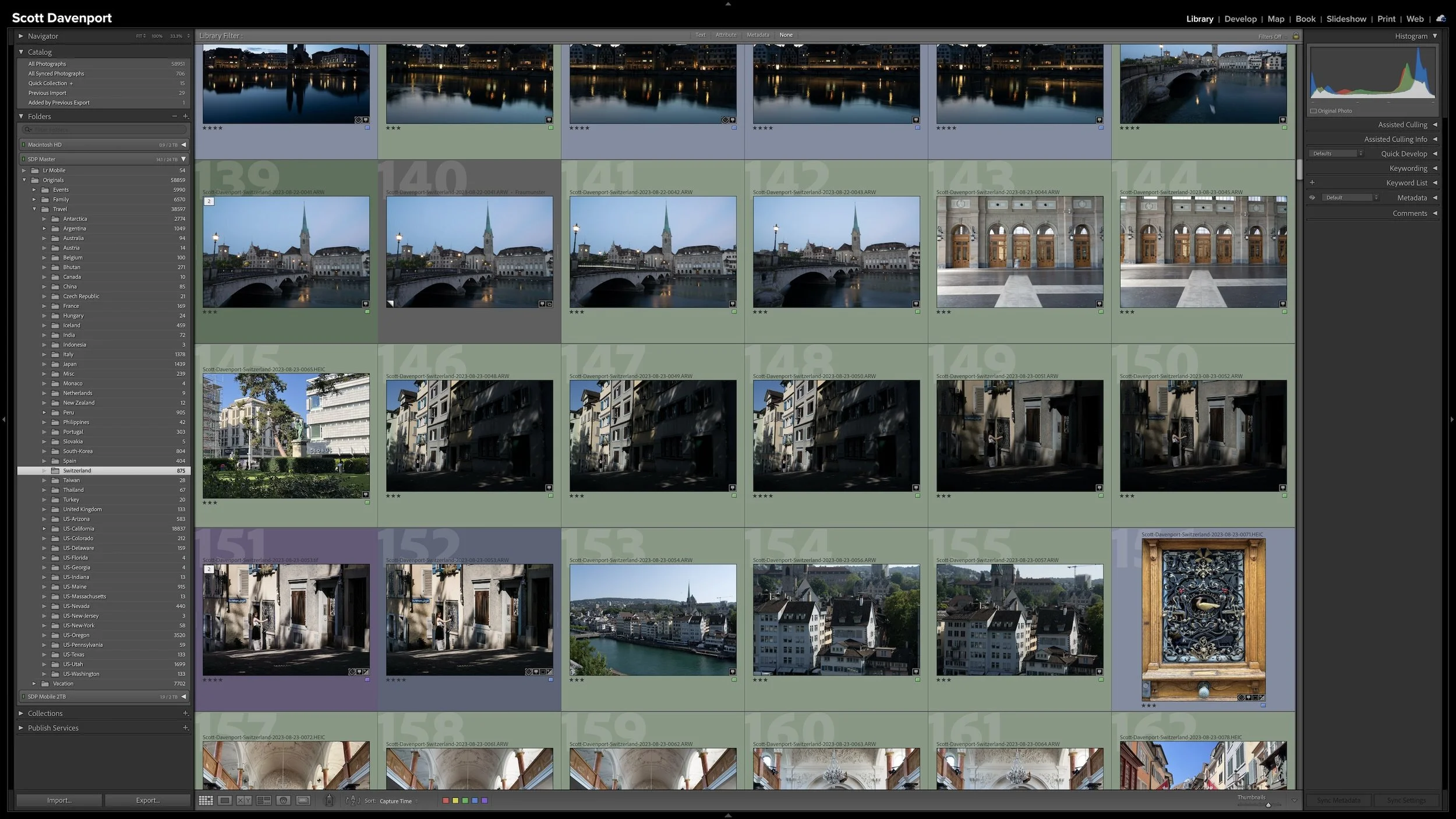
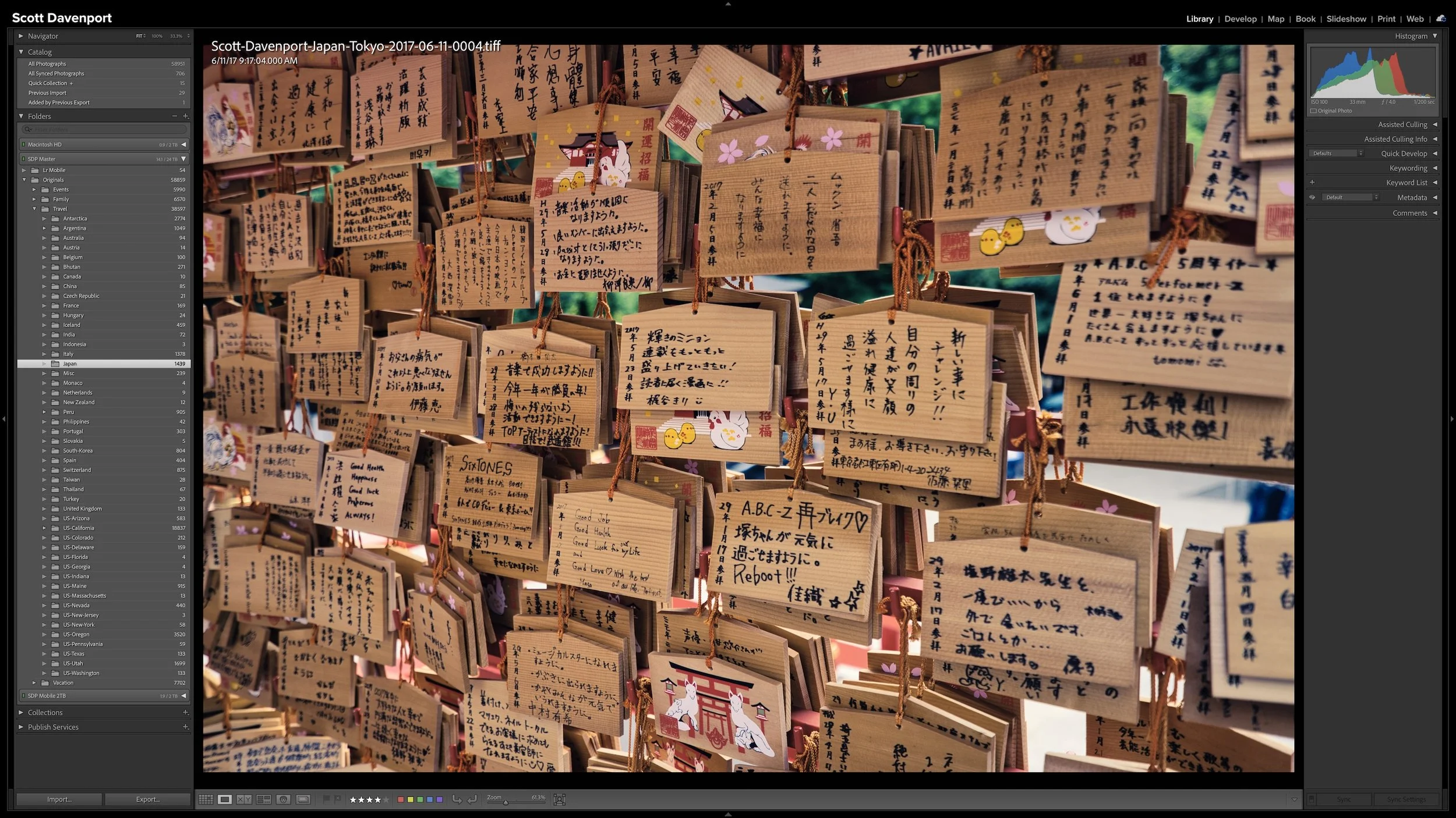
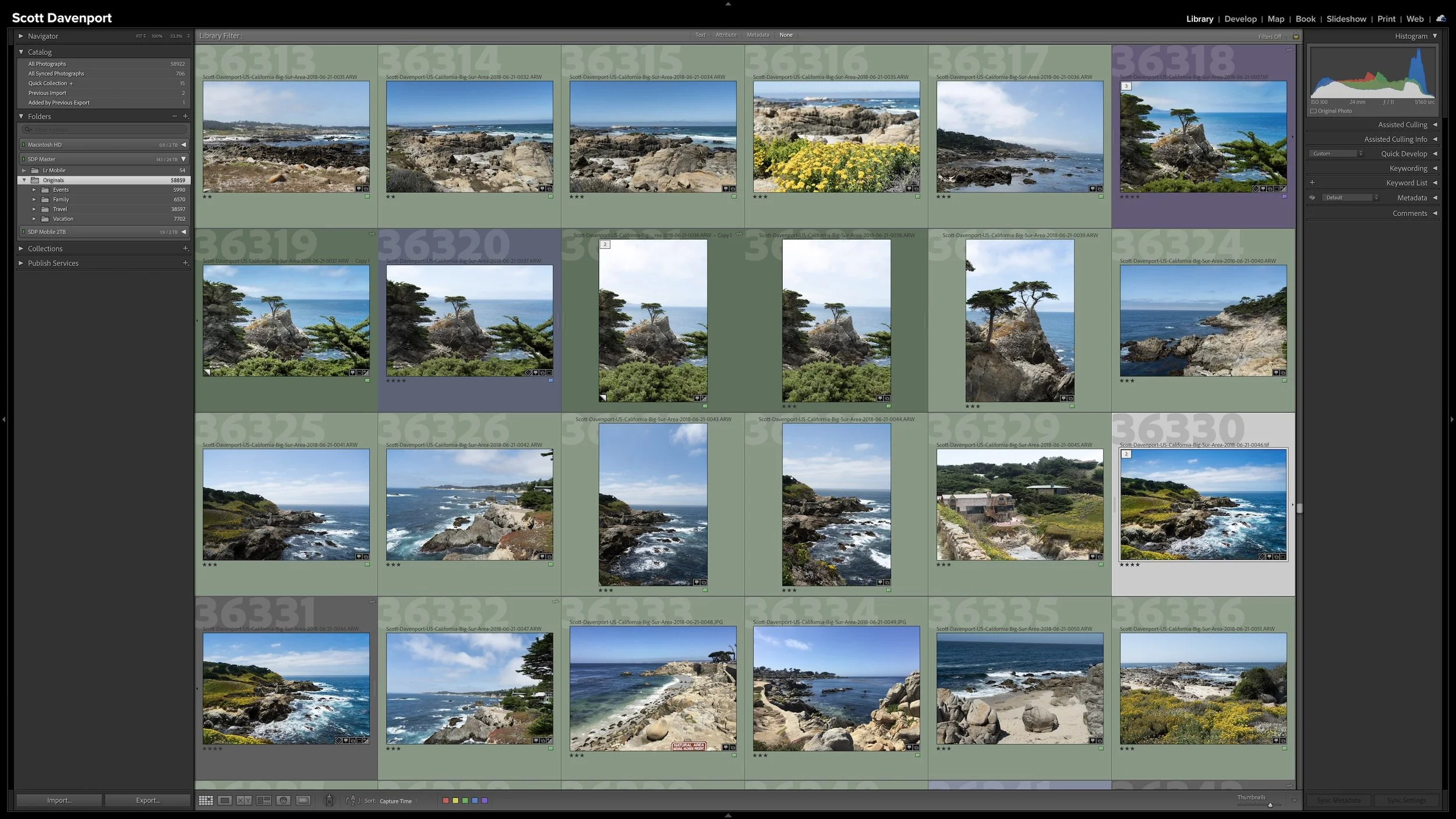
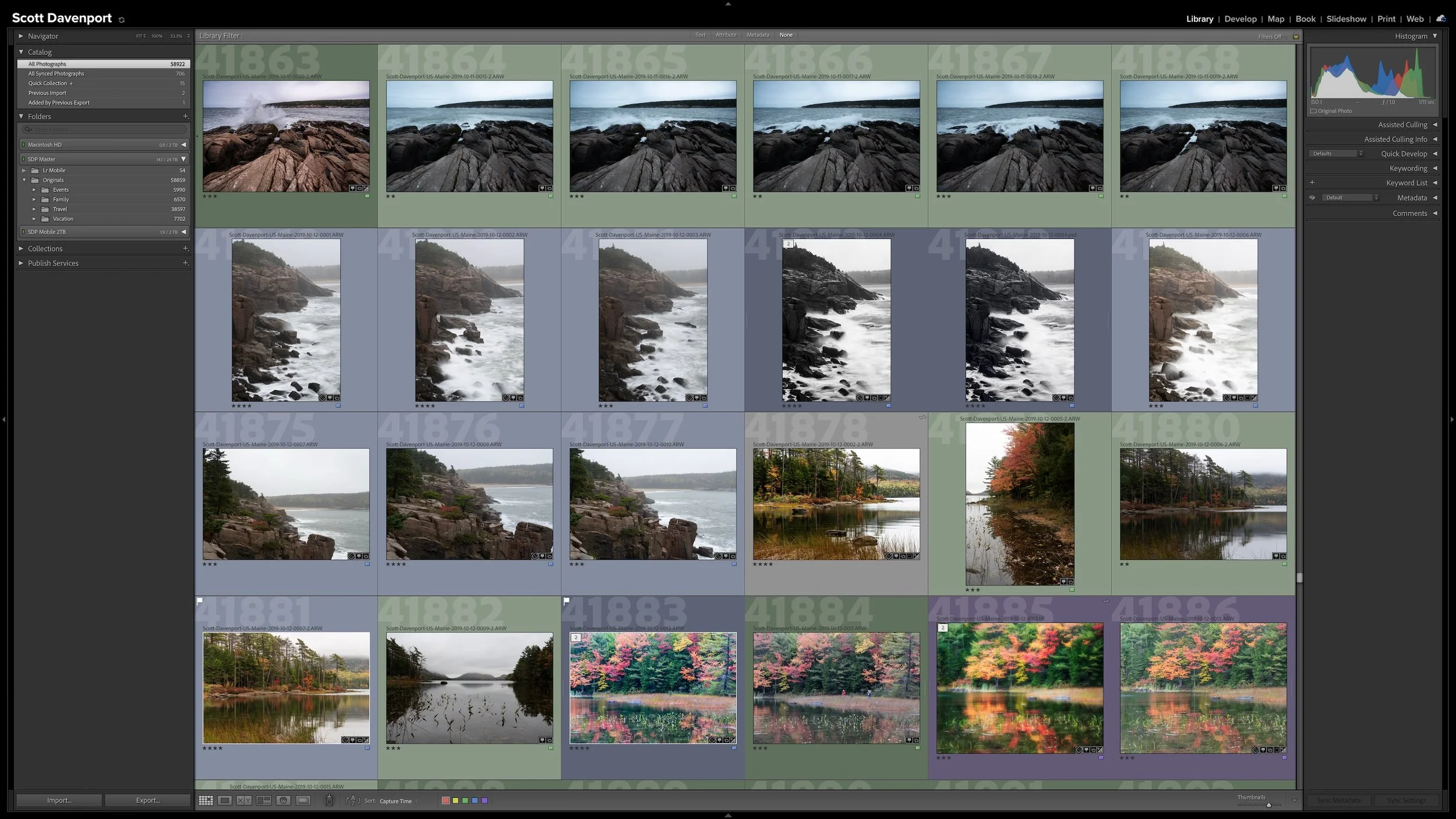
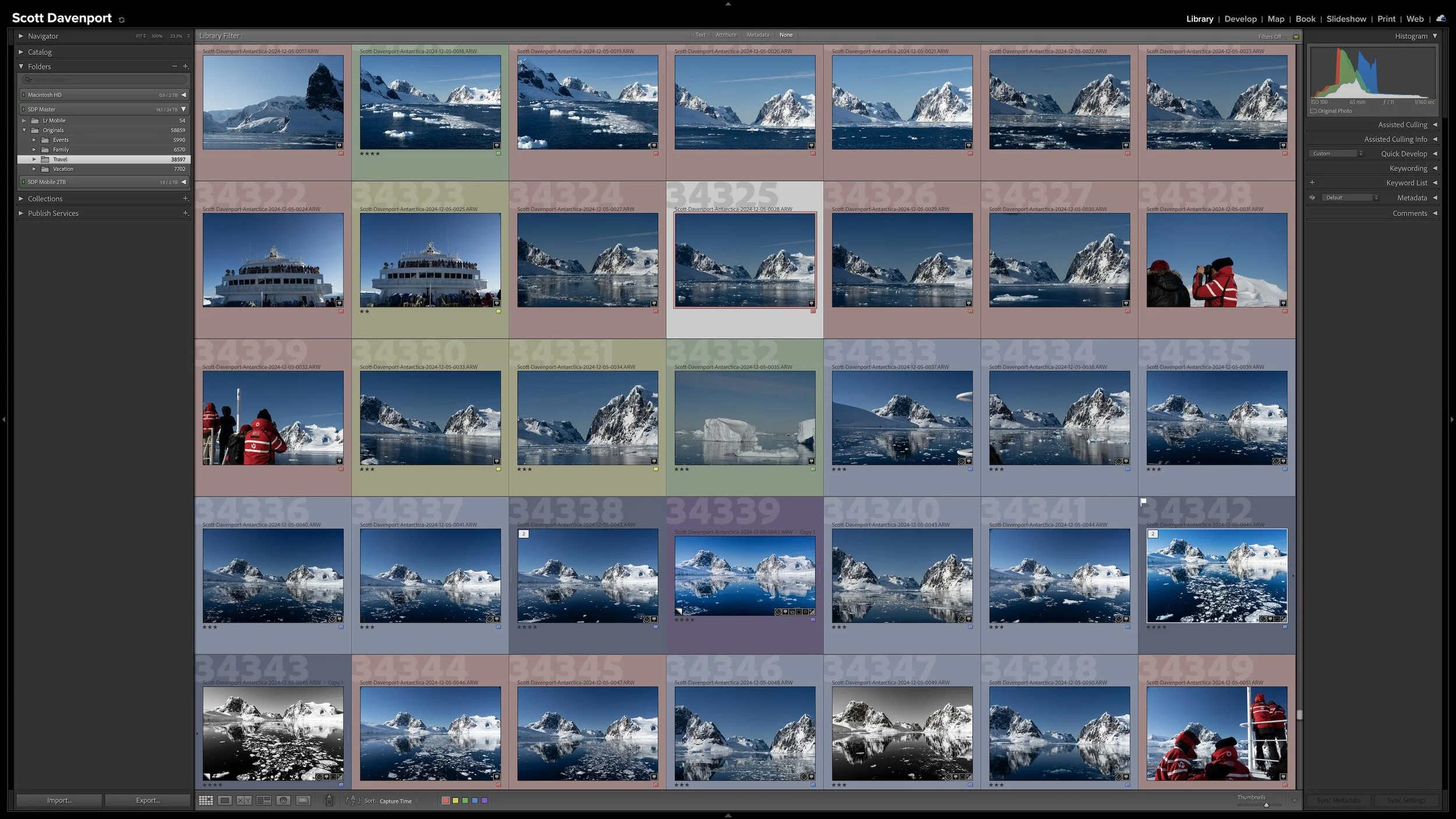
A Lightroom folder structure doesn't need to account for every date, location, subject, or shoot with another level of folders. Organizing photographs into dated folders is especially common, but unless dates are how you naturally look for your photographs, that extra structure may not be helping you. Too much structure can make a photo library harder to understand rather than easier.
I keep all of my photographs beneath one top-level folder, then use a relatively shallow hierarchy underneath it. Different types of photography can follow different organizational logic. The important thing is that the structure matches how you naturally think about and look for your photographs.
For me, one catalog works best because I want a single place for all of my photography, both personal and professional. I can still organize those parts of my library differently without separating them into completely different catalogs.
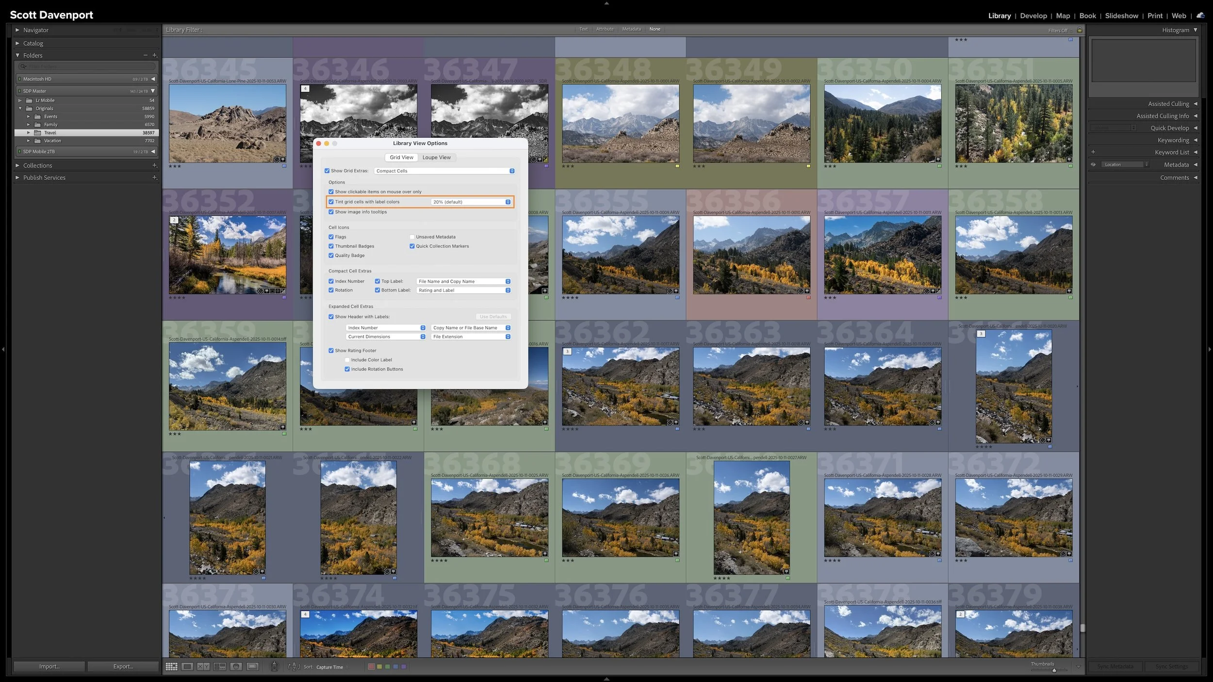
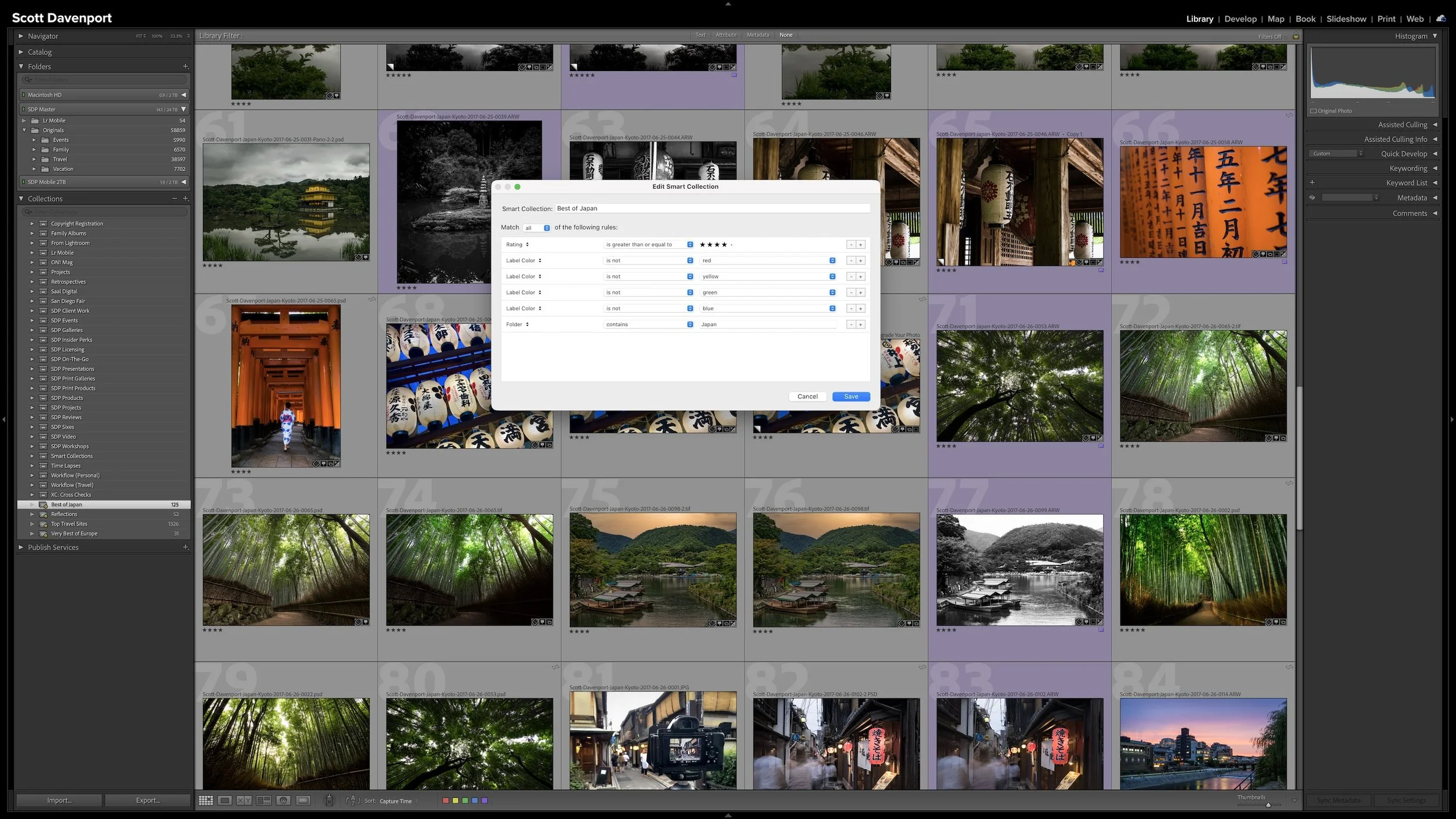
Organizing a Lightroom catalog can quickly become an exercise in folders, keywords, ratings, and metadata. Before deciding how to use those tools, step back and ask a more important question: What do you eventually want to do with your photographs?
A useful workflow begins with those goals. Once you understand how you want to find, revisit, and share your photographs, you can build a Lightroom system that supports the way you actually think and work.
Snow in shadow often picks up a strong blue color cast. Some blue belongs there—the area is in shadow, after all—but too much can overwhelm the photograph.
In this video, I’ll show you how I use a targeted Lightroom mask to reduce that blue cast while preserving the depth and shadow in the mountains. The same approach can help with many other color-cast problems in landscape photography.
Sometimes you commit to a landscape composition, but the moving elements never come together perfectly in a single frame. The best wave might be in one photo, while another has better texture or movement elsewhere in the scene.
In this video, I’ll show you how I selected three seascape photos and blended their strongest elements using simple layers and masks in Photoshop. The masking is straightforward, and the same idea works in any editing software that supports layers.
Have you ever subtracted an object from a Lightroom mask, only to find a thin ridge left behind around the selection? Cleaning that up usually means reaching for the Brush tool and carefully painting along the edge.
Lightroom Classic’s new Feather and Edge controls give you a faster way to soften, expand, or contract many AI-generated masks. In this video, I’ll explain how the controls work, which masking tools support them, and where Edge is already saving me cleanup time.
What happens when Lightroom’s AI landscape masking doesn’t recognize the subject you want to edit? Sometimes, the missing selection is exactly what you need.
In this video, I combine Lightroom’s vegetation and mountain masks with inversion, subtraction, and a radial gradient to isolate the architecture at Machu Picchu. The result adds depth to the scene and guides attention without requiring painstaking brushwork.
A vignette can help guide the viewer toward your subject, but lowering exposure around the edges of a black and white photo can quickly bury important shadow detail.
In this quick tutorial, I’ll show you a more controlled approach using a radial gradient and the Whites or Highlights slider. You’ll still get that visual nudge toward the subject without making already-dark areas disappear.
What do you do when the weather is dull, the surf is uninteresting, and a dead battery takes away one of the tools you normally rely on?
You can spend the outing wishing conditions were different—or let those constraints narrow your choices and point you toward another photograph. In this video, I share how I adapted during a recent seascape outing and why limitations can sometimes give your photography clearer direction.
Scott Davenport is a landscape photographer and photo educator and based in San Diego, California. He leads photo workshops, writes photo books, hosts podcasts, makes tutorial videos, and feels weird referring to himself in the 3rd person.
He also can't help getting his feet wet photographing at the beach.
A Lightroom folder structure doesn't need to account for every date, location, subject, or shoot with another level of folders. Organizing photographs into dated folders is especially common, but unless dates are how you naturally look for your photographs, that extra structure may not be helping you. Too much structure can make a photo library harder to understand rather than easier.
I keep all of my photographs beneath one top-level folder, then use a relatively shallow hierarchy underneath it. Different types of photography can follow different organizational logic. The important thing is that the structure matches how you naturally think about and look for your photographs.