
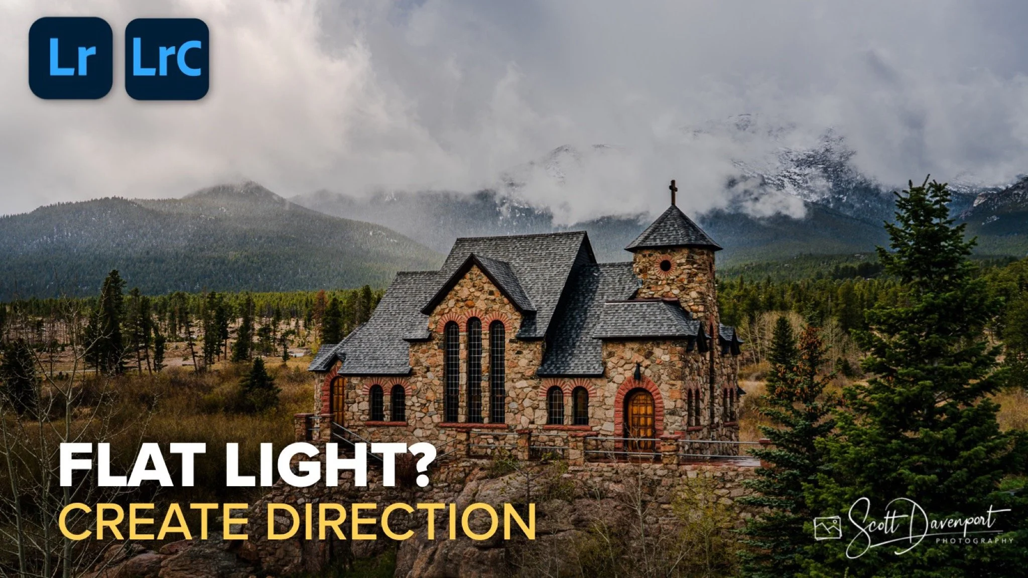
Every landscape photographer runs into this situation eventually. You arrive at a location with a great subject, interesting weather, and plenty of potential, but the light just never comes together. Maybe the clouds refuse to break at the right moment. Maybe the sun is in the wrong position. Maybe the conditions are simply dull.
That was the case with this cathedral image near Rocky Mountain National Park. The structure itself was fantastic, and the sky had enough texture to keep things interesting, but the scene never received the kind of light I had hoped for. There was no dramatic shaft of sunlight illuminating the cathedral. No spotlight effect from the clouds. Just flat, even light across most of the frame.
Rather than abandon the image, I started thinking about what the scene wanted to become. The brightest part of the sky was in the upper-left corner, suggesting the sun was somewhere behind the clouds trying to break through. That became the foundation for the edit. Instead of inventing light from nowhere, I decided to shape and enhance what was already implied in the photograph.
The final result came from a balance of darkening and lightening. One set of masks subtly pushed parts of the image into shadow. Another created the feeling of directional light moving through the scene toward the cathedral. Those two adjustments work together to create the illusion of depth, drama, and atmosphere.
Darkening the Scene to Shape the Viewer’s Attention
Before adding light, I wanted to establish where the light was not going. That’s an important part of creating believable directional light. If everything stays evenly bright, the effect falls apart immediately.
The first major adjustment in this edit was what I called a “right-biased vignette.” Instead of applying a traditional centered vignette, I used several large linear gradients to darken the right side and lower portion of the image. The goal was to guide the eye back toward the cathedral and the brighter sky in the upper-left corner.
The mask itself was intentionally loose. I wasn’t trying to perfectly trace the edges of the building or mountains. Light in nature doesn’t behave with surgical precision. It fades gradually, spills into neighboring areas, and transitions softly. Allowing the gradients to overlap naturally helped preserve that feeling.
Most of the adjustment was simple exposure reduction, but I also introduced a very subtle cool tone into the darker areas. It’s barely noticeable on its own, but it becomes important later when warmer light is introduced into the cathedral and surrounding sky. That slight temperature contrast helps reinforce the illusion that warm sunlight is entering the scene from one direction while cooler shadows occupy the rest of the landscape.
This darkening step is easy to underestimate because it doesn’t feel dramatic by itself. But it establishes the stage for everything that follows. Without controlled shadow areas, the brighter portions of the image would never feel directional.
Multiple linear gradients combine to darken the right side and foreground of the image, subtly guiding attention toward the cathedral and the brighter sky in the upper-left corner.
Creating the Illusion of Directional Light
Once the darker portions of the scene were established, I could begin building the light itself.
The main directional light mask started with a radial gradient placed in the upper-left portion of the frame where the brightest clouds already existed. That radial created the general spread of light moving diagonally through the image toward the cathedral. On its own, though, the shape felt too broad and too circular.
To refine it, I subtracted linear gradients from the top and bottom portions of the radial mask. That compressed the shape into something that felt more like guided light instead of a soft glowing oval. The transitions remained feathered and natural, but the light now had a more intentional direction flowing through the scene.
The final refinement came from a luminance range mask. I didn’t want deep shadows receiving the same brightening treatment as the naturally illuminated portions of the cathedral. By subtracting the darker tones from the mask, the effect concentrated itself on midtones and highlights where sunlight would realistically appear.
The actual adjustments inside the mask were relatively restrained: a bit of exposure increase and a subtle push toward warmth. Those two ingredients alone created most of the effect. The warmer tones helped the red and orange stonework come alive, while the added brightness established the feeling that sunlight was finally breaking through the clouds and striking the cathedral.
That interplay between darkness and light is what ultimately sells the effect.
A radial gradient refined with subtractive gradients and a luminance range mask creates the illusion of soft directional light cascading from the upper-left sky onto the cathedral.
One final refinement that helped tie the entire edit together was Lightroom’s Amount slider for masks. After building both the vignette and directional light adjustments, I revisited the masks and pushed their overall strength further than my original settings. Increasing the amount of the darkening mask deepened the shadows and strengthened the mood, while boosting the directional light mask intensified the feeling of sunlight breaking through the clouds.
That balance between the two masks became the final tuning step. Sometimes the structure of the masks is already working well, but the emotional impact simply needs a little more emphasis. The Amount slider is an easy way to fine-tune that relationship without rebuilding the masks themselves.
Before; the scene is flat, too evenly lit
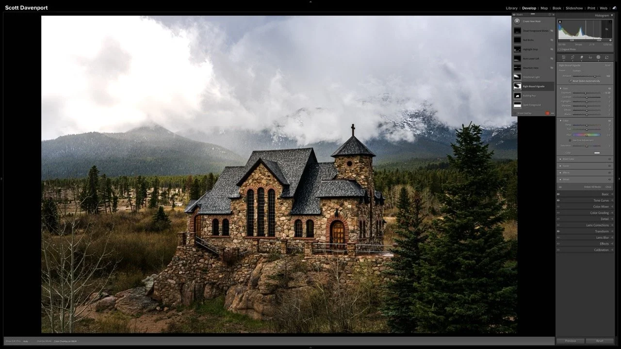
After; directional light increases the drama of the scene
Light Is About Direction, Not Just Brightness
When photographers talk about great light, we often focus on intensity. But direction matters just as much.
A scene with soft, flat illumination can still become compelling if you create a sense of movement and flow with the light. In this cathedral image, the entire edit revolved around strengthening the implied direction already present in the sky and then supporting it with carefully shaped masks.
The important thing is that none of these adjustments were random. Every darkened area helped support the brighter areas. Every brighter area reinforced the intended path of light through the composition. The result feels more dramatic not because the image became brighter overall, but because the light now has purpose.
Flat light doesn’t always mean the image failed. Sometimes it simply means the photograph still has room to be crafted.

St. Catherine’s Chapel on the Rock, Colorado
Contact Scott to commission a print or license this image.
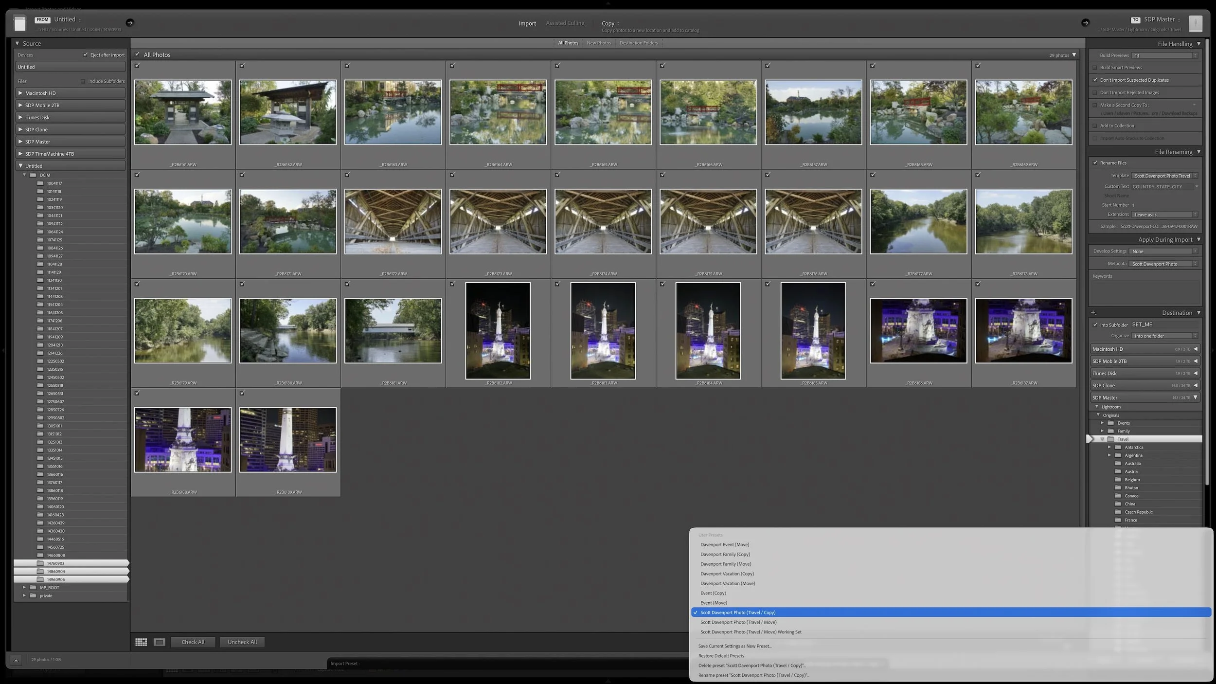
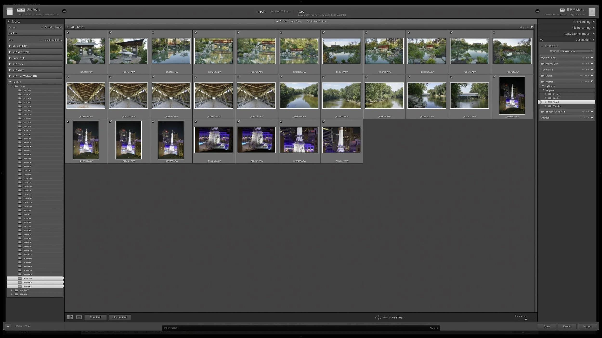
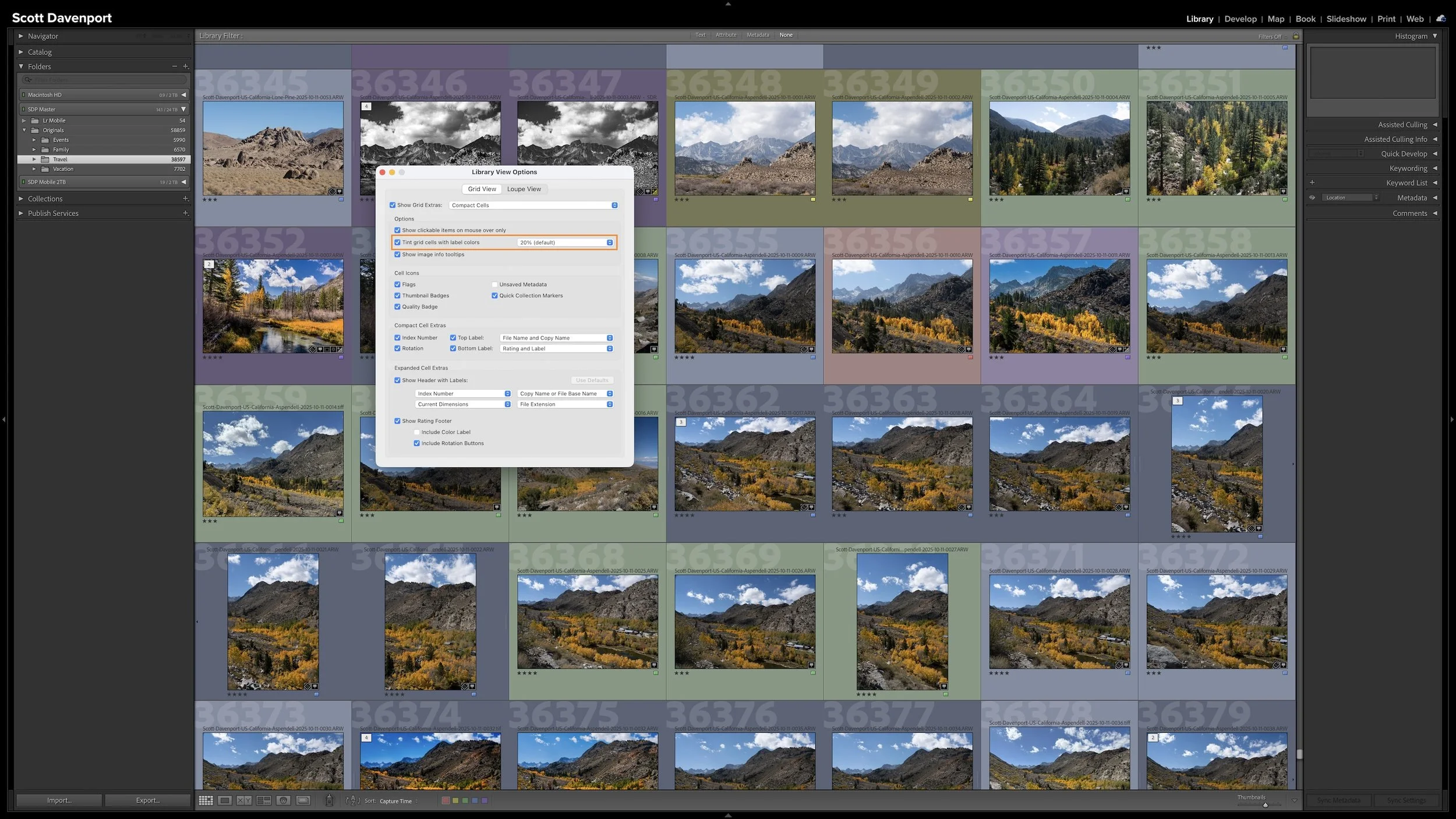
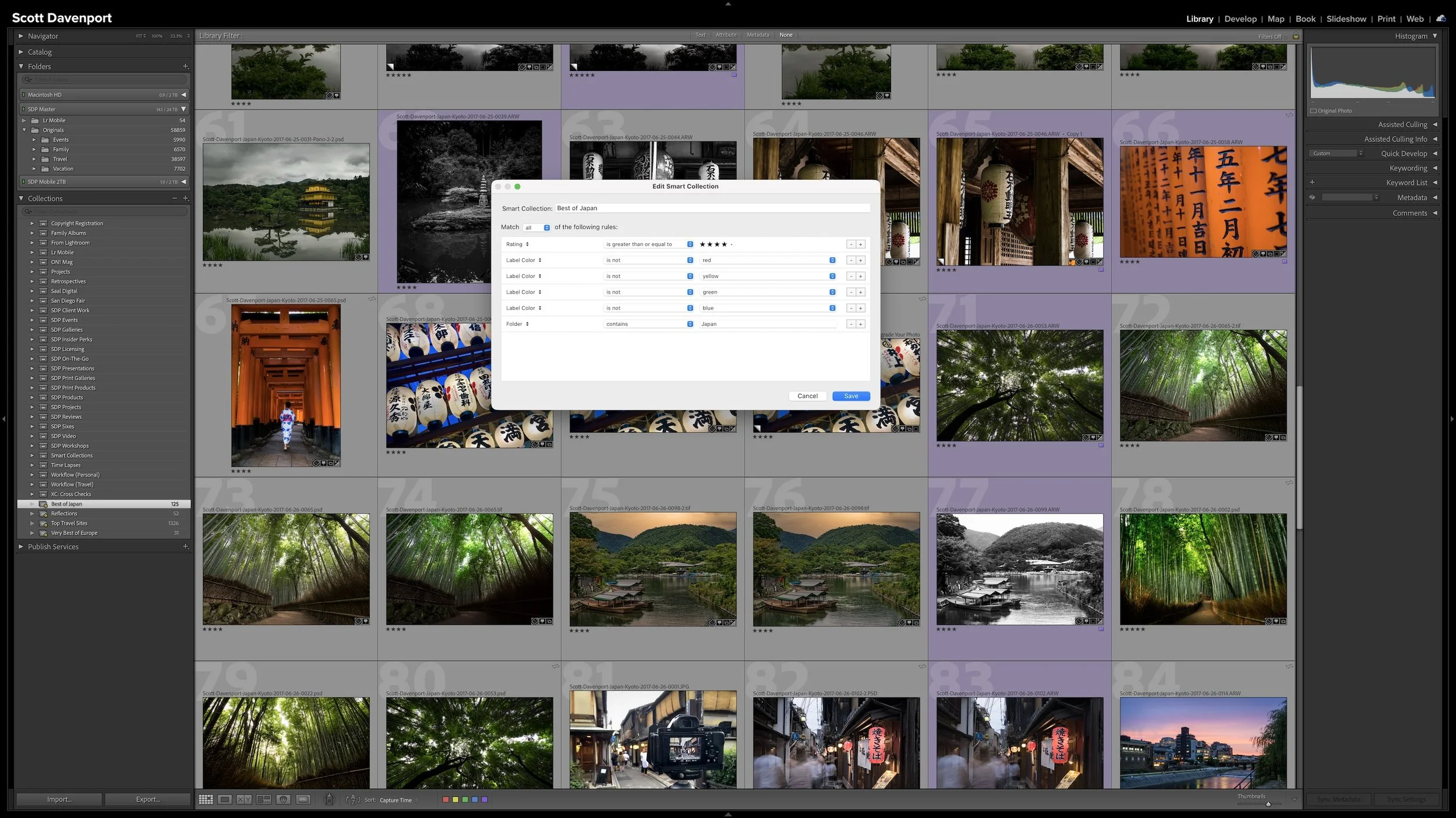
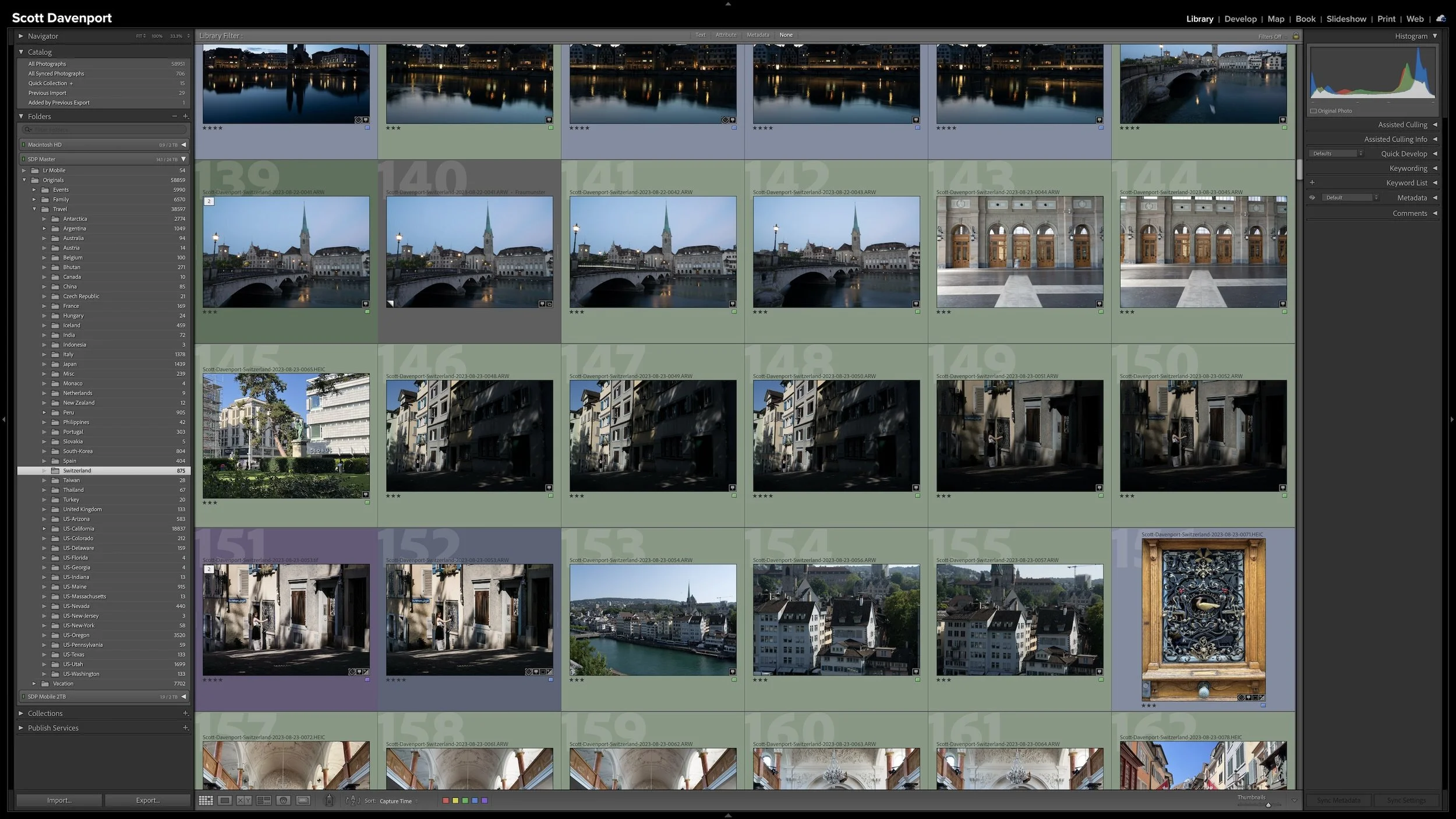
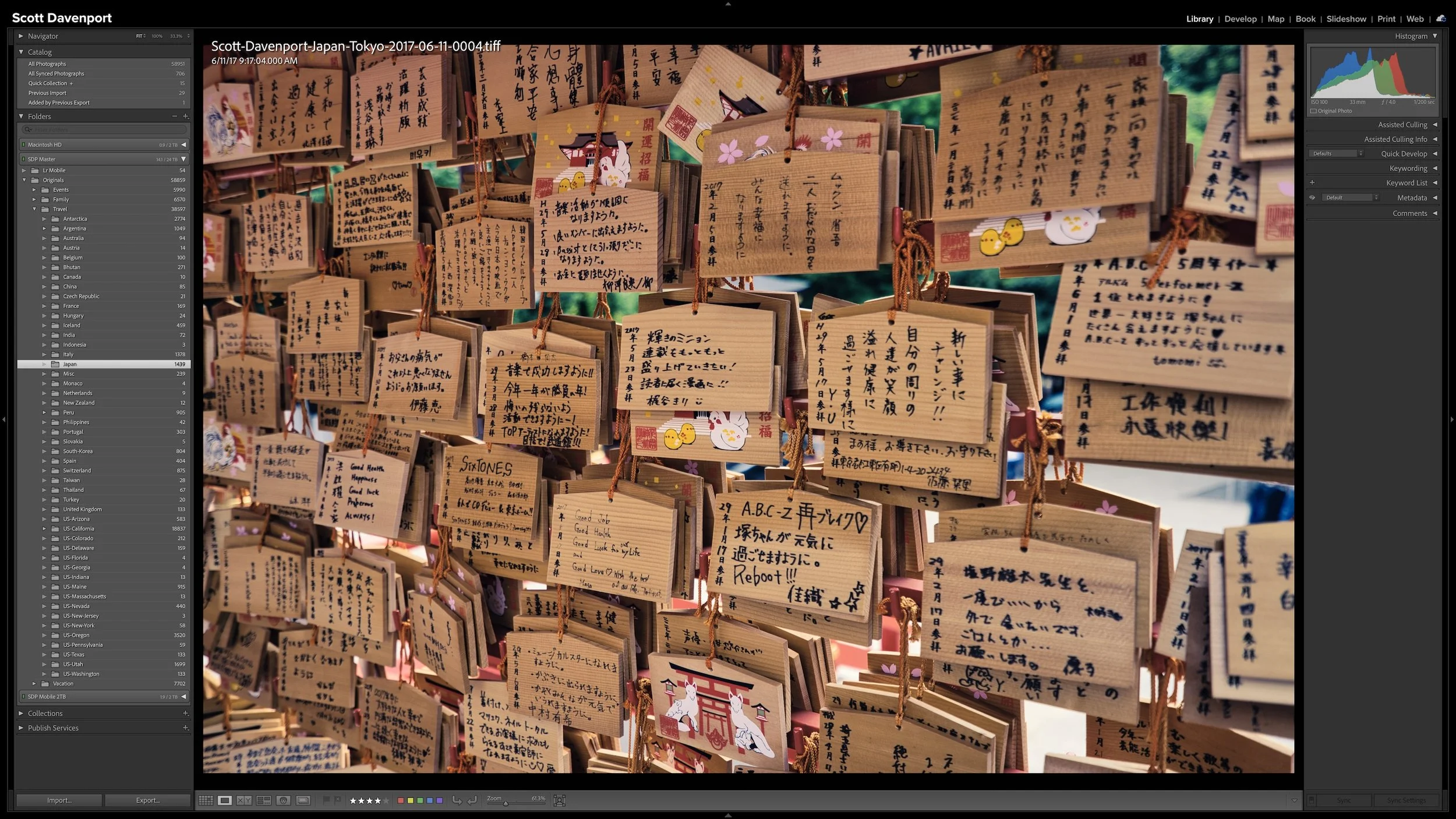
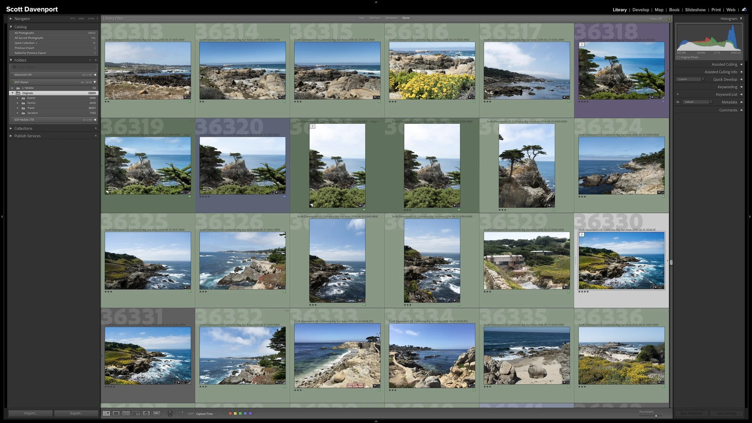
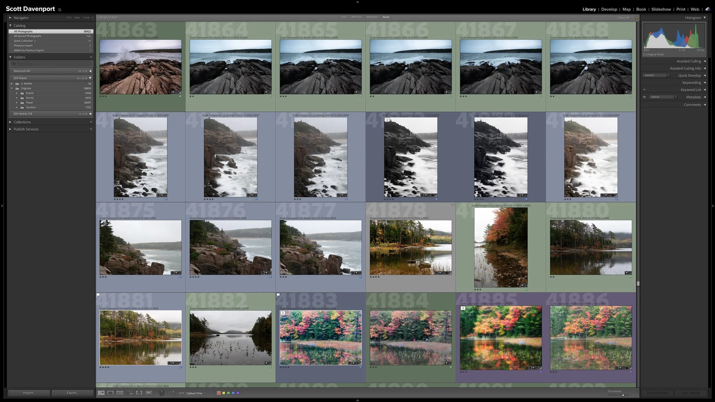

Lightroom Classic gives you five stars for rating photographs, but those stars aren't very useful if their meanings change from one shoot to another. A consistent system lets you know what a three-star or four-star photograph means without rethinking the definitions every time you rate a new group of photos.
My rating system ranges from photographs I keep primarily for sentimental reasons to photographs I consider strong enough to print. You don't need to use the same definitions I do. The important part is giving your ratings stable meanings you can apply consistently over time.