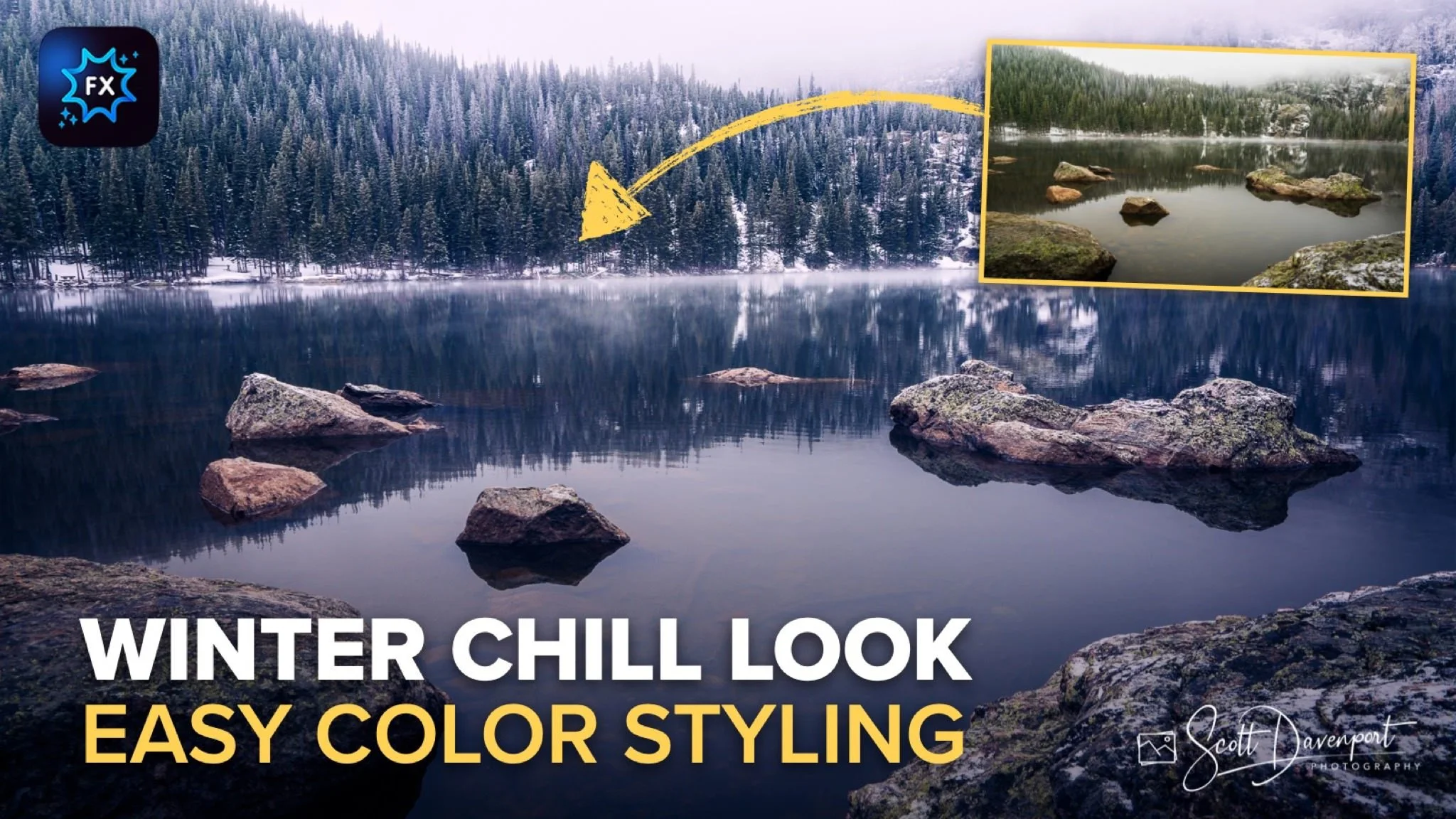
Winter Chill Look for Landscape Photos in ON1 Effects
If you are trying ON1 Photo RAW, the ON1 plug-ins like ON1 Effects or ON1 HDR, or upgrading your ON1 software to a newer version, please consider using my affiliate link. There is no extra cost to you and it helps support my work and this website.
A winter scene usually isn’t about bold color or dramatic contrast. It’s about atmosphere. Soft light, muted tones, quiet detail, and a feeling that the landscape has settled into stillness. That was the direction I wanted to take with this photo from Bear Lake in Rocky Mountain National Park.
The RAW file already had a strong foundation to work from. Fog drifted through the trees, the light was naturally diffused, and the scene carried that cold mountain air feeling. But the straight-out-of-camera version didn’t fully communicate the mood I experienced standing there. The edit became less about correcting the image and more about shaping the emotional feel of the scene.
Using ON1 Effects, I built what I’m calling a “Winter Chill” look through a handful of subtle adjustments layered together carefully. None of the edits were extreme on their own. The mood came together through several small choices all pushing the image in the same direction.
Curves: Cooling with the Blue Channel
The first major adjustment came from the Color Curve, specifically working in the blue channel. Instead of focusing on tonal contrast, I used the curve to shift the color balance colder by pushing the blue channel upward.
When you raise the blue curve, you’re adding blue into the image while simultaneously reducing yellow. That simple adjustment immediately starts cooling the scene and changing the emotional feel of the photograph. The fog, water, and shaded areas all began taking on a colder winter atmosphere without looking overly processed.
What I like about using the color channels in Curves is how natural the effect can feel. It’s not the same as dragging a temperature slider aggressively cooler. The adjustment can be more selective and nuanced, especially when you work gently. A small move in the blue channel often creates a much more believable cold-weather mood.
Curves: Cooling with the Blue Channel
Color Mixer: Pulling Back Saturation
After cooling the image, the next step was simplifying the color palette using Color Mixer. The original image contained more warmth and color intensity than I wanted for the final mood.
Rather than adding color, I actually desaturated portions of the scene. Pulling back the greens and warmer tones helped reinforce the colder atmosphere and kept the viewer’s attention on the mist, light, and texture instead of colorful distractions. Winter landscapes often benefit from a quieter palette. Less color can create a stronger emotional response than more color.
This adjustment also helped prepare the image for the later color grading work by giving me a cleaner, more neutral starting point.
Pro tip: When you’re designing a preset, push the sliders a little farther than you normally would. Then you can use the Opacity slider to dial back the strength to suit different photos. Presets are rarely one size fits all.
Color Mixer: Desaturate the oranges, yellows, and greens.

Color Grading: Refining the Winter Feel
By the time I reached Color Grading, the image already had the overall winter mood established from the earlier adjustments. This step wasn’t about making a dramatic transformation. It was more about refining and tightening up the feel of the scene.
I used Color Grading to make subtle tweaks to the existing cool tones, mainly nudging the shadows and midtones a little further into that cold winter atmosphere. Small adjustments here go a long way. It doesn’t take much before an image starts feeling artificial or overly stylized.
What I wanted was consistency. The fog, water, trees, and light all needed to feel like they belonged in the same cold environment. The grading simply helped unify those elements a bit more cleanly and reinforce the mood that was already taking shape.
This is one of those situations where restraint matters more than intensity. The best winter edits often come from gentle refinements instead of heavy-handed effects.
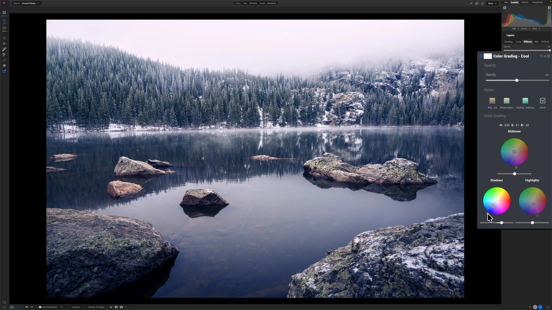
Color Grading: Refining the Winter Feel
Color Enhancer: Adding the Purple Tint
The final styling touch came from another pass through Color Enhancer, this time introducing a subtle purple-magenta tint into the image.
It’s a small adjustment, but it adds character to the final result. Snow, fog, and diffused winter light can naturally pick up slight magenta and violet tones under certain conditions, so the effect still feels believable while adding a bit more mood and personality.
Most viewers probably won’t consciously identify the purple tint, but they’ll feel the difference it creates. It helps separate the image from a standard cool-toned edit and gives the scene a more cinematic winter atmosphere.
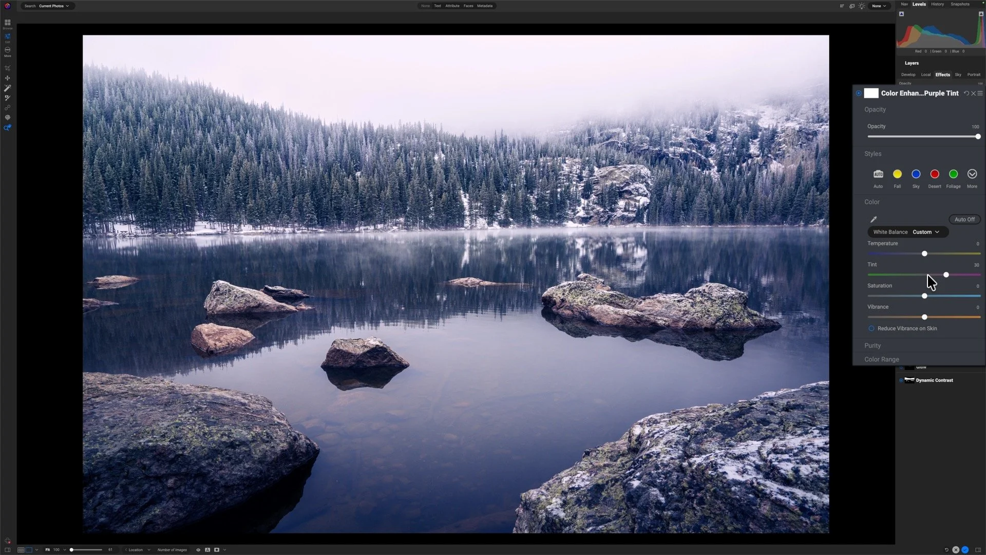
Color Enhancer: Adding the Purple Tint
Small Adjustments, Unified Mood
What I like most about this edit is how understated the individual adjustments are. No single filter dominates the process. The final look comes from layering several restrained edits together so they all support the same mood.
That’s often the difference between an image that simply looks edited and one that actually feels atmospheric. Every adjustment should reinforce the story the scene is trying to tell.
Bear Lake, Rocky Mountain National Park
Contact Scott to commission a print or license this image.