
How I Do Color Grading In Lightroom
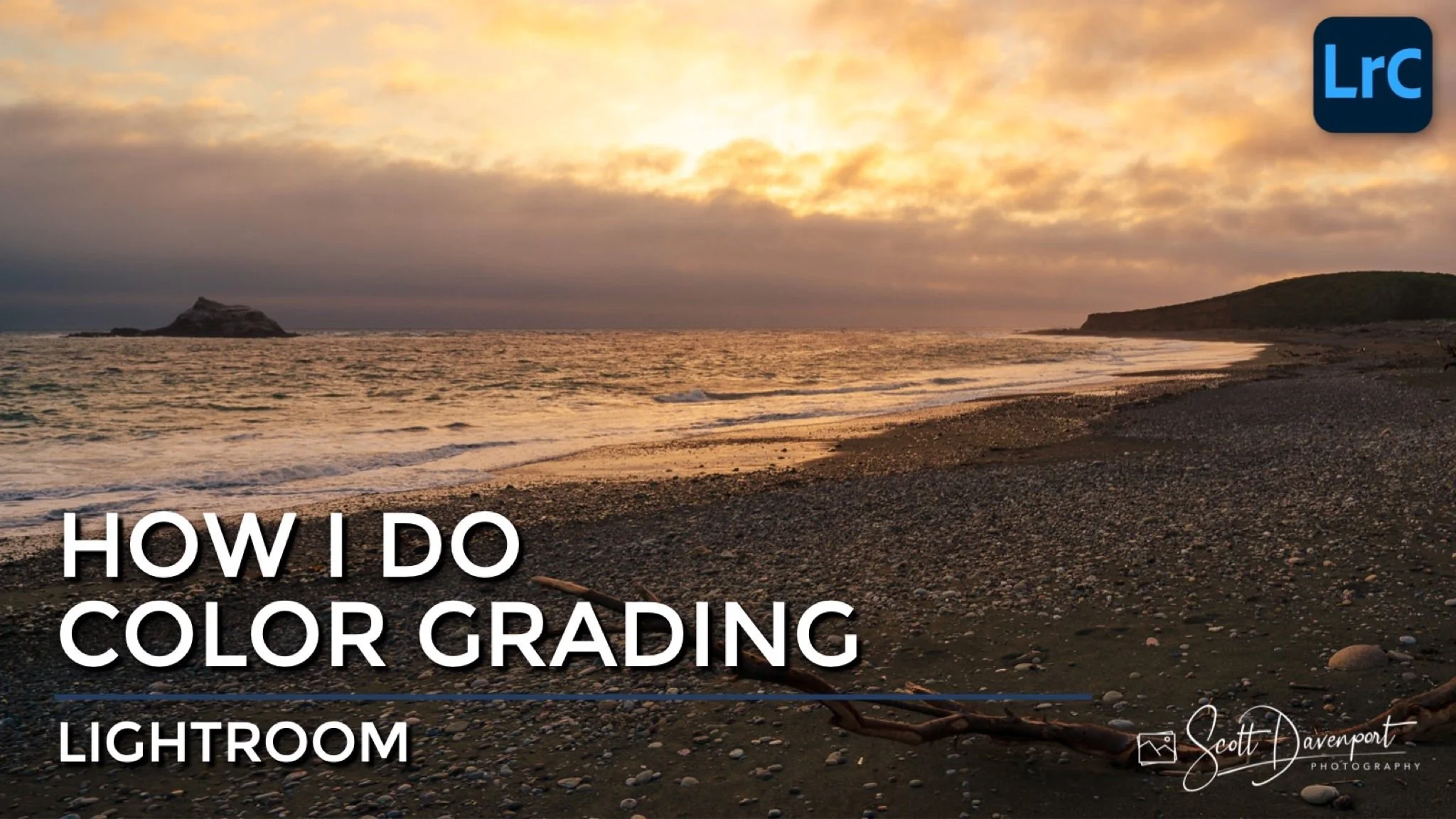
There are many different ways to adjust color in Lightroom. The Temperature slider is a starting point and can bias a photo cooler or warmer. Hue, Saturation and Luminance (HSL) is for your primary color adjustments. Curves is another method to bias hues in the shadows, midtones, and highlights.
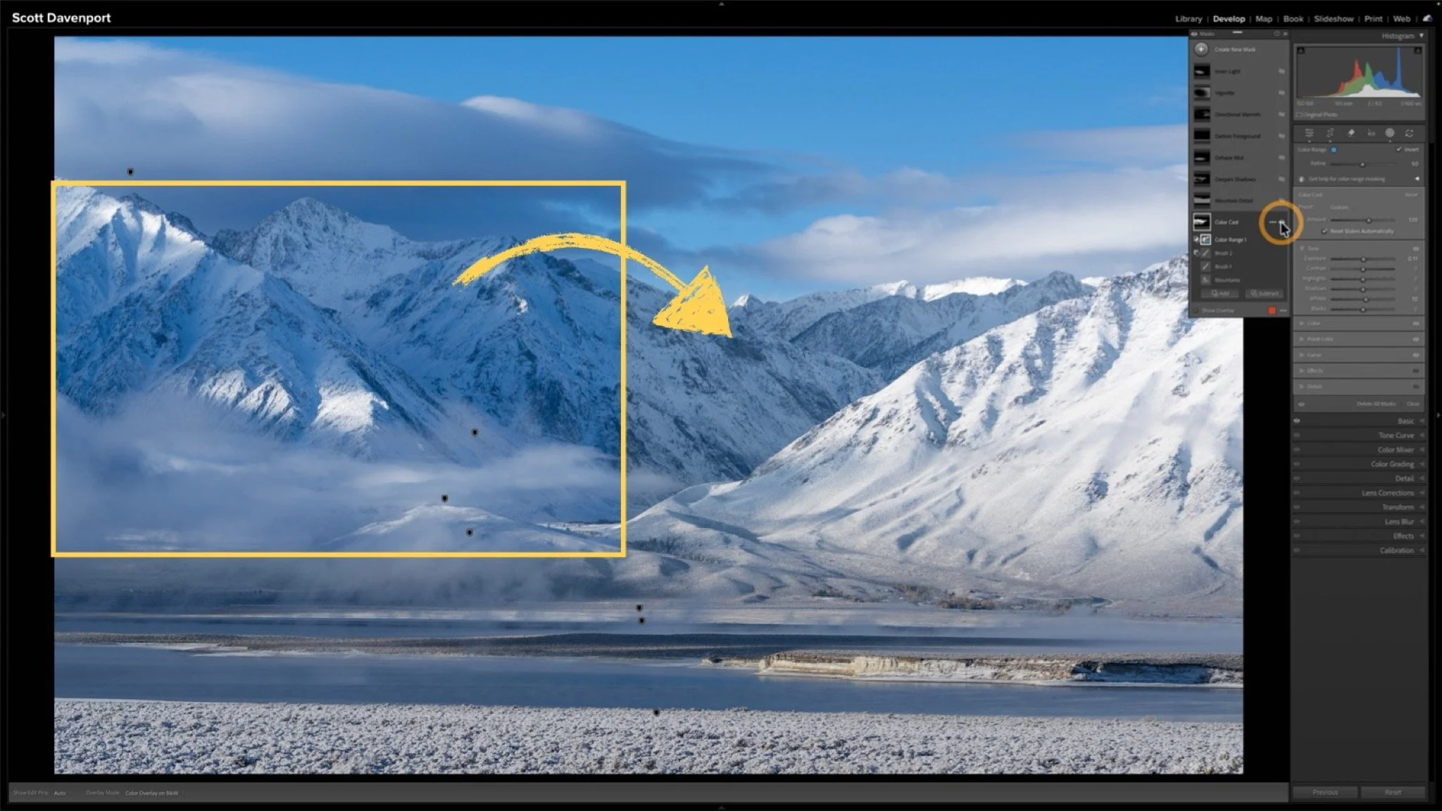
Then there is the Color Grading panel, the purpose built tool for adding a subtle or strong tint to different tonal regions of your photo. I’ve explained the Color Grading tool before and how to control the transition between the different colors. That’s the advantage of the Color Grading tool - it does the smooth transitions among the colors for you.
Watch the video in this article on how I approach color grading, and also why I choose to color grade an image. Central to my method is cranking the Saturation slider up to 100. It’s not as crazy as it sounds.
Pushing Saturation to 100 helps visualize what areas of your image are affected.
Once you have a hue you like, you can dial back the strength to suite the scene.
Sunset, Arroyo De La Cruz Beach
Contact Scott to commission a print or license this image.
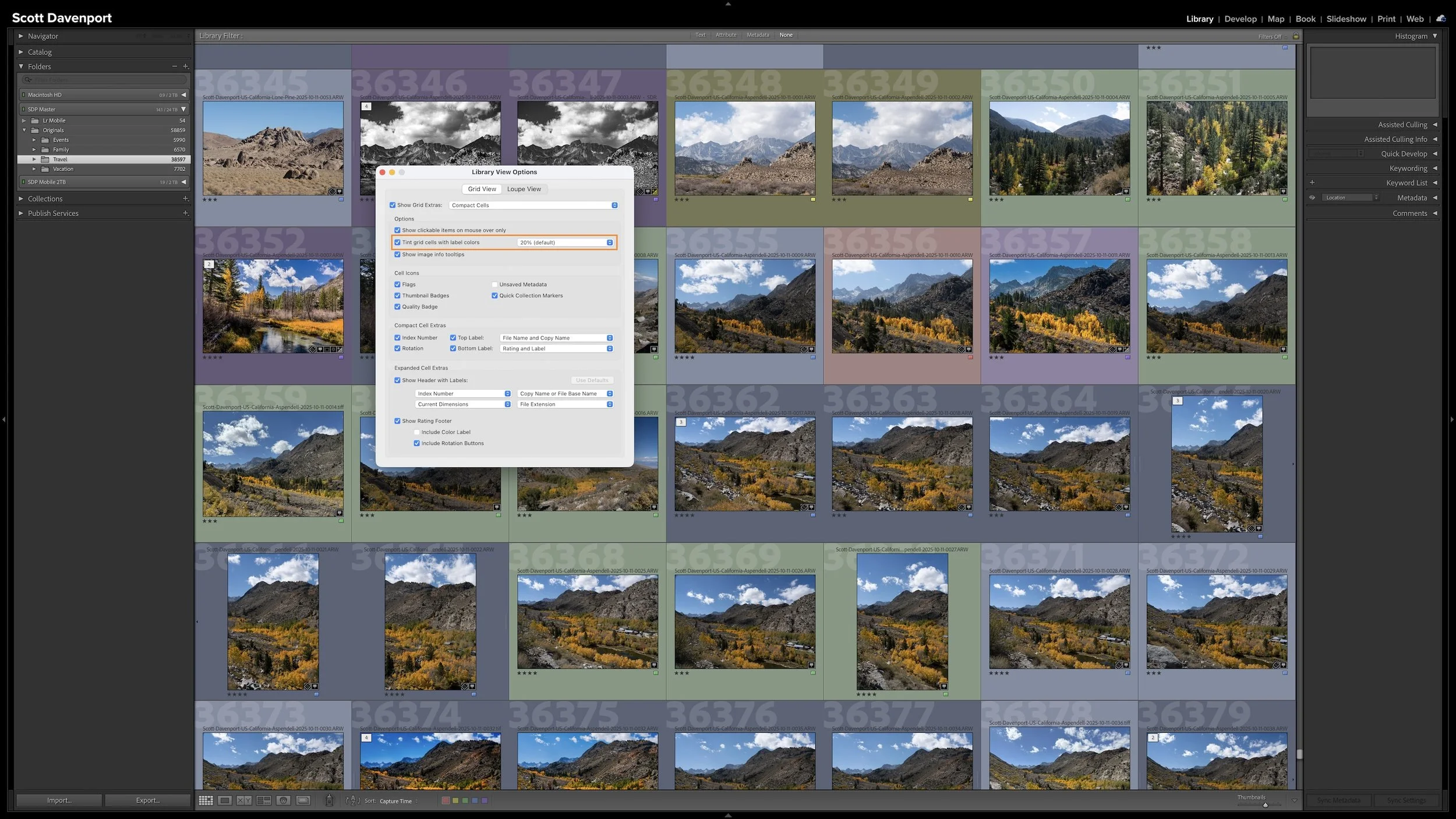
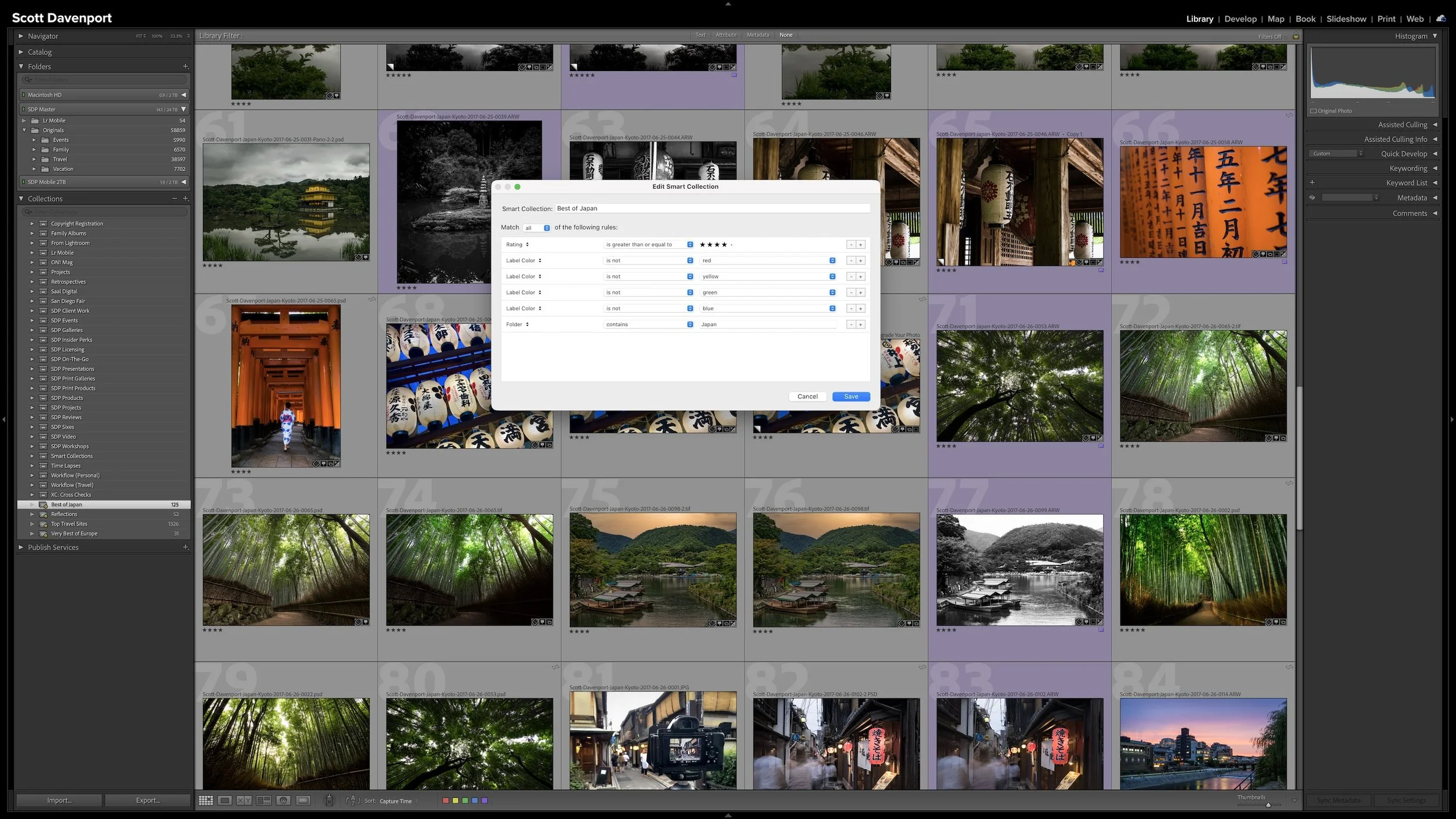
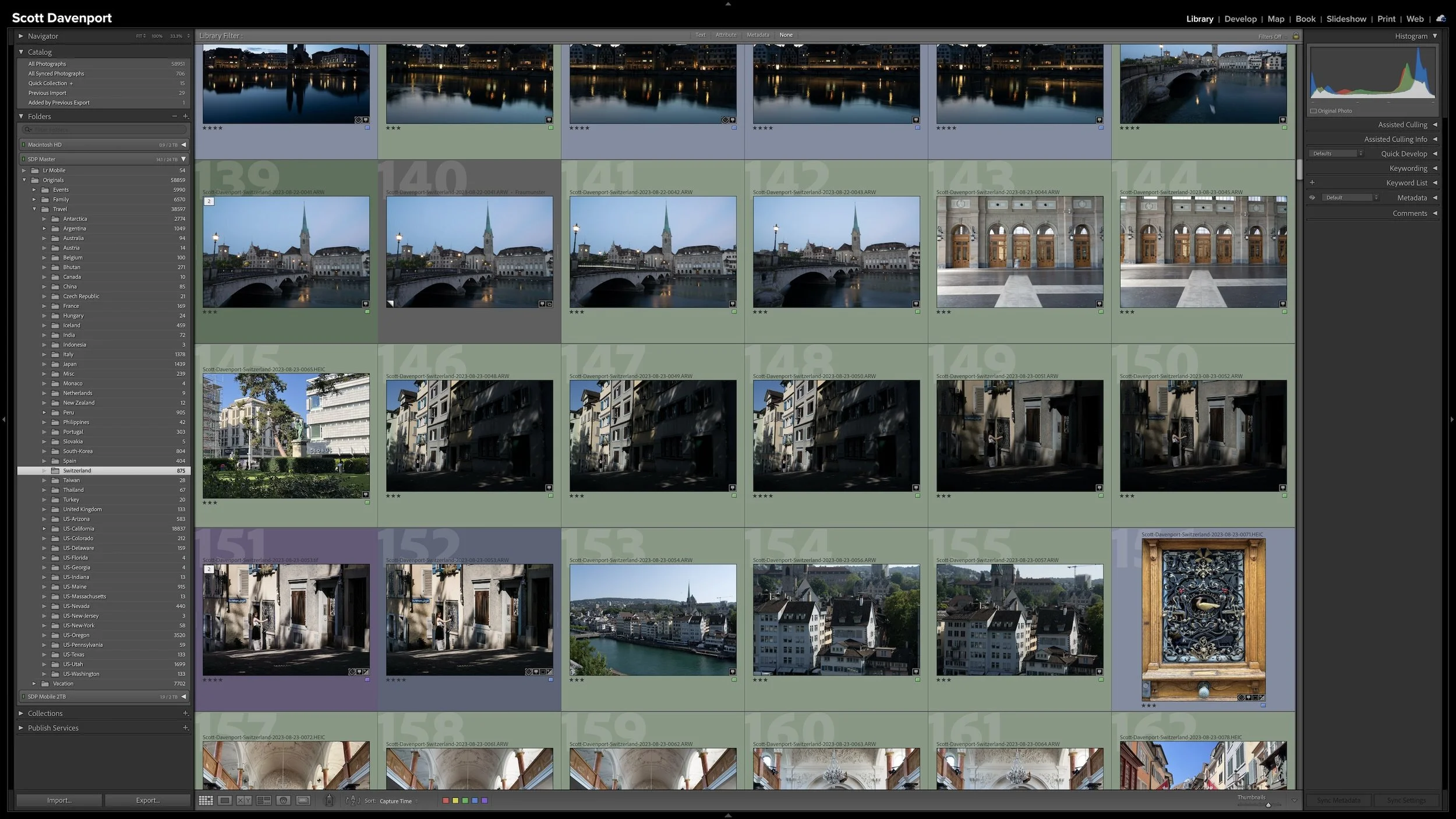
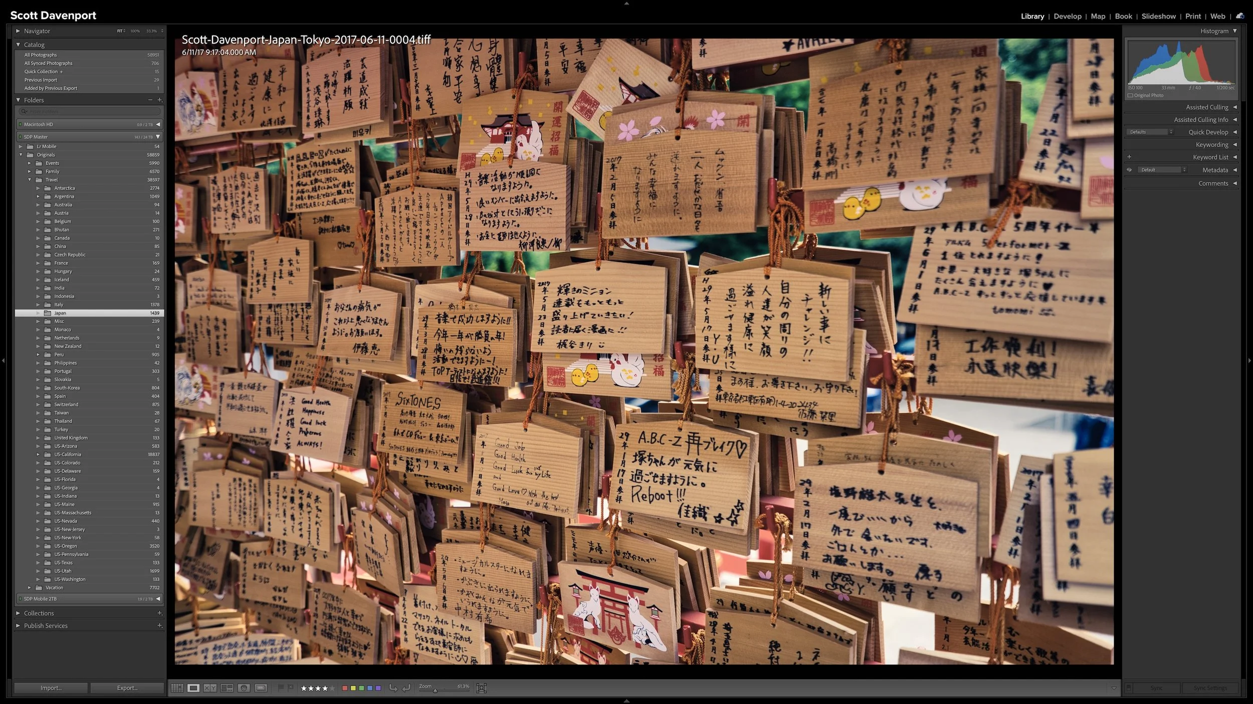
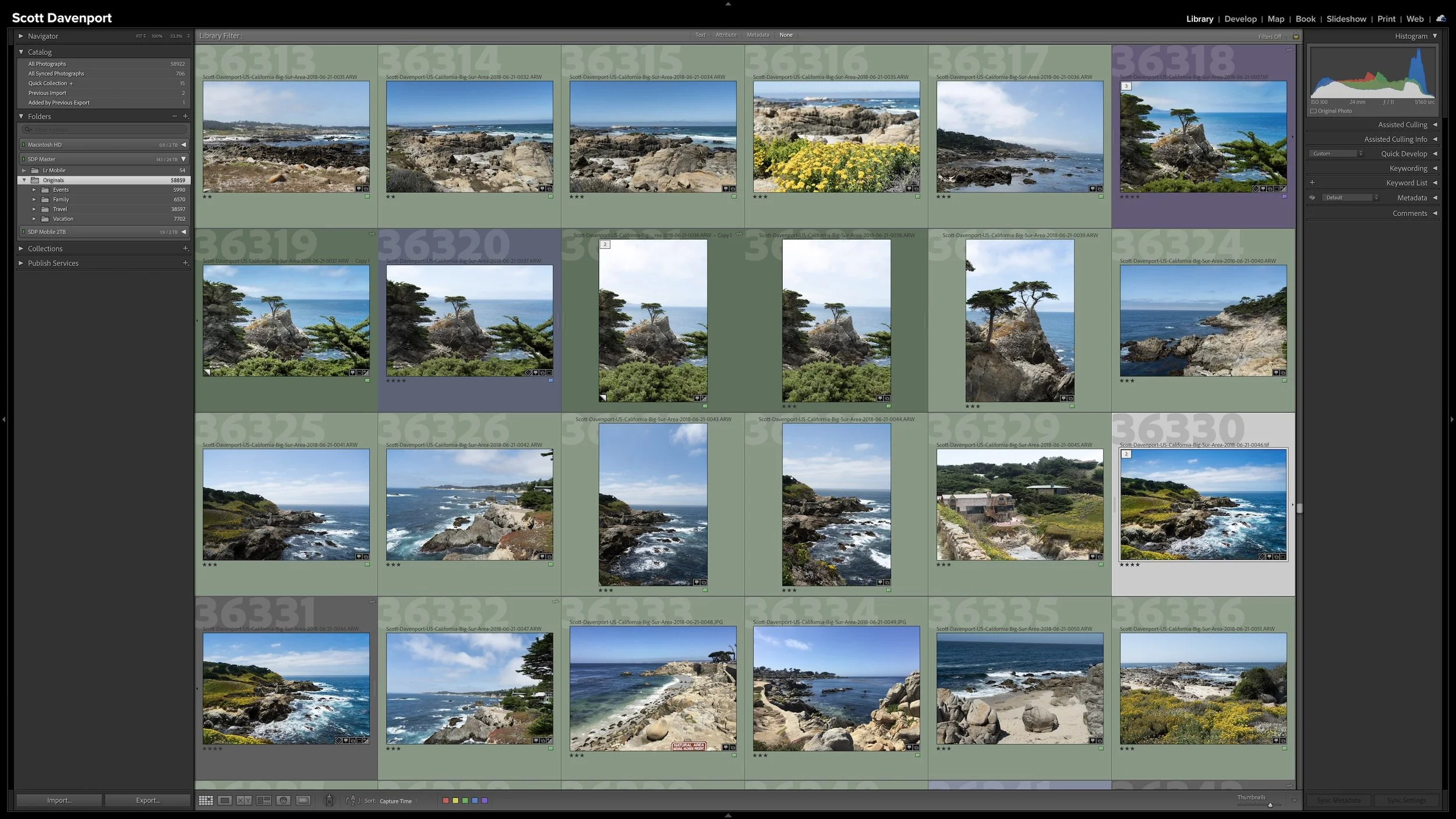
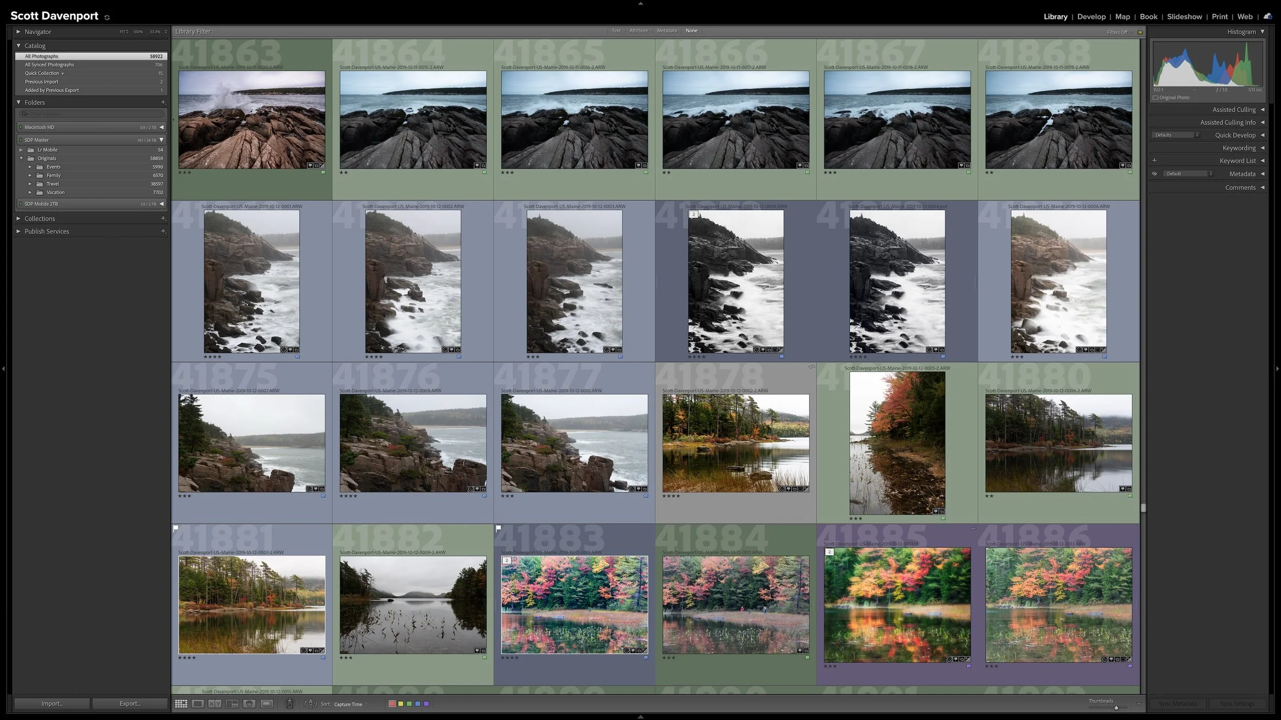
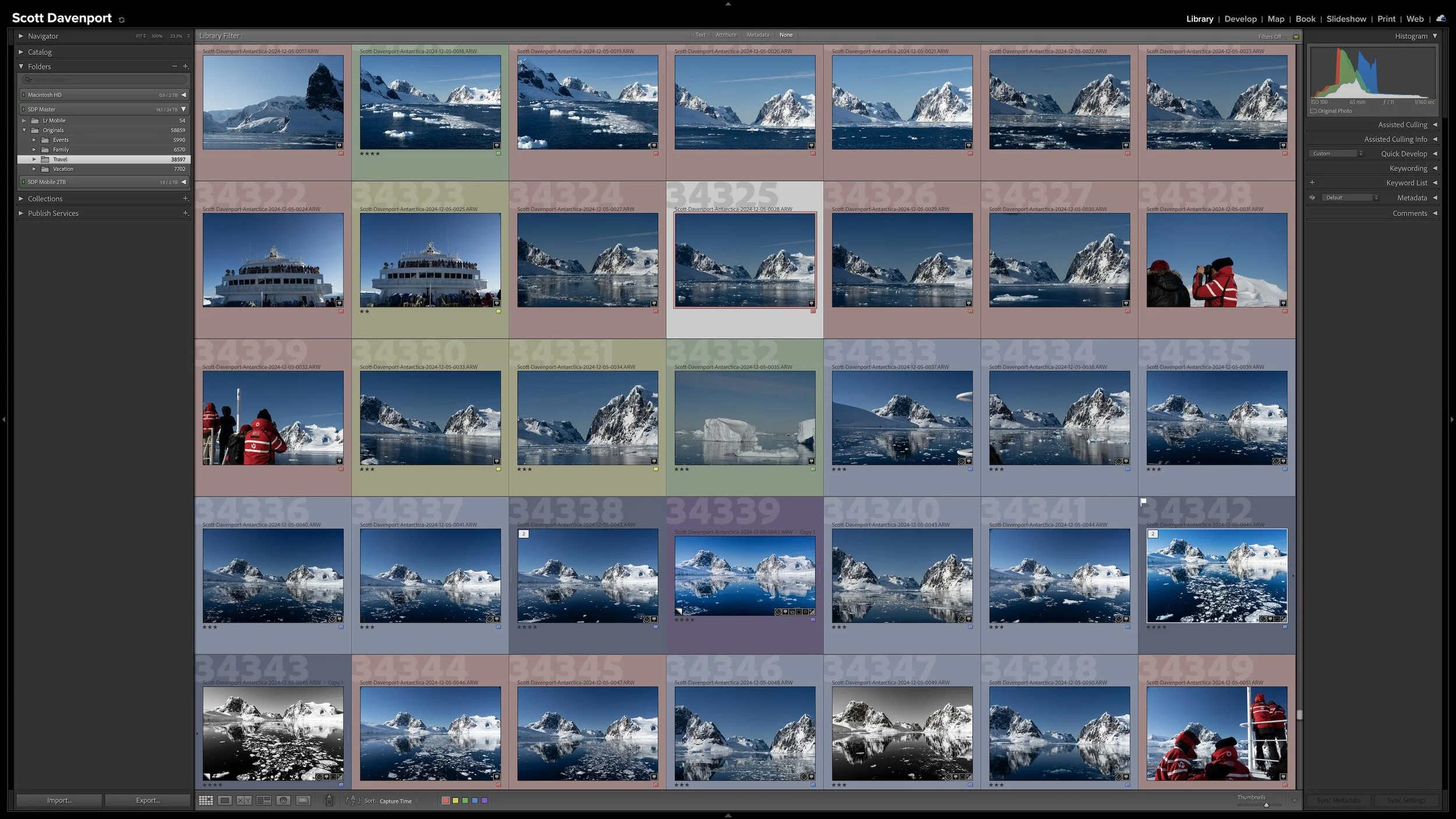

Lightroom Classic's Import dialog presents plenty of choices, but one of the most important decisions is straightforward: where are your photos now, and where do you want the original files to live after the import?
Copy, Move, and Add each handle the original files differently. Once you understand what happens to the physical files and what happens in the Lightroom catalog, choosing the right import method becomes much easier.