
X-Rite i1 Studio: Printer Color Calibration

In this video, I show how to color calibrate your printer with the X-Rite i1 Studio. I also show how to access the ICC profile in the Lightroom Print module. A feature I really like about the X-Rite i1 Studio is the ability to save progress and continue calibration later. Color calibrating a printer can take a while.
I chose the i1 Studio after speaking with X-Rite at a photo show, seeing their product in action, and its solid reviews. The i1 Studio can calibrate a variety of devices: monitors, laptops, printers, mobile devices, and scanners.
Interested in the XRite i1 Studio? Support my work and hit the link. It doesn't cost you an extra penny.
I do my prints on Red River Paper. Watch my Red River Paper Bake-Off video for more information.
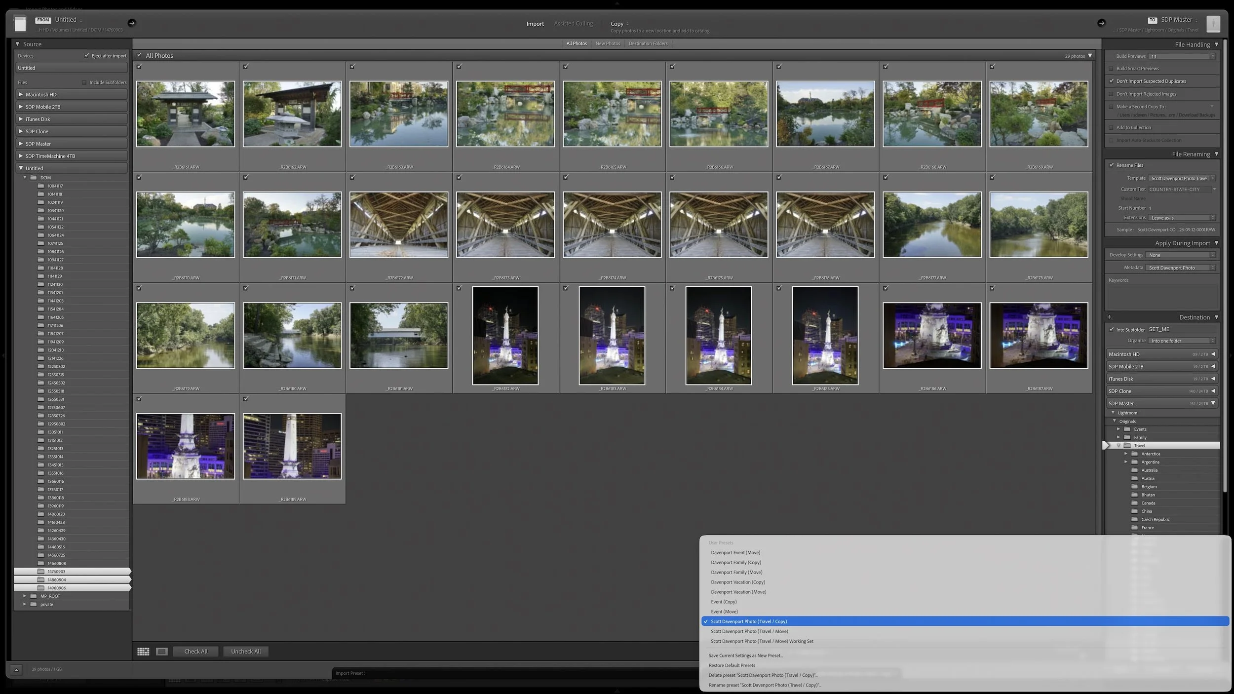
Lightroom Classic's Import dialog asks many of the same questions every time you bring in photos. Rather than rebuilding those settings for every import, you can save the choices that stay consistent in an import preset.
The preset doesn't eliminate the decisions that change from shoot to shoot. It gives you a reliable starting point, so you can concentrate on the source, destination, and other details that actually need your attention.
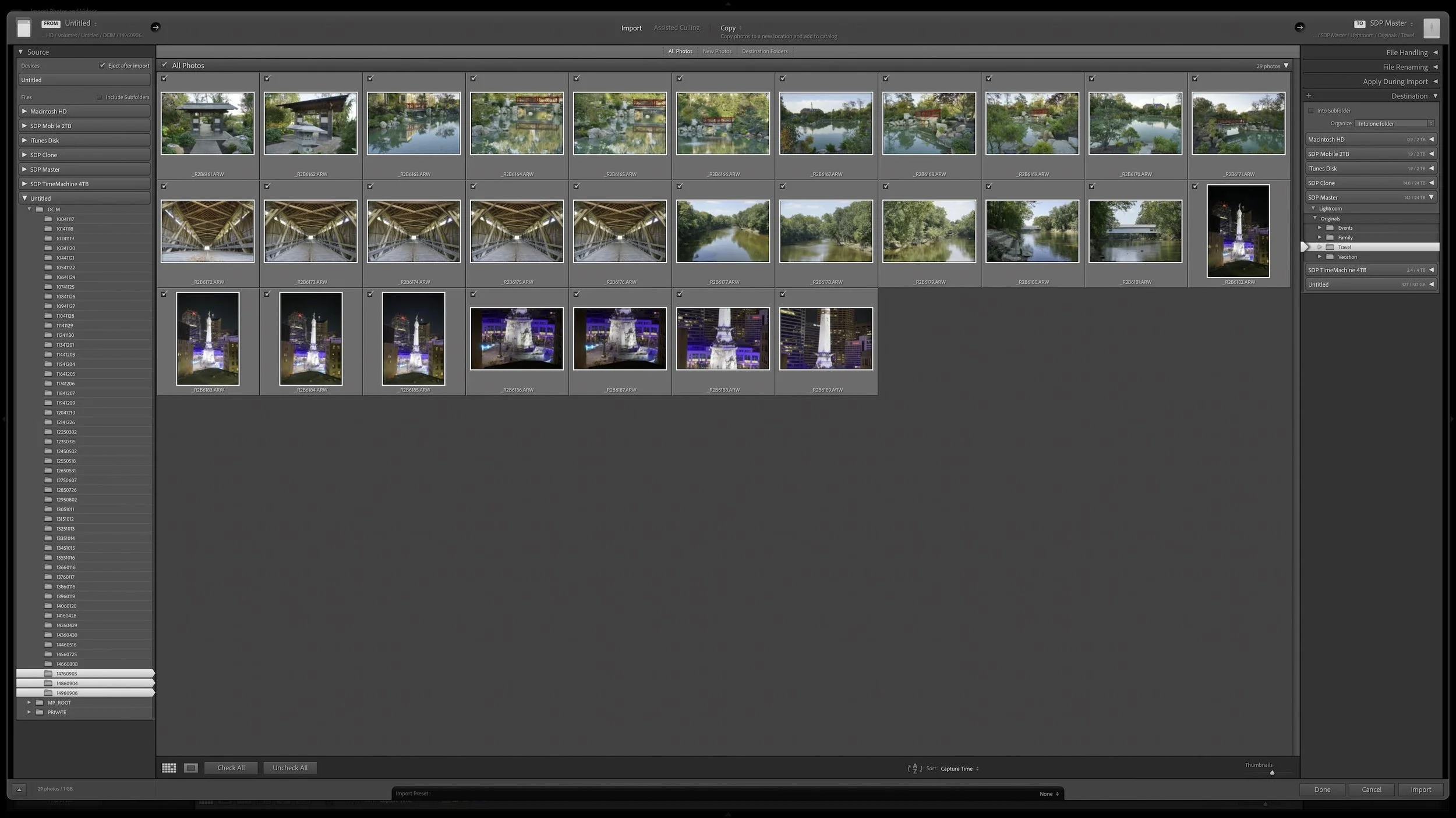
Lightroom Classic's Import dialog presents plenty of choices, but one of the most important decisions is straightforward: where are your photos now, and where do you want the original files to live after the import?
Copy, Move, and Add each handle the original files differently. Once you understand what happens to the physical files and what happens in the Lightroom catalog, choosing the right import method becomes much easier.
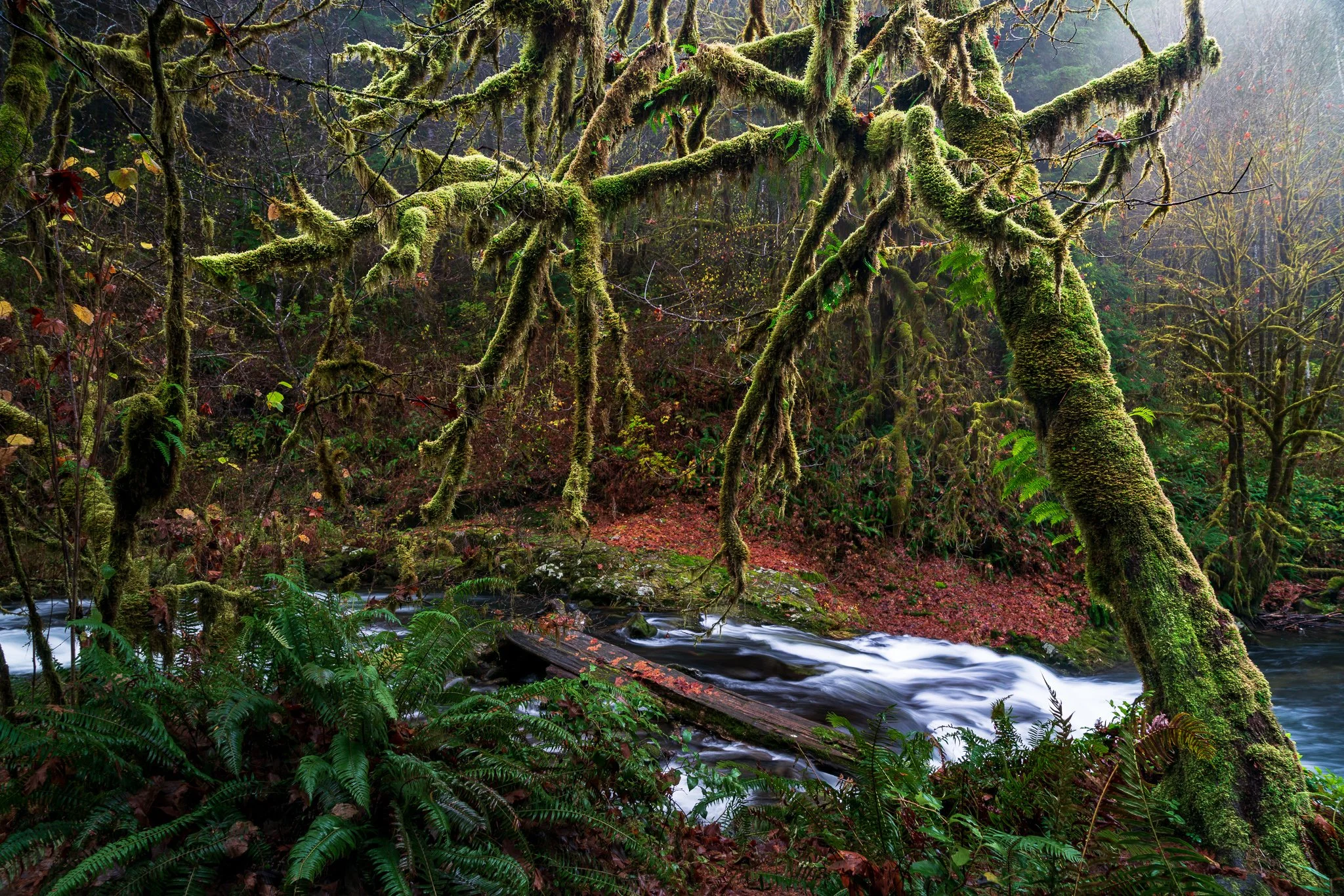
A complicated subject can take a little work to mask well. Once you've made that selection, what else can you do with it? Quite a bit, especially when you want to give your subject more separation from a busy background.
Using a mossy tree as an example, I explain how Lightroom's Duplicate and Invert lets you build several adjustments from one refined mask. You can shape the background and guide the eye while protecting the light on your foreground subject.

Great landscape photographs begin with recognizing what the light is doing. Front light can emphasize color, side light can reveal texture and form, and backlight can transform mist, foliage, and silhouettes. Once you understand those relationships, you can choose compositions that work with the conditions instead of waiting for supposedly perfect light.
Learn how to identify directional, overcast, midday, and nighttime light in the landscape—and how to adjust your viewpoint, subject, and exposure accordingly. These practical examples will help you use highlights, shadows, atmosphere, and natural layers to create clearer, more deliberate photographs.
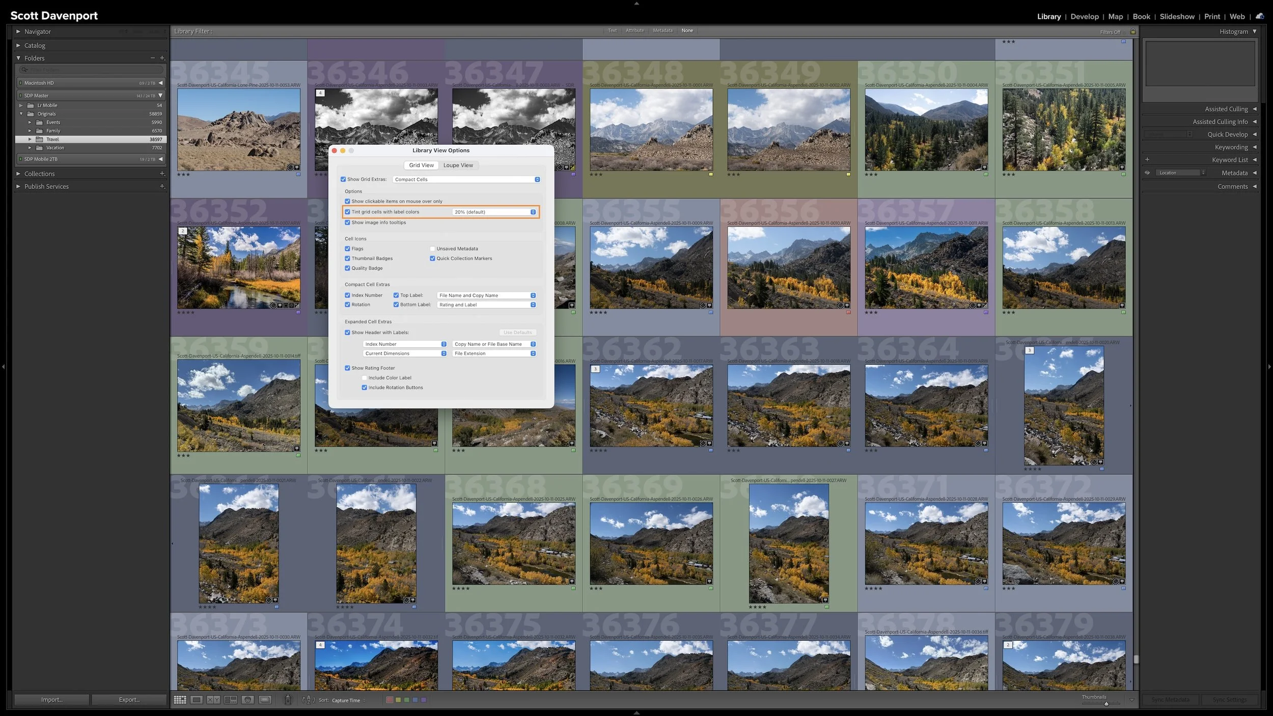
A photo workflow can fall apart when you cannot tell what has been finished and what still needs attention. That becomes especially frustrating when photographs from the same shoot are at different stages.
My six-step Lightroom Classic workflow uses color labels to give every photograph a clear next action. Whether a photo needs rating, location information, keywords, developing, or sharing, I can see where I left off and continue without retracing my steps.
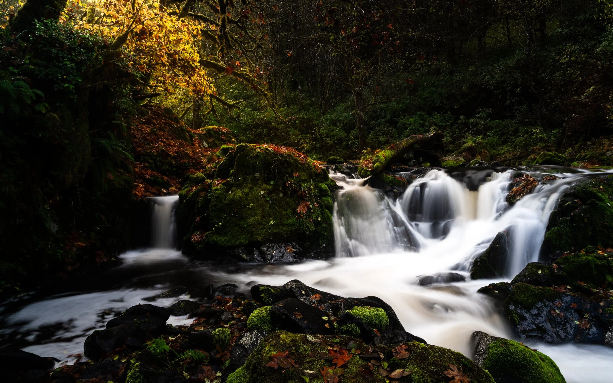
A little glow can bring atmosphere to a landscape photo, but spreading it everywhere can weaken the scene. How do you give that light a direction while keeping the shadows quiet and the brightest details intact?
Using the Sunshine filter in ON1 Effects, I shape a soft glow through a forest scene toward the water. The approach builds on an editing vision and shows how a few complementary masking tools can help you follow through on it.
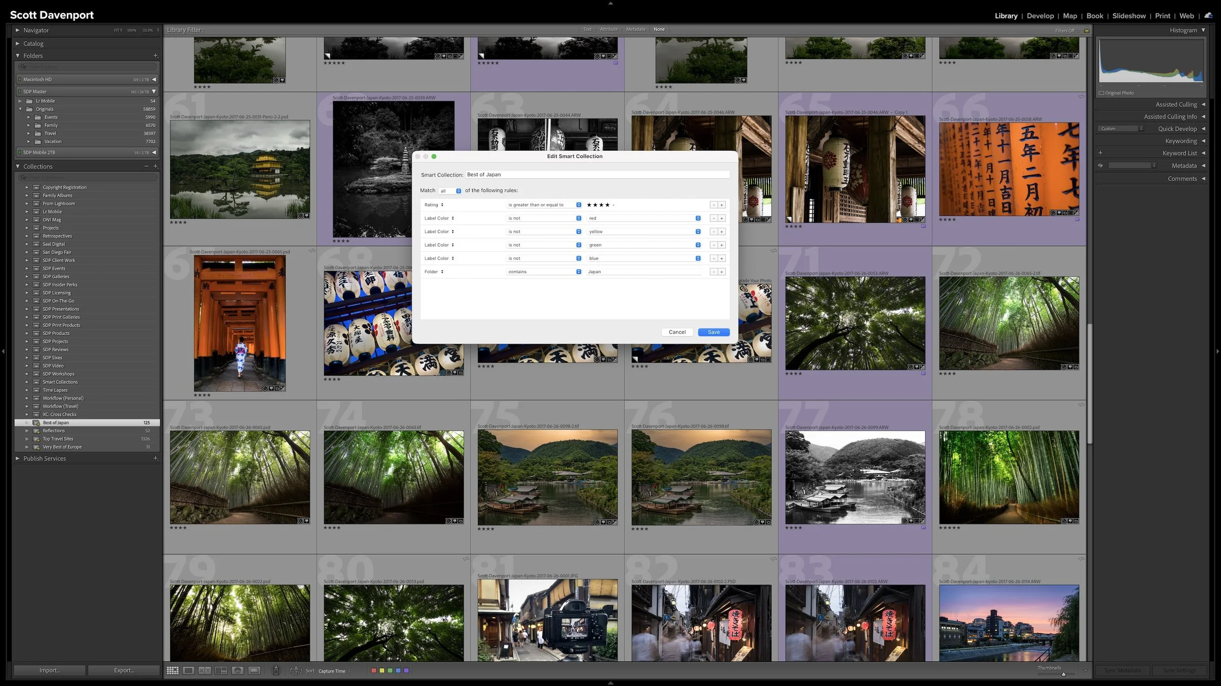
A regular Collection lets you choose which photographs you want to see together. A Smart Collection works differently. You describe the photographs using criteria such as ratings, keywords, location information, or camera metadata, and Lightroom Classic gathers the photographs that match.
The real advantage is that the group isn't static. As photographs enter the catalog or their metadata changes, they can automatically appear in or disappear from a Smart Collection. The rules keep working as the catalog changes.
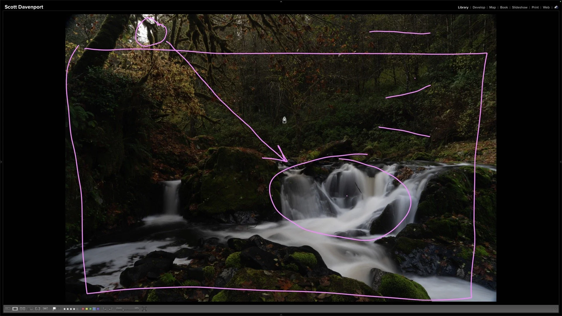
You open a raw landscape photo and see plenty of things you could adjust. How do you decide what the photograph actually needs?
Using an unprocessed Sweet Creek image, I work through the decisions that come before the sliders: finding the subject, choosing a crop, and deciding how light and contrast can guide the viewer’s eye.
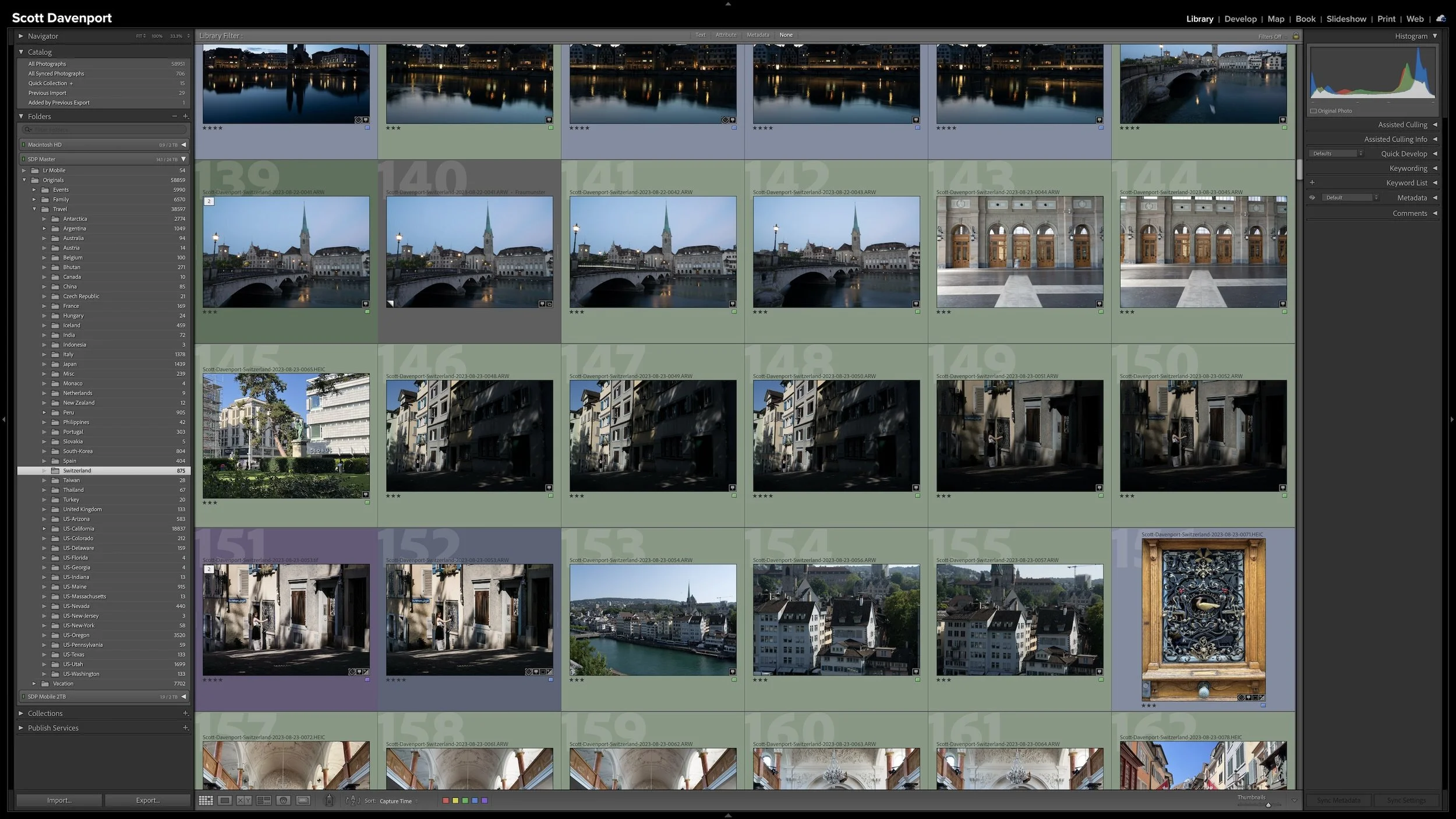
Folders and Collections can both look like ways to organize photographs in Lightroom Classic, but they solve different problems. Folders describe where the original photographs physically live. Collections let you bring photographs together without changing that physical organization.
That becomes especially useful when a gallery, project, subject, or other body of work includes photographs stored in many different folders. Collections give you another way to see those photographs together while leaving the originals exactly where they belong.
 Scott Davenport
Scott Davenport is a landscape photographer and photo educator and based in San Diego, California. He leads photo workshops, writes photo books, hosts podcasts, makes tutorial videos, and feels weird referring to himself in the 3rd person.
He also can't help getting his feet wet photographing at the beach.
Lightroom Classic gives you five stars for rating photographs, but those stars aren't very useful if their meanings change from one shoot to another. A consistent system lets you know what a three-star or four-star photograph means without rethinking the definitions every time you rate a new group of photos.
My rating system ranges from photographs I keep primarily for sentimental reasons to photographs I consider strong enough to print. You don't need to use the same definitions I do. The important part is giving your ratings stable meanings you can apply consistently over time.