Applying My Photo Editing Golden Rule
If you enjoy posts like this, please support my work and support independent photography tutorials like this.
In a post last week, I explained my golden rule of photo editing. In this article, I walk through an example of how that rule guides the adjustments I make to a photo. This is the process I go through with every photo I edit (and yes, much of this starts in the field at capture time). Yet the editing is where you can craft and shape the story of your image.
If you enjoy this article, I think you’ll really like my Story & Vision video course. This course analyzes 5 different images, illustrates my thought process on how to edit, and shows the complete start-to-finish editing.
What Is My Subject?
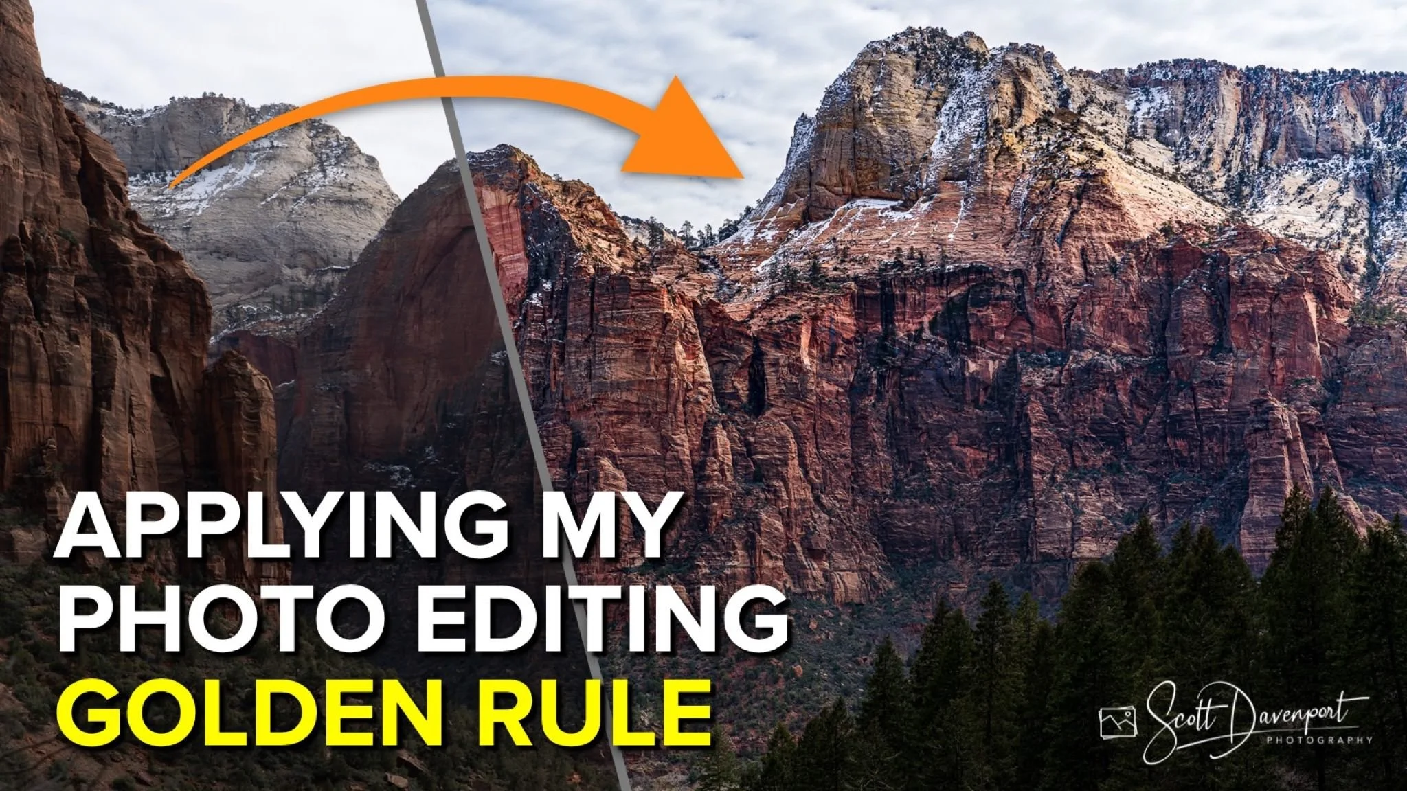
Asking this question is critical to my process. What’s my subject? Why did I take the photo? What do I want you to see? The answers guide how the photo will be edited and adjusted. In this photo, the subject is the towering cliffs across the valley floor of Zion National Park. The evergreen trees, the sky, and even the cliffs on the left side are secondary elements. I want my viewer to look across the valley and marvel at the color and strength of those cliff faces.
The original image
Cropping to focus attention on the subject
The Basic Adjustments
All RAW photos need fundamental adjustments. The automatic settings in our processing tools have gotten very good in the last few years. I begin with selecting a camera profile, setting the white balance, and clicking the Auto button to get a baseline for the image. As needed, I adjust individual sliders. I almost always add a tone curve for additional contrast. Often, these are the only two global adjustments I make to an image. All other changes are selectively applied.
The goal of basic adjustments is to have a strong foundation for the image, with no clipped shadows or blown highlights. My images still often look flat after basic adjustments alone.
Basic adjustments and a tone curve
Guiding Your Viewer’s Eye Toward Your Subject
For this image of Zion National Park, my next step was to darken the foreground.. The triangular shapes of the ground cover in the lower left corner and the evergreen trees in the lower right corner form a natural vignette. This was a conscious choice of framing when composing the photo. In post processing, darkening the trees and ground in lower left and right corners shifts attention to the center of the frame. Additionally, cooling the sky further emphasizes the cliffs. These adjustments also add depth to the photo by emphasizing the foreground, midground, and background layers in the scene.
Darkening elements of the foreground shift attention toward the cliffs
Cooling the sky enhances the natural layers in the scene, adding depth
Emphasizing The Subject
I next turned my attention to the subject itself - the ruddy, jagged cliff faces. I applied two separate adjustments (although in hindsight I could have done this with one). The first adjustment boosted saturation on the cliffs. The second adjustment applied a healthy amount of local contrast and dehaze to enhance the details of the rock.
Boosting color to the cliffs with localized Saturation
Adding detail and clarity to just the subject
A Finishing Touch
The sun is entering the scene from camera right, lighting up some of the east-facing features of the cliffs. As a finishing touch, I added a touch of warmth to just those east-facing features. How? I used a combination of a radial mask, a luminosity mask, and a color range mask to isolate the warmer orange bits of rock. Then, a simple nudge on a Temperature slider added a kiss of sunlight.
Learn more about this technique: Perfect Sunlight Accents With Lightroom And Intersecting Masks
A finishing touch of warmth to the flecks of sunlight hitting the cliffs
Conclusion
Know your subject and the story you want to tell with your photo. Keep that at the forefront of your mind while you edit your images. When you do, each edit will be in service of the story and will make a stronger photograph.
Have fun!
View From Kayenta Trail, Zion National Park
Contact Scott to commission a print or license this image.
