Lightroom Mask Overlay Modes
Adobe gave Lightroom a major masking overhaul and along with the new Lightroom masking experience came improvements to the mask overlays. Good use of mask overlays lets you get the perfect mask. When you can clearly see what areas are affected by a mask, your local adjustments are more precise and your final photo is stronger. In this article, I’ll explain the different types of overlays and my favorite combination.
What Is A Mask Overlay?
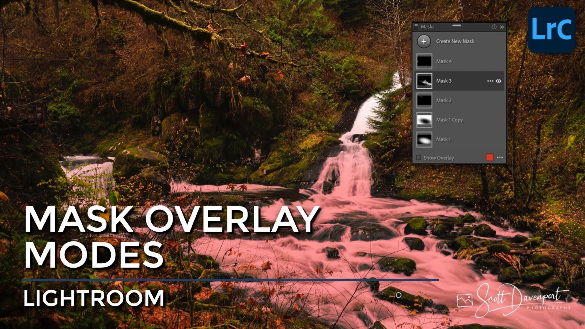
A mask overlay tints the selected mask to make the mask clearly visible. For precision masking work, using mask overlays are incredibly useful. When you create a new mask, the mask overlay is shown by default. Use the Show Overlay checkbox in the Masks panel to turn off and on the overlay.
You can set the color of the overlay and how your image is treated while viewing the mask.
The Overlay Color
Set the color of the overlay at the bottom of the Masks panel. Click on the color swatch and a popup with a color selector is available. There are four built-in Custom Colors for the overlay: red, green, white, and black. Adjust the Opacity slider to increase or decrease the intensity of the color overlay. The Overlay Shows popup controls whether the mask overlay highlights the affected or unaffected area of your image.
Pro tip: Use keyboard shortcut Shift-O to cycle through the overlay colors.
You can also set your own custom mask overlay color using the eyedropper on the color bar. Your own custom color is semi-transitory. If you cycle through the other built-in overlay colors, your personal custom color is reset.
Why does Lightroom offer different color overlays? The reason is, depending on the tones in your image, a different overlay color is more visible than others. Read this article about using different mask overlay colors for an example.
Lightroom has several built-in mask overlay colors. Click the color swatch to set a custom overlay color and adjust its opacity.
The Overlay Mode
The Overlay Mode changes how the selected Overlay Color is shown on your image while the mask overlay is active. In some modes, the display of your image is changed as well. There are 6 different overlay modes:
Color Overlay: The overlay color is displayed on your image (Default).
Color Overlay on B&W: The overlay color is shown on a monochrome version of your image.
Image on B&W: Your image displays normally in the area highlighted by the overlay. The rest of the image is shown in monochrome.
Image on Black: Your image displays normally in the area highlighted by the overlay. The rest of the image is shown as black.
Image on White: Your image displays normally in the area highlighted by the overlay. The rest of the image is shown as white.
White on Black: A full-screen rendering of the mask swatch in the Masks panel. Areas affected by the mask are white and unaffected areas are black. Partially affected areas are various shades of gray.
As with overlay colors, there are some photos where one overlay mode is more helpful over another to readily visualize a mask.
The overlay modes change how the overlay color and underlying image are presented.
Overlay modes are also changeable via the toolbar.
My Favorite Overlay Color And Mode Combination
Of all the color overlay and mode combinations available, I gravitate to a red colored overlay with the Color Overlay with B&W mode. I also prefer to have the mask overlay highlight the affected area. With this combination, the area affected by a mask is highlighted in red and the rest of the image is shown in monochrome. It is very easy to see what objects or tones in my image are impacted by a mask. I find that Color Overlay with B&W is very useful with color and luminance range masks.
My favorite overlay is a Color Overlay on B&W. Masks are very easy to see and can be adjusted with precision.
Keyboard Shortcuts
As you grow proficient with masks, speed up your workflow with keyboard shortcuts. All of the overlay shortcuts center around the letter O (as in Overlay).
O: Toggle the mask overlay off/on
Shift-O: Cycle through the overlay colors
Option-O (macOS) or Alt-O (Windows): Cycle through the mask overlay modes
Annice Falls Sweet Creek Oregon
Contact Scott to commission a print or license this image.
