
When I process my seascape photos, there are certain areas I want to have certain color tones. I like my skies to be blue and I like the whitecaps on the surf to be white. In this video, I use localized brushes and color range masks to manage colors in the scene and downplay saturation where it’s not wanted.
See the behind the scenes footage capturing this photo on In The Field #455.
Subscribe and share!

Can’t capture at golden hour? Use Lightroom’s Calibration tool or ON1 Photo RAW’s Channel Mixer to boost vibrance in your mid-day landscape images.


Stuck with harsh, unflattering mid day light? There are some steps you can take in post-processing to draw out color and depth.

Even when the preview on your camera or the unprocessed RAW looks terrible, don’t dismiss the image!
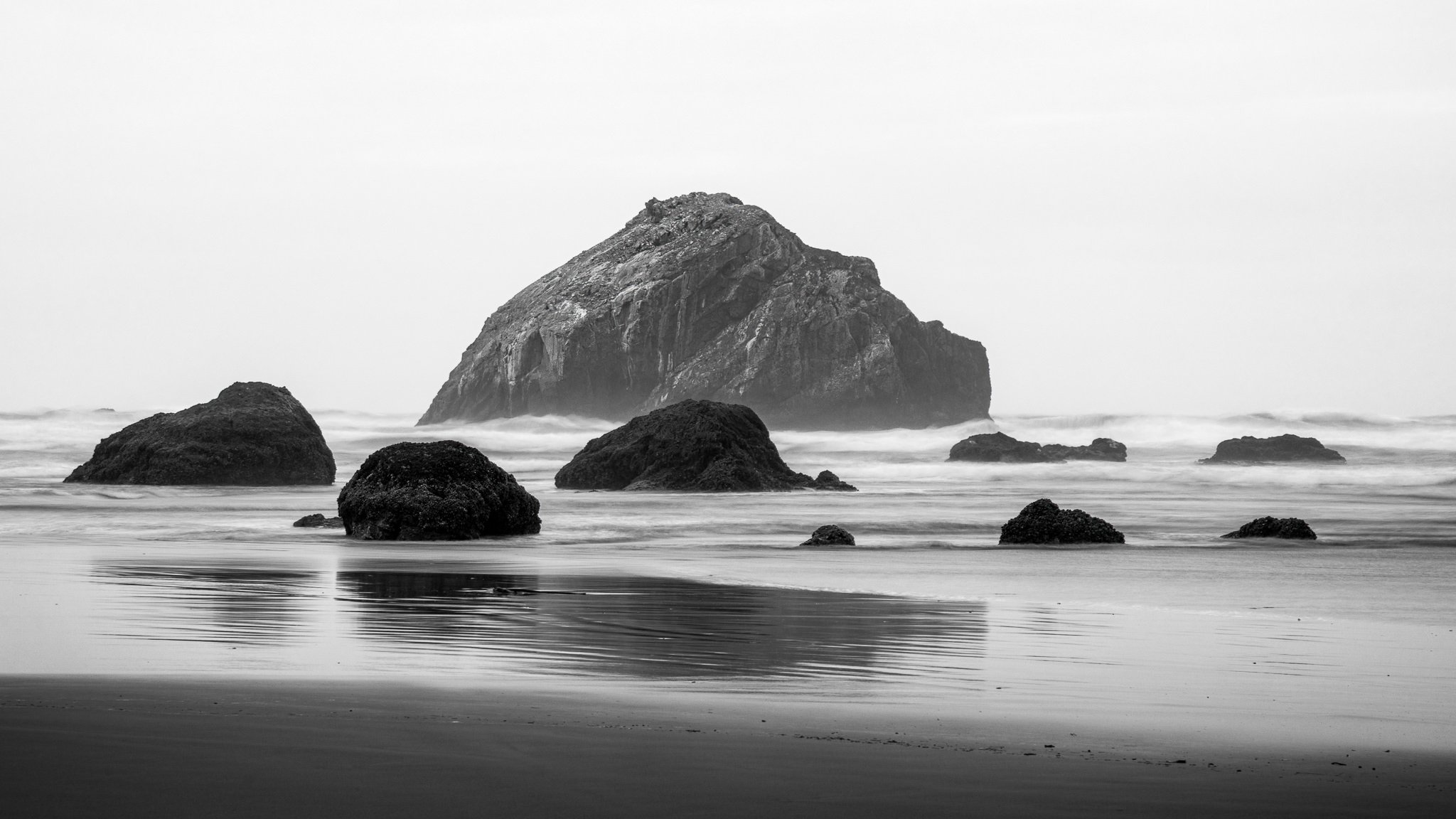
Watch over my shoulder as I work on a new image. In my Live Edit videos, I share my entire start-to-finish workflow using a photo that I’ve never worked on before.

I have a little recipe I’ve used for years with Curves to add a twilight color to my sunset and sunrise photos. It’s simple to do and targeting just the sky in a photo has never been easier.

Many of the photos I captured in Bryce Canyon needed color tweaks and corrections. I put Lightroom’s new Color Mixer through its paces to fix color issues.

Sometimes the ocean doesn’t cooperate with photographers. In one shot, the waves on the left look great. In another, it’s the right side that looks great. The solution? Composite! I’ll share my approach.

In my Live Edit videos, I process an image I’ve never worked on from start to finish, sharing my thought process and reasons behind choices along the way.

Supercharge your dodging and burning by intersecting a luminance range mask with a brush. Get professional-grade results with minimal effort.