Scott Gets A Facelift
In October, I started removing clutter from my blog. And now, I've finished the changes to the rest of the site. Have you visited my new home page? I love the new cover page option Squarespace 7 introduced. I've wanted full screen images for a long time now and I'm so glad they are here. I've also simplified and updated my photo galleries, folding everything into a few basic categories. What else... the storefront got a facelift and I added a bunch of new products. I think the site is easier to navigate now and less cluttered. What do you think?
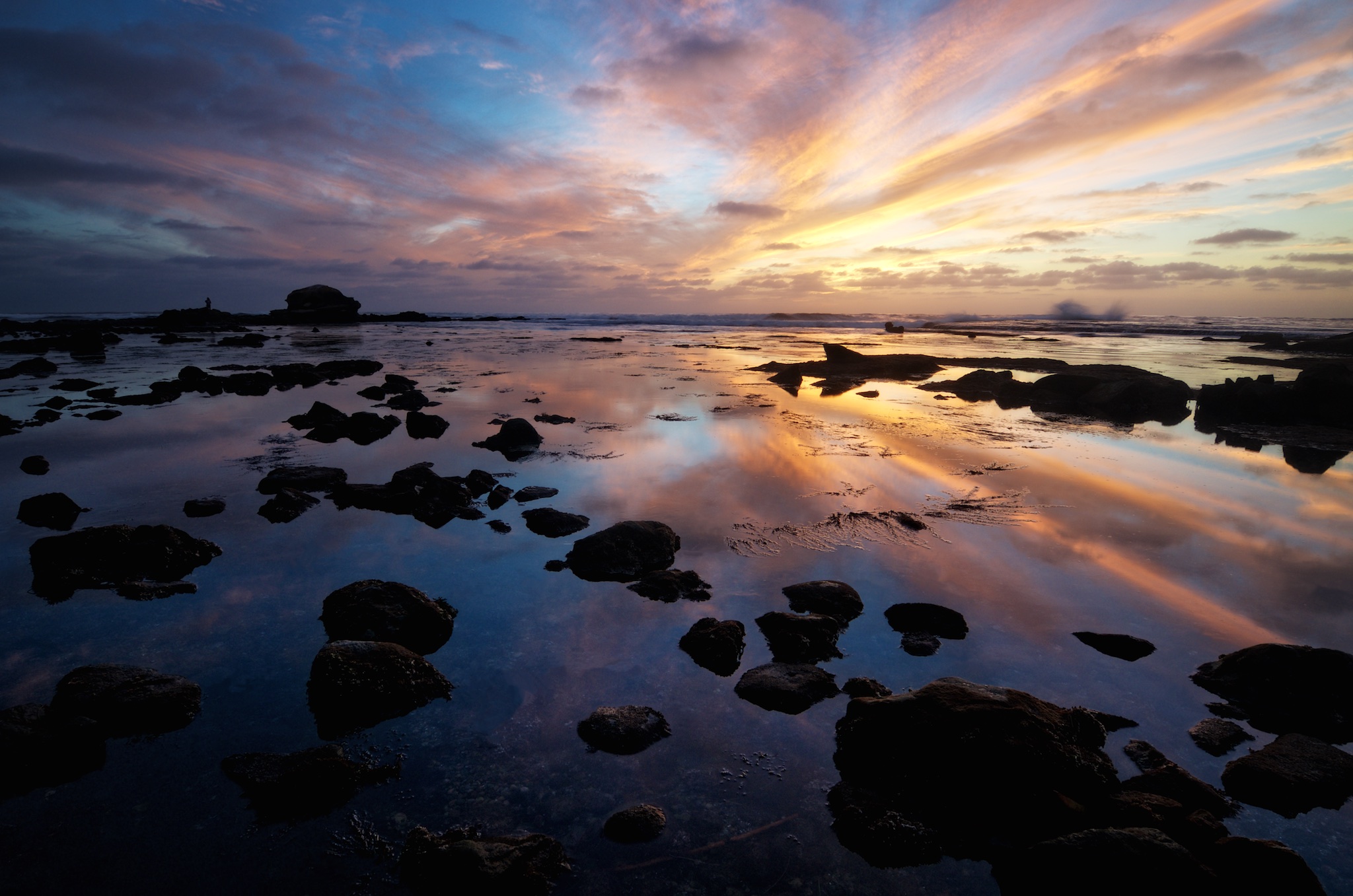
The shot above... sunset last week at Bird Rock was awesome. Sunset coincided with low tide and there was a great sky. I've been waiting for these conditions for 6 months. It's a single exposure, double-processed, once for the sky and once for the foreground. I then blended the two versions together and stylized in Perfect Effects.
